
In recent posts I've explained the new statistical procedure that produces our trend lines and how we now generate "win probabilities" for the leading candidate in each race. With this post, I want to explain how we are handling the unique challenge of aggregating and assessing available public polling on competitive races for the U.S. House of Representatives.
This is a good news, bad news, good news story. The first piece good news is that we have collected, as of this writing, 499 poll results in 111 different districts (probably more by the time you read this), including all but one of the 47 districts considered to be "toss-ups" by the Cook Political Report and all but 3 of the 53 districts in their "leaning" categories.
Now for the bad news. Available public polling for U.S. House contests is of a very different quality than the statewide surveys on the Senate and Gubernatorial races that we've been watching most closely. Specifically,
- Public House polling does not have much depth: Only five districts, as of this writing, have produced 10 or more polls, while more than half (89) have five or fewer and 18 have just one.
- Much of it is dated: As of this writing, the overwhelming majority of the 113 districts we are tracking have either no polls at all (27), just one (36) or just two polls (30) during the month of October. Only 26 districts have three or more October polls.
- Partisan polls are plentiful: More than half of the House polls we have entered (257 of 499) were internal polls sponsored by campaigns or campaign committees, though that does not count another 23 conducted by the Democratic firm Public Policy Polling (PPP). Of the 257 campaign polls, two-thirds (157) were sponsored by the Republicans.
Add the difficulty of sampling the right voters in Congressional Districts that are often heavily gerrymandered and you have the recipe for a lot of polling error. In 2006 and 2008, our polling averages had much more error than those for the statewide contests. Specifically,
- In 2008, when we used mostly straight line trend estimates to aggregate polls in 109 districts the median of errors on the on the margin separating the major party candidates was 4.7 percentage points (absolute value).
- In 2006, when we averaged the five most recent polls in 87 districts, our median error on the margin was 4.5 points
- By comparison, the median error on the margin for our 2008 presidential campaign trend estimates in all 50 states was 2.3, and an even lower 1.8 in the 18 most competitive states where the margin separating Obama and McCain was less than 10 points.
In some districts, our trend estimates produced huge errors. In twenty districts in 2008, for example, our trend estimates missed the actual margin by more than 10 percentage points and predicted the wrong winner (ignoring sampling error) in 14 of 109 districts. The miss rate using simple averages was even larger in 2006 (20 of 87 districts).
So that's the bad news. But there's a second piece of good news, and it's very good. Even though the House polling produced huge variance across individual districts for the last two election cycles, it was virtually unbiased on average. In other words, if we take the direction of the errors in account -- whether they favored Democrats or Republicans -- and averaged them out across all districts the result is near zero: 0.1% on the margin in 2006 and 0.2% in 2008. For that reason, if you had ignored the individual district numbers for the last two cycles and focused only on our top-line scoreboards, you would have predicted the seat counts almost exactly by simply allocating the "toss-ups" evenly to Democrats and Republicans.
But our mission here is about more than predicting the ultimate seat count a few days before the election. We are interested, first and foremost, in collecting every public poll we can find and aggregating the results into charts that produce averages (or "trend estimates") that help you to put each new poll into the perspective of all other polls. And just recently we overhauled the statistical engine that produces these trends to produce more sensible results, especially when polls are sparse (as in House races), and to produce a "win" probability percentage associated with each race.
We believe these changes will marginally improve the quality of the House trend estimates, but we realize that most of the errors had to do with the scarcity of polls, especially within the last 30 days before the election. In some cases, as noted above, the "current" trend estimate for any given district is going to be badly dated or may depend entirely on partisan polls produced by only one party or the other.
So to try to compensate for those problems, we added a very important feature to the statistical model that produces our win probabilities: It now incorporates the House race ratings produced by the Cook Political Report. For those who don't know, Charlie Cook and his colleagues have been rating the status of competitive House races since 1984, making a systematic, qualitative assessment based on whatever information they can gather, including both public and private polling and old-fashioned reporting. For example, as noted on their site, James E. Campbell of the State University of New York-Buffalo examined late summer Cook Political ratings over a 20-year span and found:
99.8 percent of the 3,387 races rated by the Cook Political Report as Solid Republican or Solid Democratic in July or August of an election year went by way of that party, 94.9 percent of the 641 races rated as Likely Democratic or Likely Republican fell the way the Cook Political Report predicted, and 85.7 percent of the 441 races rated Lean Democratic or Lean Republican broke in favor of the leaning party. Of the 130 Democratic-held seats rated as Toss Up, 49.2 percent went for Democrats, and 55.0 percent of the 160 Republican held seats rated as Toss Up were won by the GOP.
The simple explanation of the change we are making is that we now incorporate the most recent Cook Political ratings for each race into the model that generates the House probabilities. The basic idea is that when polls are recent and numerous, the model will largely defer to the polling, but where estimates tend to depend on polling that is either dated or divergent from the Cook rating, the model will tend to move the probabilities into agreement with the Cook ratings. The older or more divergent, the more the probability adjusts. Where we lack polling altogether, we depend entirely on the Cook ratings to select likely winners.
The more technical explanation involves the Forward Filtering Backward Sampling (FFBS) (Kim, Shepherd, and Chib, 1998) technique that we now use to smooth our trend lines (those unfamiliar with the technique may want to skip to the next paragraph). As described previously, we use FFBS to estimate true candidate support over time, where we sample the estimated support on day T-1 given day T, starting from election day. We used data from prior elections to calculate the average percentage for the Democratic and Republican candidates in each category of the Cook ratings over a ten-year span (much like the data cited by Professor Campbell except ours were collected and calculated by UCLA political scientist Jeff Lewis). We used those averages and their variances as the "prior models" to initialize election day means in our model.
This process does not dictate that our trend estimates end on a specific value, mind you, merely that it gives the model a ballpark estimate of where the candidates will end up and prevents our model from randomly walking into insanely nonsensical scenarios. Again, as we have more polling data available that has been collected closer to Election Day, the model gives that data more weight, so we may see trend estimates that run counter to their Cook ratings.
This procedure appears to work reasonably well and will hopefully improve on the quality of individual race estimates as compared to our 2006 and 2008 experience, but there is a downside. As noted previously, the model effectively pools data across multiple polls, and the probabilities it produces assumes that all polls are unbiased. As a result, relatively small leads on House District estimates -- sometimes as little as 4 to 6 percentage points -- would generate win probabilities at or near 100%, often in races that Cook still puts in the their toss-up category. While we have found that polling has been unbiased overall since 2006, our experience shows that individual polls (or trend estimates based on only a poll or two) may carry considerable bias or error that the model does not anticipate.
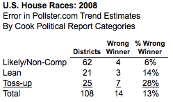
Given our prior experience with House polling, we would consider it irresponsible to report "100%" certainty about the outcomes of highly competitive House races. Consider this table, which shows the error rate for our 2008 House district trend estimates, tabulated by the three levels of the Cook Political ratings for that year. The miss rate on our trend estimates -- districts where the leader in the poll averages ultimately lost -- increased in stair-step fashion from 6% in the likely or non-competitive districts, to 14% in districts rated as leaning to one party or the other to 28% in the toss-up races.
As such, we have opted to weight back the probabilities produced by our model accordingly so that we give no more than a 95% probability of winning to races rated as "likely" or non-competitive, no more than a 90% probability of winning in lean races rated as "leaning" and no than than an 85% probability of winning in the "toss-up" districts. As explained in my previous post, this weighting back of the probabilities has zero impact on whether we rate the Democrat or Republican the more likely winner, it simply reduces the level of certainty we give to each race. We made just one more adjustment to the House ratings because of these weights -- in the House districts, a win probability of 70% or less (or 30% or greater) qualifies as a "toss-up" in our categorization scheme (slightly less than the 75/25 range for the Senate and House). We are using the most current Cook ratings, so if they change between now and Tuesday, our probabilities will update accordingly.
Where's My District? - One last question that has come up repeatedly: Many readers want to know why their district is not included on the Dashboard map or listed in the summary table below. For example, I received this cheerful email this morning (lightly edited to protect the innocent):
May the residents of [my district] ask what we did to offend Pollster?[...]Your site is acting as if [our] race does not exist, and our district is not even listed anywhere I can find.
True. Currently, the map lists just the (mostly) competitive districts where public polls are available, not all 435 in the House of Representatives. We have tried to find every poll we can, and will continue to add districts as we find more polls. If your district is not included, it's because we have not found a public poll for it. Also, given the time crunch over the next three days, the summary table will likely be more up-to-date than the map, so please check that first, and if you know of a poll that we haven't found, please email us!
So hopefully, that explains the mechanics of our House model. I will have a subsequent post up later on what our most recent trend estimates and probabilities have to say about the outcome of the battle for the House in 2010.