The last ten years certainly weren't pretty.
The last decade was "one of the weakest on record" for GDP and job growth, according to Rebecca Thiess, the author of a new report from the Economic Policy Institute. The the last decade, the real value of the minimum wage declined, and the gap between rich and poor grew, meaning there was no cushion when the recession hit, Thiess wrote.
The EPI report, "The Great Recession's Long Tail," was released on Tuesday, as the Bureau of Labor Statistics announced that unemployment fell or stayed the same in two-thirds of American cities in December.
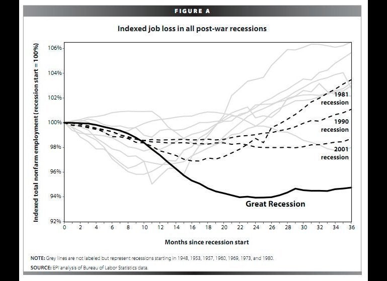
Using federal data, the EPI report found that while the economy will add jobs this year, it could be up to a decade before pre-recession employment levels return. The graphs, from a new Economic Policy Institute report, show in stark black-and-white the impact of the great recession: the highest job losses and lowest gains on record since 1948.
One chart (slide 1 below) shows indexed job loss during the recent recession, which ended in 2009, outstripping every other post-war downturn. "Three years past the start of the recession, the labor market is down a larger percentage of jobs (5.2%) than at any point in any other post-war recession," Thiess writes. "The economy continued to shed jobs for two years after the recession."
Another chart (slide 2) shows the number of unemployed people in a sector vastly outstripping the number of job openings. "Job creation has been overwhelmingly slow," writes Thiess. At the beginning of the recession, there were around two unemployed workers for each opening, now there are around six she adds.
According to the Bureau of Labor Statistics, unemployment rate dropped in 207 of 372 of the largest metropolitan areas, and stayed the same in another 43 in December.
Washington, D.C., Dallas-Fort Worth, Boston, Phoenix and Minneapolis-St. Paul posted the biggest gains, AP reported.
Check out the EPI's disturbing charts below:
