This is part of an ongoing series on rejected book cover designs, in which we invite cover artists to reveal some of the rejected ideas and inspirations behind a particular project.
Rachell Sumpter, designer of three Penguin Threads books, including "The Wizard of Oz":
In your own words, what is this book about?
A child figures out the rules of a strange land and helps others believe in themselves after getting stranded. She goes on a quest to return home. She’s reluctant to be exceptional, the person everyone in Oz thinks she is. Believes strongly that she is normal. Always does what is right. I think it’s a child’s perspective of how to be a hero.
What was the mood, theme or specific moment from the text you depicted with this cover?
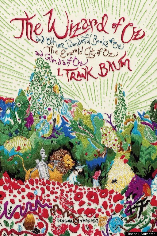
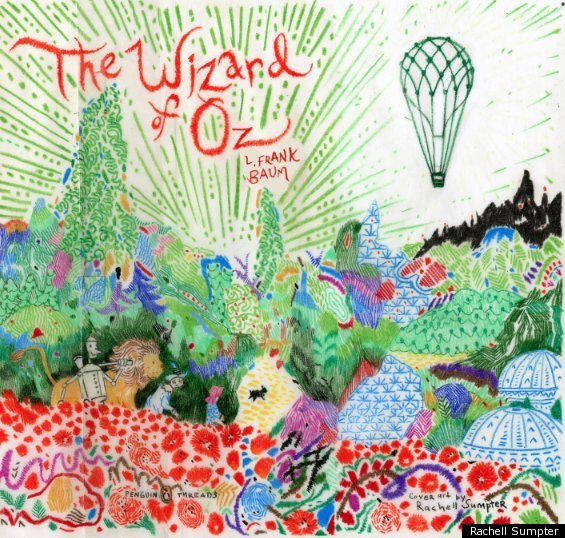
This is Dorothy and her companions approaching the Emerald City. Oz is such a dense world, it was challenging to pick out one moment. There are important elements from other parts in the book also. The poppies are so iconic and beautiful I had to include them. I also wanted to include the four main heroes since the book is about how they support one another.
What inspires your design?
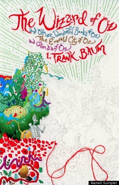
I have to read the book, even if it’s an unedited early version - which has sometimes been the case and I begin by letting the story and style of prose be the sentinel for the overall feeling I want the design to communicate. Then I try to pick out moments that encapsulate the story and have exciting visual potential. With Oz I wanted the cover to reflect that it was an epic adventure, filled with odd characters and bizarre lands. When it came time to translate the sketch to stitchery I delved into various embroidery books, the old ones in particular, to find stitch patterns that would further compliment those ideas.
What is your previous design experience, with books and otherwise?
I’ve been illustrating for over 10 years and showing in galleries for a little bit more than that. At this point in my career the cover work that is probably most recognizable is What is the What, Zeitoun and The Wild Things all written by the unfathomably talented and inspiring Dave Eggers. I’ve also worked on various advertising projects, album covers, and you-name-it’s – diversity is good and I’m happy for it. For the past year I’ve been the resident illustrator for O Magazine’s Reading Room section, edited by Sara Nelson and designed by Angela Reichers. It’s a dream job for me; I absolutely love it.
What was the biggest challenge in designing this cover?
The original Denslow drawings and design of the Wizard of Oz are already beautiful. There was also the movie made about it and numerous children’s books. It’s well covered ground graphically. I hadn’t stitched extensively before this either.
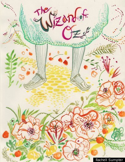
Did you consider different ideas or directions for this cover?
I considered many options; there are so many meaningful moments in the book. Originally I was trying to do something with the yellow road and her slippers. It took a while to figure out what would work stitched. A lot of the early ideas were eliminated simply because didn’t lend themselves well to the line quality that stitching produces. I am grateful for the final result.
What is the most important element of a successful book cover?
Three things: A book cover should be as eye-catching as it is gorgeous and it needs to translate well into various mediums. It is also good for the cover to reflect the content, but I have learned that this is not necessarily imperative.
What are some of your favorite book covers?
I love cover art, sometimes I’ll buy a book because the cover has captivated me though I have no intent to read its insides. The Black Beauty cover Jillian Tamaki created for the previous Threads edition is pretty wonderful. In general I like covers that take into account their medium and use it to their advantage. If it is a four-color, glossy mass market book it needs to do something amazing within that realm. If it’s turn-of-the-century color stamp printing then there are other things the cover artists needed to concern themselves with. The latter method usually produces my favorite covers. I like to see how artists can create amazing works with limited detail and color palette. Aubrey Beardsley was very good at this. I also like Pushpin, Leonard Baskin, Alvin Lustig, Saul Bass, Paul Buckley, Rodrigo Corral, Gabriel Wilson, the list goes on and on, its difficult to pick a cover without considering its creator(s), there are so many incredible book covers and designers out there!
Here are some sketches and embroidered designs made in the process of Rachell's "Wizard of Oz" cover:
And here is the final product: