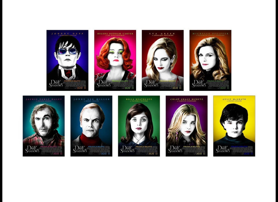
When the marketing executives at Warner Brothers Pictures asked Ignition Print to pitch ideas for movie posters to promote Tim Burton's remake of "Dark Shadows," the only mandate was that posters feature the face of the movie's star, Johnny Depp.
But other than that, Ignition was allowed to "go crazy," said Jacky Shu, the Ignition account executive assigned to "Dark Shadows."
Competition for such projects is usually fierce. Even small, independent movie outfits usually ask at least two graphic design firms to mock up designs. For a major tent-pole like "Dark Shadows,” it’s not unusual for a studio to solicit ideas from 10 firms in the first round.
"It's like 'The Hunger Games.' You're up against other companies literally fighting to stay alive. You're never on something by yourself. There's always another vendor willing to cut you for the finish," Ignition's creative director, Jason Lindeman, told The Huffington Post.
The rewards for the winner are substantial. A big-budget movie like "Dark Shadows" demands poster designs in every conceivable format, from iPhone ads to double-decker-bus billboards.
So Ignition's designers mocked up 200 different concepts -- a huge number even in the Photoshop era, when a good designer can draft a poster in two hours. "Johnny Depp, Tim Burton, quirky -- that's our MO, so we were enthusiastic," Shu explained.
It took Warner Bros. weeks to look through all 200 designs, but studio representatives liked what they saw. They asked for some revisions, and after a months-long winnowing process, told Ignition that one design stood out: a high-contrast, black-and-white photo of Depp's face on a white background, the brainchild of a designer named Ravi Rochanayon. Warner Bros. asked Ignition to make a version for each of the main characters. Instead of a white background, though, they wanted a neon rainbow.
After seeing the full slate of characters and colors, which gave the posters a Warholesque look, the marketing executive at Warner Bros. handed Ignition the account.
It was just the latest in a string of victories for 6-year-old Ignition, which has fast become one of the biggest graphic design firms in Hollywood.
Ignition designed the posters for "The Hunger Games," with the flaming mockingjay pins. "The Devil's Double" one-sheet, the painterly posters for "Precious," and the witty Ryan Gosling-and-George Clooney ads for "The Ides of March” were all Ignition. Not to mention the posters for "Inception," "Kick-Ass," "Salt," "Coraline" and "Contagion."
Ignition Print is now a major business. Yet Lindeman -- who cofounded the company with Jill Green and Abbi Russal, now the president and vice president, respectively, of Ignition Print -- said his early ambitions for the company had everything to do with artistic expression.
"Our vision was to do the coolest movie posters humanly possible," Lindeman said. "From the beginning, we decided to emphasize iconic, conceptual design -- something that's different from the mainstream."
Ignition got a big chance to prove its artistic bona fides early on, when the firm was asked to submit designs for a relatively high-profile movie, "Premonition," starring Sandra Bullock. The safe approach called for a big photo of Bullock's face. Instead, Ignition used tree branches and leaves, on top of a foggy white background, to form a vague suggestion of Bullock's eyes, nose and mouth.
"That poster should never have been printed for that movie," Lindeman said. "Not with a star as big as Sandra Bullock."
But the design got Ignition noticed. It became known as the cooler alternative to other major firms, the one that was willing to try designs outside Hollywood's comfort zone.
"There are ideas in every one of our first-round presentation that other agencies wouldn't present. That's what I love," Russal said.
Sometimes, it encounters an executive or filmmaker who's willing to push the Ignition boundaries. Such was the case with "District 9." Producer Peter Jackson and director Neill Blomkamp had a particularly edgy idea. They wanted to install apartheid-style warning signs about the presence of aliens in public places.
"As the graphic designer, that's like going to heaven. It doesn't get any better than that. It's iconic, but it's also viral," Lindeman said. "That was like the coolest campaign in the world."
As buzz from such bold endeavors spread, Ignition climbed swiftly through the ranks of the movie poster graphic design world. Today, it’s second only to BLT Communications, which was founded way back in 1992, in terms of the number of projects it completes each year. The company now employs 80 people, up from five at its inception. And in six years, the company's posters have been nominated for 95 Key Art Awards -- the industry standard -- and have won 30, including one for their innovative "District 9" campaign.
Still, becoming an establishment graphic-design firm also means that Ignition takes on clients who insist on hewing to Hollywood's safe, often stale templates.
The poster-design world "is really a microcosm of Hollywood," said Sam Sarowitz, owner of New York City's Posteritati Gallery and writer of “The Art of the Modern Movie Poster.” "There's that same constant battle between commerce and creativity."
Consider the superabundance of posters that feature an actor's face hovering above the title of the movie, a visual cliché that Sarowitz jokingly refers to as "The Curse Of The Floating Head."
That's just the most obvious trend in a business that has no shortage of trite configurations, many of them documented on the web. "You try and alter things or try something similar but different that works better for the film, but in the end they'll steer you to a carbon copy that worked before and should work again," Jared Mobarak, a graphic designer who writes a column about movie posters for The Film Stage, told The Huffington Post.
Even when Ignition does manage to avoid "The Curse of the Floating Head," it can't always reinvent the wheel. Some of Ignition's most famous posters -- including the one for "Premonition" -- have been criticized for their striking resemblance to influential, iconic poster designs produced in Poland during the Cold War.
Lindeman admitted that he likes Polish posters -- "but not as much as every blogger wants to believe.”
Sarowitz thinks some overlap in design is understandable, given the volume of design that comes out of a firm like Ignition, and argues that the easy access the Internet gives to graphic design references, including Polish posters, has been a force for good in American posters.
"What's original in the world today? It's easy to say, 'Oh, that poster looks like so and so,' but the truth is that almost everything that can be done has been done," he said.
Even if Ignition occasionally borrows too much from its inspirations, its designers are referring to material that was, for a long time, outside the purview of movie posters.
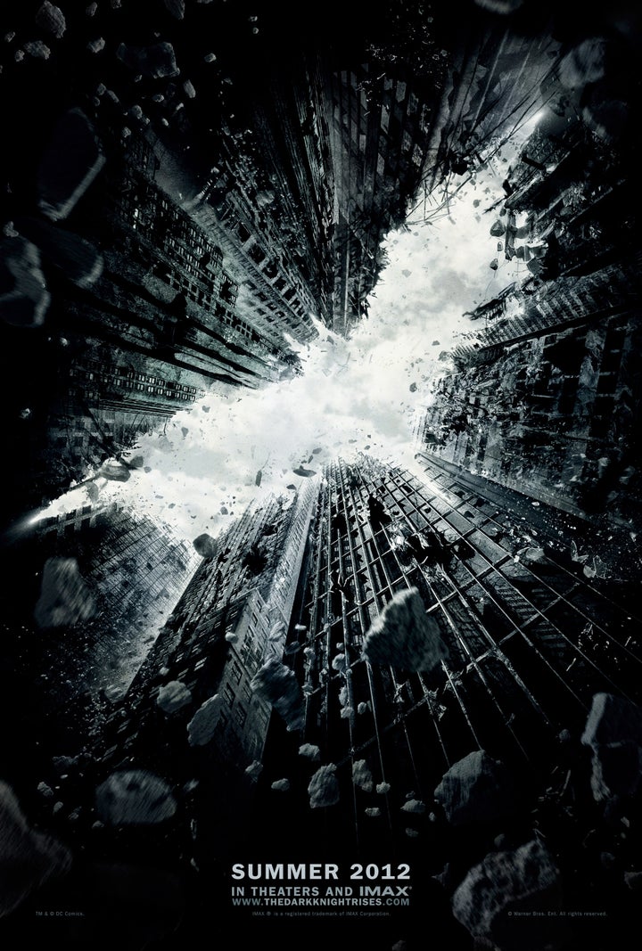
And there are advantages to toeing the line between art and commerce. It means working on projects that are both creatively and financially fulfilling. Case in point: Ignition was selected to design the teaser posters for "The Dark Knight Rises" that were revealed in December. That's an especially big coup considering that BLT designed all the posters for "The Dark Knight" -- including the revered "Why So Serious?" teaser. It's not yet clear whether Ignition will design more posters for the final installment of Nolan's Batman trilogy, but Lindeman said they're happy to have gotten a chance to participate in the project.
"We've done two teaser posters. I worship them. I hope we get to do more on the campaign, but we haven't heard yet," Lindeman said.
Russal agreed: "Christopher Nolan is amazing -- that's one of the best situations of commercial and iconic."

