
Rejected Covers is part of an ongoing series on rejected book cover designs, in which we invite cover artists to reveal some of the rejected ideas and inspirations behind a particular project.
Brian McMullen, the designer of "The McSweeney's Book of Politics & Musicals" [Vintage, $14.95]:
In your own words, what is this book about?
"The McSweeney's Book of Politics & Musicals" collects some of the best politically-tinged writing from mcsweeneys.net, our daily humor website. 77 different people have work in this book -- seasoned comedy writers, previously unpublished funny people, and the witty actors Jesse Eisenberg and Ellie Kemper among them. It's a neat collection. My cool-cat colleague Chris Monks, who has edited the McSweeney's website for many years, had tons of sleepless fun pulling it together.
When I showed my father-in-law a copy of the book so he could see his grandson on the cover, he laughed, and then asked me a good question: Can Republicans enjoy this book? Yes, they can. This isn't the sort of book that tries to make Democrats look brilliant and Republicans look insane. Instead, you get Simon Rich's non-fiction research report on which U.S. presidents have murdered people. It's an enlightening piece that I can imagine Mitt Romney and Barack Obama perusing with equal interest.
What was the mood, theme or specific moment from the text you depicted with this cover?
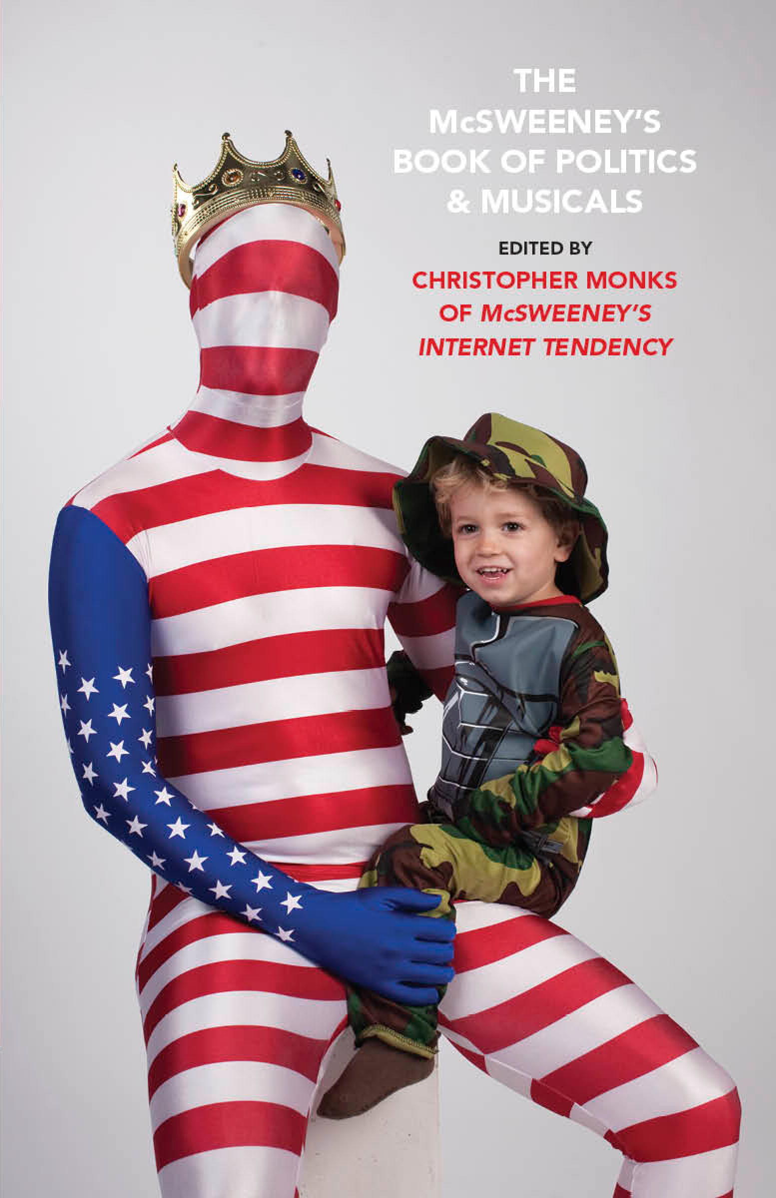
The cover image doesn't refer to anything specific. It's way more about the mood. I wanted the cover to feel sweet, friendly, and loudly patriotic on the surface, while also communicating a deeper sense of dread and even horror under the surface. My hope is that readers of all ages, creeds, and income & literacy levels can look at this cover and experience a chuckle-infused wave of nausea… and then crack open the book and start reading.
What inspires your design?
Desperation played a role here. I stumbled upon both of these costumes while wandering alone in a Party City store, and I thought it would be a lot of fun to dress up with my son and get our picture taken together in a typical father-and-son pose -- like the kind of photo you might get at an Olan Mills or a Sears Portrait Studio. The key difference being that instead of wearing uncomfortable matching sport coats like you would at Sears Portrait Studio, my son and I are dressed in a silky-smooth American flag–suit and a chintzy soldier costume. The king’s crown was a last touch that made me laugh.
Jason Fulford kindly agreed to jump in at the last second and shoot the photo. If you haven't seen Jason's work, suffice it to say that he is overqualified to work at Olan Mills. Inviting Jason to shoot this photo was like inviting an elephant to squash an ant. I was embarrassed to ask Jason for help shooting this idea, but I got over my embarrassment. I'm glad I did.
This particular cover also owes a debt to the artist Matt Furie, whose intensely detailed colored-pencil drawings of monstrous families in mundane poses I've loved for years. Matt is a genius.
What is your previous design experience, with books and otherwise?
I'm the art director and a senior editor at McSweeney's in San Francisco. Over the years, I've designed the covers and interiors for many of our books and journals. One of my favorite recent McSweeney's projects is McSweeney's #36, which I conceived as a box that looks like a human head. Conceptualizing that issue and then editing it with Jordan Bass and Dave Eggers was an extremely satisfying experience -- one of those things that makes you go "this is what it's all about."
In the past year I've had a great time heading up McSweeney's McMullens, the new children's book department at McSweeney's. We've already published a handful of wonderful picture books for children, and I strongly encourage you to check them out here.
What was the biggest challenge in designing this cover?
The biggest challenge was the rushed timeline. I was called on a Thursday evening, out of the blue, and asked to make a finished front cover – ready to print, from a starting point of zero -- by Monday. I agreed to give it a shot. The first thing I did, before I even had a specific concept in mind, was immediately contact Jason Fulford, and set up a time and place to shoot a bunch of concept-based photographs. I spent Friday and some of Saturday thinking up ideas. When Jason and I met on Saturday morning, he was running a fever and feeling unwell, but he came out anyway. The two of us just tried a bunch of stuff in front of the camera for four hours while my amazingly patient wife wrangled our two children until their camera moments came. On Sunday I circulated a handful of different conceptual directions to my colleagues at McSweeney's and we agreed unanimously on the final image by Monday morning. Then I typeset the title over the photo, emailed the design to Vintage, and crossed my fingers. I felt happy and relieved when I hit this deadline, and just as happy when Vintage agreed to print the cover exactly the way we sent it.
Did you consider different ideas or directions for this cover? Why were these rejected? Do you have a favorite amongst them? Are you happy with the final decision as it ran?
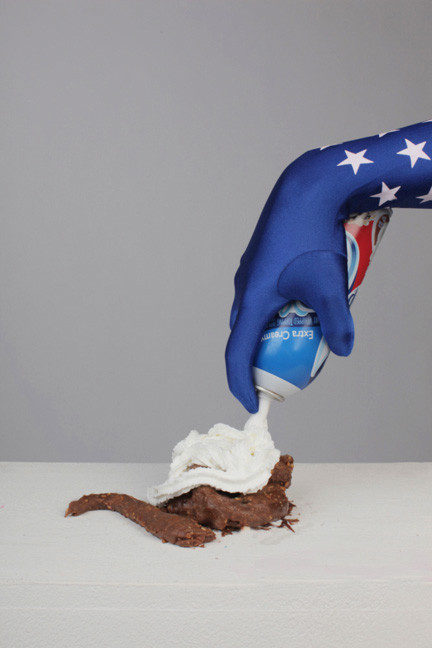
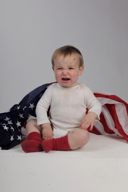
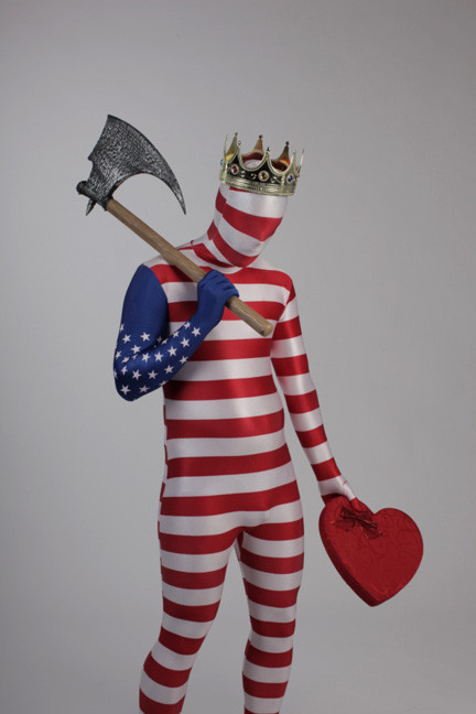
Attached here are three of the other photo concepts that lost out to the final cover. The typesetting on these photos would probably have been similar to the type seen on the final cover.
(1) The poop in the whipped-cream-on-poop photo is actually fake poop made from chunky peanut butter and Fox's U-bet chocolate syrup. I tasted it after the shoot, and it wasn't too bad. A few weeks after this photo failed to make the cut for the Vintage cover, I pitched it as the cover image for the "American Food" issue of our quarterly food magazine, Lucky Peach. Alas, the photo was deemed "too poopy" for the cover of a food magazine. Lucky Peach #4 has just hit the stands with a less-disgusting, more-appropriate cover image.
(2)The crying-baby photo stars my younger son. The idea was to have a baby wearing an American-flag cape crying inconsolably -- perhaps about his prospects as an adult American of the future. We didn't pinch him or anything like that to make him cry. We just dressed him that way, and waited. When he started crying we quickly shot the photo and moved on to the next idea.
(3) The photo with the huge axe and the Valentine's Day candy heart is eye-catching, but it lacks the sweetness of the final cover. The axe would have made the book look too sinister too fast, probably. I still like the downtrodden stance, though. This figure has so much love, and wrath, to give. Poor guy -- doesn't anybody appreciate him anymore?
(4) Here is the final cover:
What is the most important element of a successful book cover?
A successful book cover intrigues and charms potential readers into becoming actual readers. It also strives to honor and please the book's author or authors. If everyone loves a book's cover design except the author, then whoops -- that cover is a failure.
What are some of your favorite book covers?
- One of my favorite hobbies is browsing eBay for high-school yearbooks published between about 1930 and 1992. Some of the strangest, most passionate illustrations and designs in the world are found on these covers.
- Jonathan Barnbrook's cover, layout, and type design for Damien Hirst's monograph "I Want to Spend the Rest of My Life Everywhere, with Everyone, One to One, Always, Forever, Now." This book helped grow my understanding of how a thoughtful designer can take a decent project and make it unforgettable.
- Not a book, but Richard Turley & Jennifer Daniel & co's cover and overall designs for Bloomberg Businessweek are some of the best design stuff in print today. Everyone who's interested in design would do themselves a favor to subscribe.
- The Designers Republic cover for Emigre #29.
- David Shrigley's cover for his book of drawings "To Make Meringue, You Must Beat the Egg Whites Until They Look Like This."
- Daniel Clowes's covers for "Eightball." Especially #4, where the guy is saying “Welcome to my house of dreams.”
- Jason Fulford's cover for his photo book "Raising Frogs for $$$" is, to me, perfect.
- My McSweeney's colleague Walter Green is an amazing designer full of great ideas. Some of the best covers of the 21st century will be designed by Walter Green.
- I could keep going forever. I've been lucky in my career to work with Rick Valicenti and Sina Najafi and Chester Jenkins and Dave Eggers. All four offered me design chances at a young age and pushed me to do better work than I could have done by myself.