

When it comes to predicting elections, pollsters are often judged on whether their results seem to consistently favor one party over another. The industry shorthand for this is "house effects."
Poll critics are quick to argue that the existence of house effects proves deliberate partisanship and to suggest that many election surveys are deliberately skewed. But partisanship is not the only reason that a pollster's work may repeatedly favor one party’s candidates.
In a series of articles, HuffPost Pollster will dig into the factors that push poll results in a partisan direction. The ultimate goal is to figure out how we can use an understanding of house effects to measure the quality of individual pollsters. We'll start by focusing on how house effects are calculated and how the basic patterns of partisan bias played out in 2014 Senate and gubernatorial polling.
Fair warning: The 2014 results may look like they're revealing that Republican pollsters are better than Democratic pollsters. Read on -- we'll explain what really happened last year.
House effects are measured by how much a pollster leaned toward one candidate or another relative to some estimate of the candidate’s real support, which is usually calculated as the average of all polls for that race. The model that HuffPost Pollster used for Senate and governor’s race predictions last year calculated a house effect for each pollster based on the model's polling averages. (These data are still available on the forecast pages.)
For this piece, we modified the 2014 HuffPost Pollster model to calculate how pollsters leaned toward one candidate or another relative to the certified election results. The analysis includes every pollster who publicly released a Senate or gubernatorial poll in 2014. Certified results were obtained from Dave Leip’s Atlas of U.S. Elections. (Additional technical information about these calculations appears below.)
A house effect of zero indicates that the pollster favored neither party on average. A negative house effect means the pollster’s surveys consistently showed higher support for Democratic candidates than they actually received; a positive house effect means the pollster's work consistently showed higher support for Republican candidates than they actually received. The further from zero the house effects get, the stronger the tilt toward one side or the other.
Overall, we looked at 191 pollsters and 1,740 polls. The house effects on average for all the pollsters combined, and for several subcategories, were negative, meaning the survey results from each group on average favored Democratic candidates and underestimated Republican candidates.

Within the general Democratic tilt, predictable patterns emerged when the pollsters were split up by party affiliation. Republican pollsters leaned toward the Democrats the least, while Democratic pollsters leaned the most, by nearly 5 percentage points on average. The differences between Republican, nonpartisan and Democratic pollsters are statistically significant -- the likelihood of those differences happening by chance is less than 5 percent.
The pattern was exacerbated when we further divided the two groups of partisan pollsters based on whether the survey was sponsored by a candidate or party-affiliated group. Sponsored polls by Republican pollsters were even more pro-Republican than unsponsored ones. Sponsored polls from Democratic pollsters were a whopping 1.6 points more pro-Democratic than unsponsored ones -- the latter category consisting mostly of surveys from Public Policy Polling. (In general, sponsored polls from Republican pollsters are conducted for Republican candidates or groups, while sponsored polls from Democratic pollsters involved Democratic candidates or groups.)
Remember that our data include only publicly released polls. When candidates and party-affiliated groups sponsor surveys, they tend to release only those whose results will help their side. Overall then, publicly released polls with partisan sponsors are more likely to overstate support for their side.
Here's where this gets a little tricky. Because Republican pollsters' findings were closer to the actual election results in 2014, people might infer that those pollsters were generally less partisan. In fact, the historic pattern of Republican pollsters leaning toward the GOP, the Democratic pollsters leaning the other way and the nonpartisan pollsters ending up in the middle continued last year. What changed is that all polls underestimated how well GOP candidates would do -- even the Republican pollsters consistently underpredicted their vote totals.
We don't know exactly why this happened, but possible explanations include the possibility that the polls overestimated turnout among Democrats or that voters shifted significantly toward the GOP in the days right before the election.
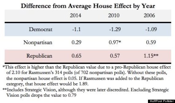
In any case, we can confirm the historic trend by comparing the 2014 house effects to those in previous midterm elections. The chart below shows the difference between the average house effect for all polls and the average house effect for polls in each partisan category. For example, the difference in 2014 between the overall average of -3.84 and the Republican pollsters' average of -3.19 was 0.65.
With the exception of the nonpartisan polls' house effect in 2010, which was skewed by 314 Rasmussen polls with high pro-Republican house effects, the same patterns emerged across the years. Nonpartisan pollsters were closest to the average house effect, Democratic pollsters leaned toward the Democratic candidates, and Republican pollsters leaned toward the Republican candidates.
The discussion about house effects, of course, does not end here. Looking more closely at partisan results can reveal more about pollsters' methods and methodological biases. In the coming weeks, we’ll discuss what we can learn about house effects by grouping pollsters based on how they collect data, investigate how the number of polls and the races polled affect house effects, and consider how we can use house effects to get what we really want -- a measure of pollster quality.
Additional technical information:
A technical description of the HuffPost Pollster model for the 2014 Senate and governor’s race forecasts can be found here. The model was adjusted to generate the house effect averages used in this article by comparing pollsters' results to the actual election vote, instead of a polling average. The "calibration" to nonpartisan pollsters that were within one standard deviation of the 2012 outcome was not used in generating the house effects for this article, and the individual partisan polls (when the pollster only surveyed the race once) were not grouped into the Republican and Democratic pollster categories. The resulting house effect for each pollster was not restricted by any other pollster’s house effect.
The house effects calculation shows how far the pollster was from actual results, on average, by comparing the margin of the poll (Republican estimate minus Democratic estimate) to the actual margin (Republican result minus Democratic result) and combining these figures for all the polls that the pollster conducted in that race. The model treats polls conducted closer to the election as more influential than earlier polls, so pollsters are not penalized for conducting early polls. If a pollster surveyed in multiple races, the house effects for each race were combined into one overall measure by multiplying the house effect for each race by the number of polls in that race, adding those results together and dividing by the total number of polls.
Before You Go
