We log every movement of our bodies via Fitbit. We track every penny of our spending through Mint. There are apps devoted to tracking your menstrual cycle, your child’s location, your diet, your sleep, your sex life, your time.
With data visualization and infographics becoming an increasingly central part of the media we consume daily, the ability to analyze the details of our own lives is seductive. It’s also, with the proliferation of expensive gadgets and user-unfriendly apps, a bit intimidating.
Dear Data, a data visualization art collaboration between Giorgia Lupi, co-founder and design director at Accurat, and Stefanie Posavec, an information designer, shows a gentler, more human side to the data craze. “We are trying to show how data is not scary, is not necessarily ‘big,’ but is ever present in everyone’s lives,” Lupi and Posavec told The Huffington Post.
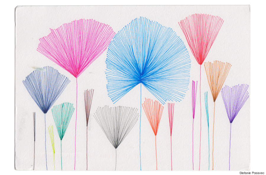
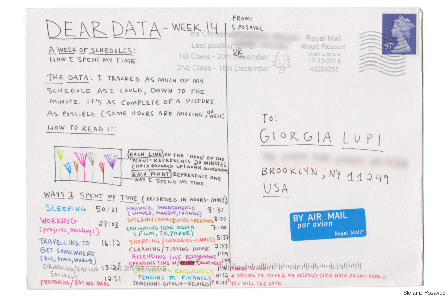
Stefanie's Week 14 -- a week of productivity/schedules
Since Sept. 1, 2014, Lupi and Posavec have been sending each other weekly, hand-illustrated postcards visualizing data about their own lives tracked over the past week. Week 5, for example, found them sketching quantitative representations of the purchases each had made that week; Week 10 tracked their to-do lists. On the back, in addition to the necessary postage and addresses, they squeezed in elaborate keys to their infographics.
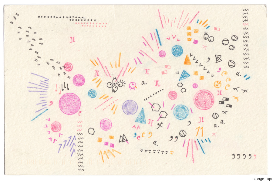
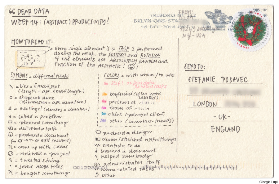
Giorgia's Week 14 -- a week of productivity/schedules
The project highlights the possibilities offered by creative design. Each week, the designers’ postcards show two highly distinct visualizations, despite the similarity of their data set. Where Lupi may have chosen to use a scattered assortment of disconnected images, Posavec may have a series of flowers assembled from lines representing data.
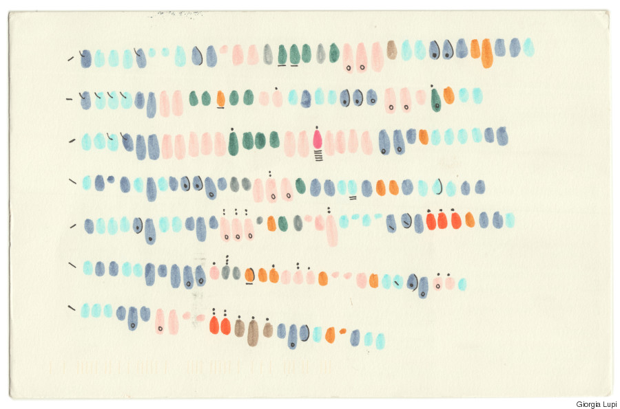
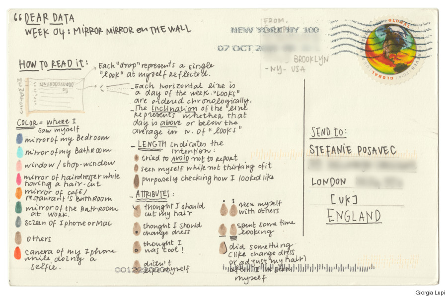
Giorgia's Week 4 -- a week of mirrors
The medium Lupi and Posavec chose -- hand-made postcards sent via snail mail -- adds a warmth and personality to their data visualizations, a form we typically associate with cold numbers and clean, computer-generated graphics. “There is a huge potential to explore a more human way to measure personal experiences without reducing it to a simple quantification,” Lupi and Posavec explained.
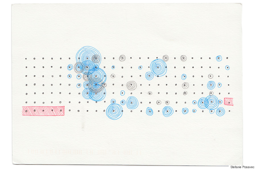
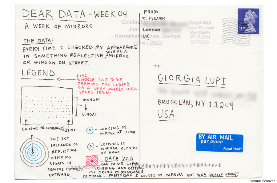
Stefanie's Week 4 -- a week of mirrors
This may mean dropping the easy-to-use tracking gadgets: “Our data-gathering process is more labor-intensive than just using standard metrics derived from technological devices," they admitted. But looking to the data that eludes smartphone sensors and Jawbone bracelets allows us to uncover patterns in more personal aspects of our lives.
The designers began the project as a way of getting to know each other. With Posavec London-based and Lupi in New York, an in-person friendship was impractical, but they were struck by their shared interests and artistic values. By exchanging postcards that capture the personal minutiae of their lives, as well as exploring different forms of data visualization, they created a friendship as well as a striking collaboration.
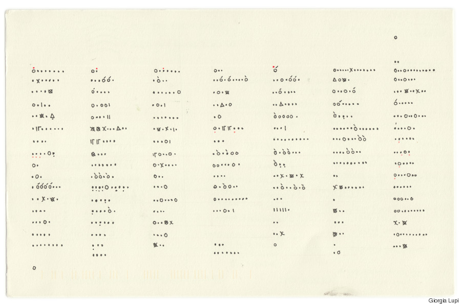
Where it all began -- Giorgia's week 1 card.
Data visualization carries an inherent tension between the need for accurate representation of data and the aim of creating an aesthetically lovely design. This tension creates a palpable ebb and flow in the visual component of the project, as well as in the clarity of the data shown. "We shift and move our focus in order to experiment and better understand how to work with data both for insight and aesthetic, and feed this knowledge back into our work," explained Posavec. The goal, of course, is a balanced marriage between the two. "Beauty and functionality together achieve extraordinary outcomes!" said Lupi.
With the end of the project scheduled for Sept. 1, 2015, the two will complete the collaboration with 52 postcards apiece, “a mosaic of one year of our lives, in data and drawings,” as they put it.
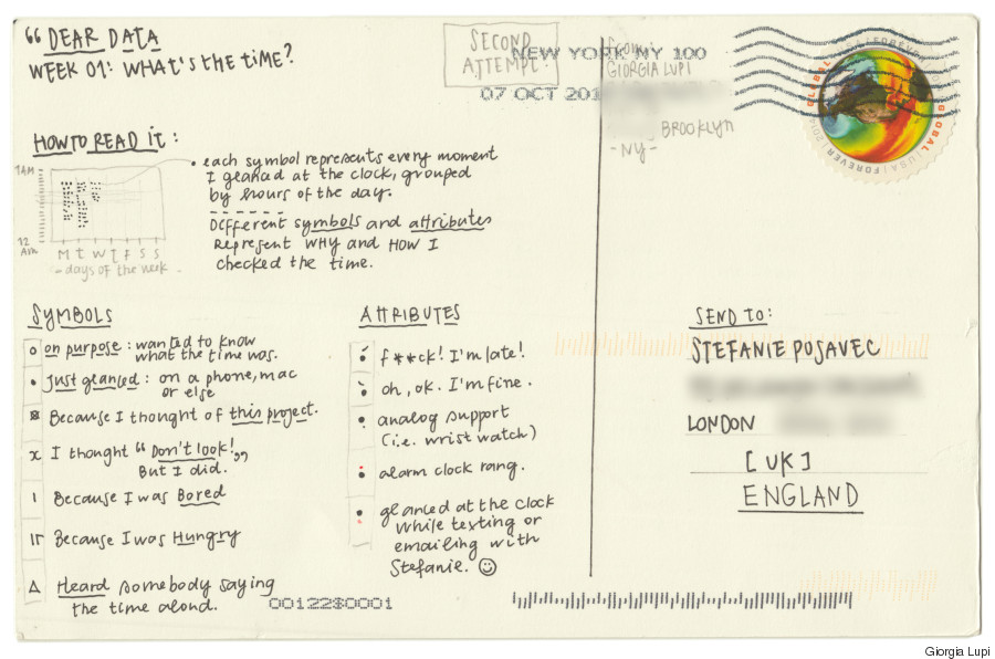
Stefanie, Week 1: A week of clocks
Stefanie, Week 7: A week of complaints
Giorgia, Week 7: A week of complaints
Stefanie, Week 9: A week of Stefanie's interactions with Giorgia
Giorgia, Week 9: A week of Giorgia's interactions with Stefanie
Our 2024 Coverage Needs You
It's Another Trump-Biden Showdown — And We Need Your Help
The Future Of Democracy Is At Stake
Our 2024 Coverage Needs You
Your Loyalty Means The World To Us
As Americans head to the polls in 2024, the very future of our country is at stake. At HuffPost, we believe that a free press is critical to creating well-informed voters. That's why our journalism is free for everyone, even though other newsrooms retreat behind expensive paywalls.
Our journalists will continue to cover the twists and turns during this historic presidential election. With your help, we'll bring you hard-hitting investigations, well-researched analysis and timely takes you can't find elsewhere. Reporting in this current political climate is a responsibility we do not take lightly, and we thank you for your support.
Contribute as little as $2 to keep our news free for all.
Can't afford to donate? Support HuffPost by creating a free account and log in while you read.
The 2024 election is heating up, and women's rights, health care, voting rights, and the very future of democracy are all at stake. Donald Trump will face Joe Biden in the most consequential vote of our time. And HuffPost will be there, covering every twist and turn. America's future hangs in the balance. Would you consider contributing to support our journalism and keep it free for all during this critical season?
HuffPost believes news should be accessible to everyone, regardless of their ability to pay for it. We rely on readers like you to help fund our work. Any contribution you can make — even as little as $2 — goes directly toward supporting the impactful journalism that we will continue to produce this year. Thank you for being part of our story.
Can't afford to donate? Support HuffPost by creating a free account and log in while you read.
It's official: Donald Trump will face Joe Biden this fall in the presidential election. As we face the most consequential presidential election of our time, HuffPost is committed to bringing you up-to-date, accurate news about the 2024 race. While other outlets have retreated behind paywalls, you can trust our news will stay free.
But we can't do it without your help. Reader funding is one of the key ways we support our newsroom. Would you consider making a donation to help fund our news during this critical time? Your contributions are vital to supporting a free press.
Contribute as little as $2 to keep our journalism free and accessible to all.
Can't afford to donate? Support HuffPost by creating a free account and log in while you read.
As Americans head to the polls in 2024, the very future of our country is at stake. At HuffPost, we believe that a free press is critical to creating well-informed voters. That's why our journalism is free for everyone, even though other newsrooms retreat behind expensive paywalls.
Our journalists will continue to cover the twists and turns during this historic presidential election. With your help, we'll bring you hard-hitting investigations, well-researched analysis and timely takes you can't find elsewhere. Reporting in this current political climate is a responsibility we do not take lightly, and we thank you for your support.
Contribute as little as $2 to keep our news free for all.
Can't afford to donate? Support HuffPost by creating a free account and log in while you read.
Dear HuffPost Reader
Thank you for your past contribution to HuffPost. We are sincerely grateful for readers like you who help us ensure that we can keep our journalism free for everyone.
The stakes are high this year, and our 2024 coverage could use continued support. Would you consider becoming a regular HuffPost contributor?
Dear HuffPost Reader
Thank you for your past contribution to HuffPost. We are sincerely grateful for readers like you who help us ensure that we can keep our journalism free for everyone.
The stakes are high this year, and our 2024 coverage could use continued support. If circumstances have changed since you last contributed, we hope you'll consider contributing to HuffPost once more.
Already contributed? Log in to hide these messages.


