The difference between the almost right word & the right word is really a large matter -- it's the difference between the lightning bug and the lightning. - Mark Twain, Letter to George Bainton
Let's look at two prints from around the same era: Edward Hopper's etching Night Shadows from 1921 and Martin Lewis' drypoint Speakeasy Corner from 1928. They easily could represent a view from a window at the same street corner of Lower Manhattan in the '20s; both evoke qualities of lurking intrigue, expectation, and enigma. The Hopper is lightning and the Lewis is a lightning bug.
A few points of comparison (though there's lots more that can be said):
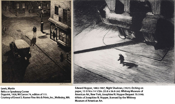
Hopper subtly shifts our expectations. Not a vertical or horizontal is in sight; space is disorienting and dislocating; we have lost our bearings. We're across the street, and we're looking down. In the Lewis print we're clearly looking down as well, but we're on our feet, verticals stay vertical, and orthogonal lines (angled lines appearing to recede into the distance) predictably seem to recede into an almost measurable distance.
Medium: Hopper's print is an etching, a printmaking medium characterized by distinct lines of relatively even weight. Dark areas, such as the heavy shadows, are made up of lines drawn close together and printed so the ink blends across the lines. The contrast of black and white is starkly emphasized by very black ink and very white paper. Lewis' print is a drypoint, a medium in which lines have a variety of weight from faint to heavy, and soft, blurry edges. In the Lewis we see a greater tonal range (more grays) and nuance. The almost brown ink melds softly into the warm cream paper.
Detail: The Hopper, while rendering architectural features with credible simplicity, doesn't let us read or recognize much beyond a man, a fire hydrant and awnings. The Lewis allows a full inventory of objects, down to hairstyles, a license plate and the writing on a sign. We could name the street corner. The Hopper can be resolved to a few dominant, heavy shapes with loosely defined textures; the Lewis has too many small distinct shapes, with differentiated textures, to count.
Both shift our eye from near to far and from right to left, a direction counter to unconscious general expectation and opposed to the direction we read (remembering it is an artifact of printmaking to reverse the image, but artists plan for that). Both depict strangely shaped, lengthening shadows. The Lewis shows us the source of light, a street lamp; the Hopper does not.
The purpose of analyzing and taking things apart is to put it all back together and see the whole anew (arriving where we started and knowing it for the first time, to borrow from T. S. Eliot). Everything adds up, purposefully, coherently and expressively in good art, and both these prints are very, very good. Both offer us images of uncertainty; both are the product of artists who know exactly what they're doing -- but the Hopper, in giving us so much less in not giving us what we expect, tells us so much more about what we don't know.