Last December, a chart began circulating among Wall Street trading desks that drew parallels between 1929 and today. This chart is obviously frightening as the market fell over 40 percent in one month back in 1929.
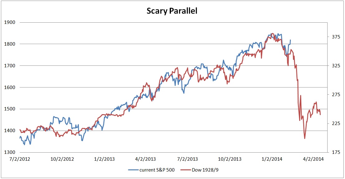
Technician Tom DeMark first drew parallels with the 1928-1929 period last November.
"Originally, I drew it for entertainment purposes only," he said -- but no longer. "Now it's evolved into something more serious."
According to DeMark, if the S&P decisively brakes the 1762 level then a major bear market will have only just begun.
So should you sell everything?
Sorry, but simply lining up two data sets and seeing a similarity doesn't make it predictive of the future. First of all, every pattern will break trend eventually. It is just a matter of time. Secondly, you can match many data sets to previous time periods and get a very different picture. So how about this one correlating the current market with the 1996-1997 period.
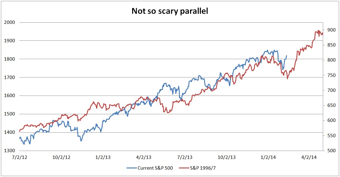
Wait, now I'm confused. This chart tells me to buy, buy, buy! The market could increase by 20 percent.
In conclusion
Scary charts are great for catchy headlines resulting in ratings for news agencies so it is no surprise that they search for this type of attention grabbing chart. Technicians look for patterns while totally ignoring fundamentals. This is an incomplete analysis that lacks the understanding of what drives the market. Technician Tom DeMark, who drew the 1929 comparison, has been calling for a top almost every year. Last March, he said the S&;P 500 would top out at 1567. That was just a bit off the mark. One of these years he will be right and given that we are in the fifth year of the bull market, this time he just may be.
But keep in mind that fundamentals drive stock performance, not similar looking chart patterns. In 1929, Dow earnings collapsed along with the market. Unless you are forecasting a similar collapse in earnings in 2014 or think the market is grossly overvalued, then you shouldn't be scared.
What do you think of the 1929 comparisons? Are you scared?
This post originally appeared on the Runnymede Blog.