Welcome to the first installment in what will hopefully be a four-year (or eight, even) monthly series of articles examining President Barack Obama's job approval ratings with the public, as provided by America's pollsters. Each month we will take a snapshot of how Obama is doing, and track it for his entire term. This should give a longer-term perspective than what is currently available online, and show his relative political strength over time.
We had a lot of fun with polls and charts during the election season, and several readers have complained that they have gone through "chart withdrawal" since. This column should help them with their affliction.
Now, I am aware that many people look down their noses at public opinion polling in general, and consider it untrustworthy for one reason or another. Indeed, some consider it no better than voodoo or divination. If this describes you, then I strongly advise you stop reading now, because the rest of the column is just going to bore you or annoy you. And you've got better things to do with your time than that, right?
For those of you still with me, let's get straight to the chart, and then I'll talk a bit about where the numbers come from (and why), and what the past few months has meant for Obama.
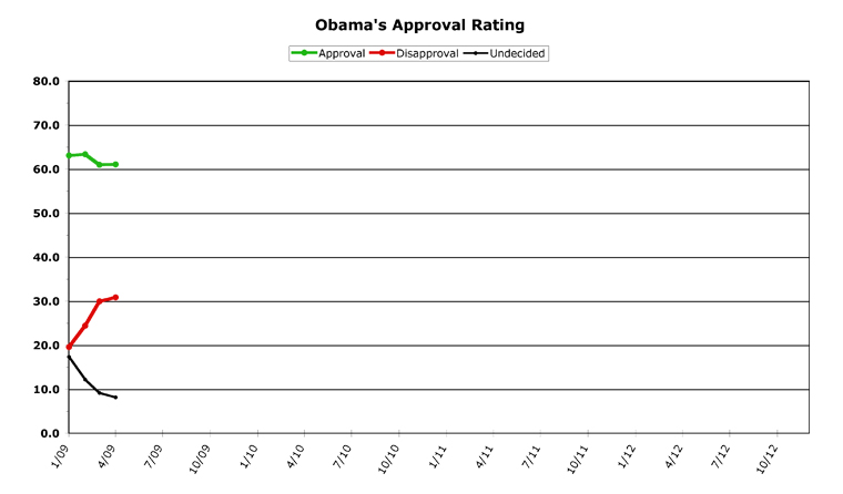
[Click on the graph to see a larger version of it.]
The numbers on this graph come from RealClearPolitics.com. I considered other sources for the data, but settled on RCP for a few different reasons. First, they provide a chart on their site which averages recent polls, and tracks the average numbers over time on a daily basis. This allows me to use their daily numbers and not have to average the raw poll numbers myself. Secondly, they minimize the effect both Gallup and Rasmussen have on some sites, by not including every single one of their polls.
Both Gallup and Rasmussen poll weekly, sometimes even bi-weekly, which results in a flood of data from two sources -- which tends to minimize the weight of other sources when you add in every single polling number Gallup and Rasmussen provide in your averages. And Rasmussen, in particular, seems to be polling a very different group of people than most of the other polls out there. The latest poll from Rasmussen shows 57 percent approval for Obama, and a whopping 43 percent disapproval. Gallup, on the other hand, leans a bit to the other side of the average of other polls, and is currently reporting 68 percent approval and 26 percent disapproval. I wrote about this back in March (complete with graphs), which is worth reading for further discussion of the "Rasmussen Effect" (especially the update at the end, from Mark Blumenthal of Pollster.com).
This is why some people don't trust polls, it is worth pointing out. If two professional pollsters can come up with such wildly differing numbers on a basic question, then something must be wrong.
But different polls use different statistical methodology, and some are better than others at predicting (for instance) the outcome of an election. Which is where the whole "poll of polls" idea comes from, since averaging the numbers tends to smooth out such differences.
The way I get my monthly numbers is to take all of RCP's daily average numbers and then average them out for the month. Thus creating a "poll of polls of polls," so to speak. So each number in my chart is the average of the daily averages of recent polls which can be seen at the RealClearPolitics page for Obama's approval rating (mouse-over the chart to see these numbers). There are probably more professional ways to come up with such numbers, but this is the best I could come up with, so you'll have to excuse my amateur methodology.
You'll also have to excuse me for explaining it in such detail, but since this is the first one of these columns, I thought I'd get it out of the way to avoid questions about where the numbers come from.
Looking at the poll numbers themselves shows a few trends. I have to admit a few things before we start analyzing the numbers, though. First, Obama is still in his historical "honeymoon" period, so these poll numbers don't mean a whole lot at this point. Americans tend to support newly-elected presidents for a few months, and give them the benefit of the doubt during this period. So Obama's approval numbers may be slightly buoyed and may indeed go down in the coming months. This is natural, and happens with just about every president, so it should be expected.
Second, there's not a whole lot of data points to look at yet. This is why I haven't done this before now, when we have at least four points on each line to consider.
But we've got to start somewhere, so let's take a look at what the numbers are telling us.
January
January didn't have a whole lot of poll numbers, because I am only starting from when Obama was sworn into office (on the 20th), meaning it is not a full month. Obama's approval numbers started off very high, at 63.1 percent, and his disapproval rate was only 19.6 percent. The number of undecideds was extremely high, at 17.3 percent, since many hadn't made up their minds about the new president yet.
Obama's highest daily average during January was 63.5 percent approval, and 20.0 percent disapproval. His lowest daily average was 61.8 percent approval, and 19.3 percent disapproval. Not a lot of range for either number, but then it was a short month for data.
February
Obama's first full month of polling was his best so far for approval. He ended the month with a 63.4 percent average approval, and a 24.4 percent disapproval rate, with 12.2 percent undecided. During the month, Obama's approval numbers ranged from a daily high of 65.5 percent to a low of 61.6 percent. His disapproval numbers ranged from 19.4 percent at the beginning of the month to 28.6 percent towards the end. Overall, the trend of undecided people moving into the disapproval column over time (which can be seen on a monthly basis) played out generally on a daily basis as well -- meaning the trendline within the month was pretty much the same as the monthly trendline you see on the graph.
While it is normal to expect the undecideds moving into one column or another, for the most part they seem to be moving into "disapprove." This trend will continue into March, but shows some signs of leveling out in April.
March
March was a bad month for Obama in the polls, relative to the other three months we're looking at here. Relative to presidential polling in general, it wasn't all that bad at all (ask any politician if he'd swap his poll numbers for Obama's ratings in March if you don't believe me). But it was a letdown for Obama on both fronts. His approval ratings slid 2.5 percent, and he wound up with an average 60.9 percent approval for the month. His disapproval ratings continued their climb upwards, adding 5.5 percent to finish at 29.9 percent for March. Still not that bad, but moving in the wrong direction.
This is seen more dramatically when looking at the daily numbers. Obama started off the month with his highest approval rating (64.2 percent) and ended the month with his highest disapproval rating (32.2 percent). But while his approval number went below sixty for the first time on the fourth of the month, and hit 59.8 percent, it soon recovered and spent the rest of the month in the 60.2 to 61.5 percent range. His disapproval numbers, however, continued their climb over time in the daily numbers, starting at a monthly low of 27.2 percent and marching upwards to end at the month's high. Again, this is due to undecideds shrinking to 9.1 percent for the month, down three percentage points from the previous month.
April
Things began settling down for Obama in April, however. The steep trendline for the disapproval rate was muted, and his approval numbers recovered a tiny bit. The movement of undecideds to disapprove slowed as well.
Obama's approval rate went up by a tenth of a percent in April, to finish at 61.0 percent. His disapproval went up by almost a full percent, to 30.8, but this was much better than adding five percent (as happened in February and March). Whether this has topped out and leveled off cannot be said until we get next month's numbers, but at least the slope of the line is looking better for Obama. Undecideds lost another percent, to finish at 8.1 percent, but again, this trend is slowing as well.
When looking at the daily numbers, there was movement in Obama's direction all month. He hit his highest approval number, 62.8 percent, on the 26th of the month, up from a low of 60.3 on the ninth. His highest disapproval rating, 32.5 percent, came on the second day of the month, but then fell back to the lowest, 29.9 by the eighth of the month.
Overall Trends
Over the last four months, Obama's approval ratings have been remarkably stable. This stability is remarkable because of all that has been on Obama's plate during this time. Republicans have been doing their best (worst?) to tear the popular president down with every chance they get, and yet his approval ratings remain solidly in the 60-65 percent range. This is exceptionally good for any politician.
The rule of thumb in approval polling goes something like this: anything over 60 percent is gold; 55-60 percent is excellent, but watch the trendlines carefully; 50-55 percent is good, but the closer to 50 the more worrisome; 45-50 is a warning sign of slipping support, 40-45 is dangerously close to falling off a cliff; and anything below 40 percent is "Nixon/Dubya" territory. Others may define these ranges somewhat differently, but it's generally agreed upon that from 45-55 percent is dangerous territory, but anything outside that shows the country either supports you or does not support you in general.
By this measure, Obama doesn't have much to worry about at this point. But then, it could all just be "honeymoon" approval which will dissipate as time goes on. But over four months, Obama's approval only moved around by two and a half percentage points (from 60.9 to 63.4), which is extremely stable indeed.
The other numbers paint a somewhat different picture. His disapproval numbers climbed 11.2 percentage points over the period, from 19.6 to 30.8. Almost all of this came from undecided people making up their minds to disapprove of him, as the undecided numbers went down by around ten points in the same period. But both of these trends show signs of leveling off, so next month we'll be able to tell whether this is a "beginning of the term" trend or not. After all, there are only so many undecided poll respondents, so once they've mostly all made up their mind, the trend should die off.
While this column has gone over all of these numbers already, for future consistency I am including a list of data below, if you'd like to see some hard numbers. In the future, this will help keep any one month's numbers in perspective.
[Note: This series is a work in progress. What do you think so far? Is the chart too boring? In coming months, when I only have a single month of data to talk about, should I examine other trends? In other words, what else would you like to see this column cover? Let me know in the comments, or drop me an email. We aim to please.]
Data
Highest Monthly Approval -- 2/09 -- 63.4%
Lowest Monthly Approval -- 3/09 -- 60.9%
Highest Monthly Disapproval -- 4/09 -- 30.8%
Lowest Monthly Disapproval -- 1/09 -- 19.6%
Highest Daily Approval -- 2/15/09 -- 65.5%
Lowest Daily Approval -- 3/4/09 -- 59.8%
Highest Daily Disapproval -- 4/2/09 -- 32.5%
Lowest Daily Disapproval -- 1/29/09 -- 19.3%
Monthly Data
[All-time high in bold, all-time low underlined.]
Month -- (Approval / Disapproval / Undecided)
04/09 -- 61.0 / 30.8 / 8.1
03/09 -- 60.9 / 29.9 / 9.1
02/09 -- 63.4 / 24.4 / 12.2
01/09 -- 63.1 / 19.6 / 17.3
Chris Weigant blogs at: ChrisWeigant.com