What's your color obsession lately? I can't stop pondering yellow... a little sunshine never hurt a room, right?
One of the biggest misnomers in the interior design world is the notion that stripping a room down to its most neutral base is more calming, streamlined and sophisticated. The next big misnomer in this category is that some shade of beige-toffee-grey is generally recognized as the quintessential neutral. I'm not so sure...
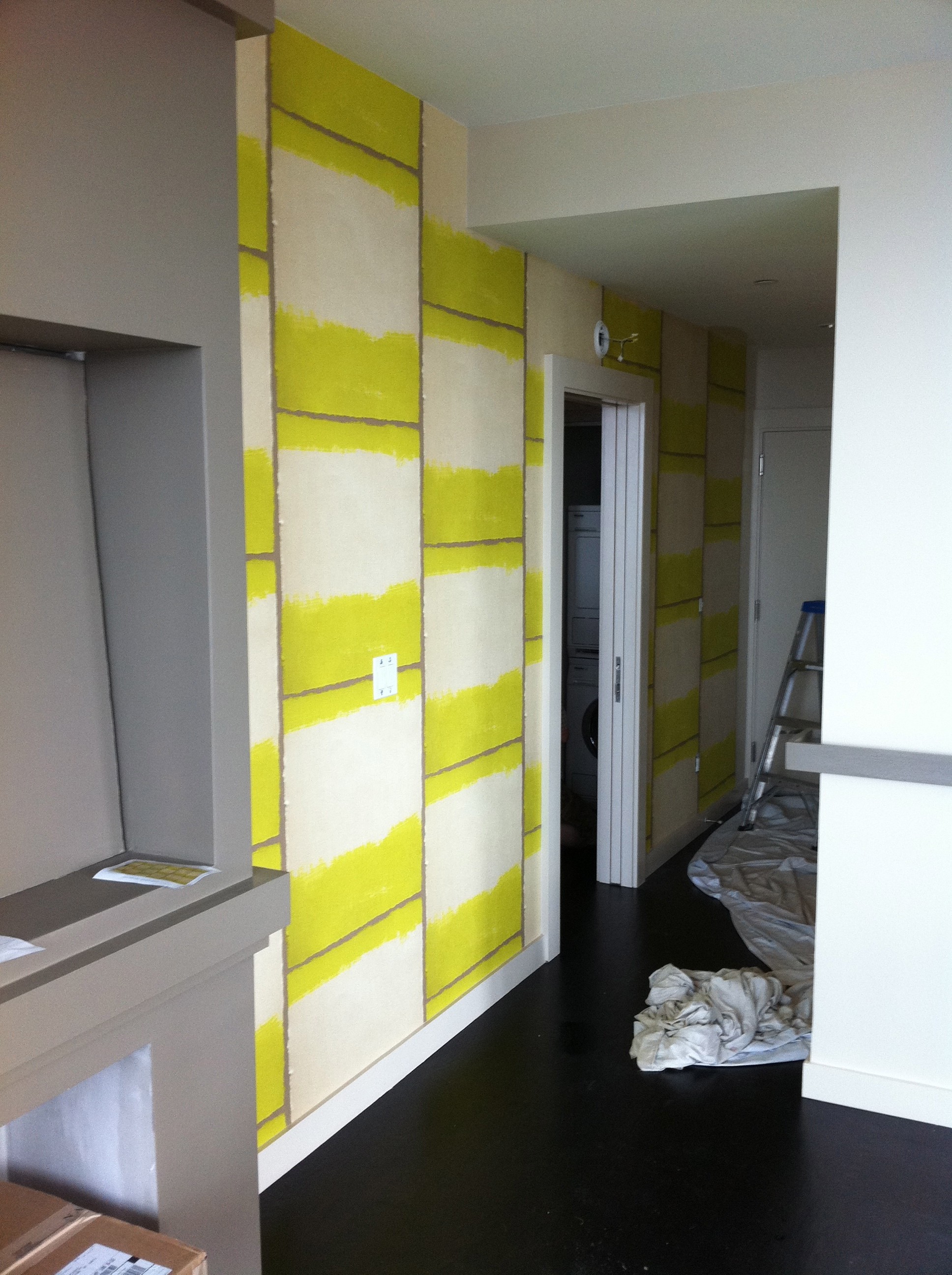
While a streamlined palette can be absolutely beautiful, I believe the 'Age of Beige' flew out the window with our last economy. Lately, life at home is about color, layers, a hand quality, and one-of-a-kind furnishings. Our 2000s-era concrete towers of steel and glass may be here to stay, but most designers I know are busy reimaging basic developer stock floor plans and creating warmer, more functional homes. The same really goes for single family dwellings. I'm currently working on two 6,000 square foot spec houses that fall 100 percent into the category of what I call "Developer Grey." I'm also finishing up a Chelsea high rise where we've added a fireplace with bio-fuel insert to a formerly square box in order to create a vocal point and centralize the floor plan. We've infused exciting wallpapers throughout to elevate a clean base of brown-greys and muddy whites.

I just read an upbeat piece through ASID on wall color stealing the show at the recent NYC Fine Art & Antique Dealers Show. Click through to the link and visual how your collections might come to life if offered a more dramatic backdrop.
BACK TO MY YELLOW BEAT
When I think about color, I go straight to the color wheel -- the good old "opposites attract" phenomenon. In other words, on the color wheel we actually call opposites "complements." I often think of achieving neutrality in a space by using color complements to even out or balance the overall appeal without sacrificing 'zest' or personality.
Take a look at the wheel and see yellow's opposite (purple). Now start to envision breaking both colors down into various shades, and how many options come to life in your palette. Next, think about choosing a third color to 'pop' your scheme. Next thing you know, you've nailed a color scheme that has life, balance and an overall neutral sensibility without relying on beige. I think of color in the same way I think of natural light -- totally necessary!
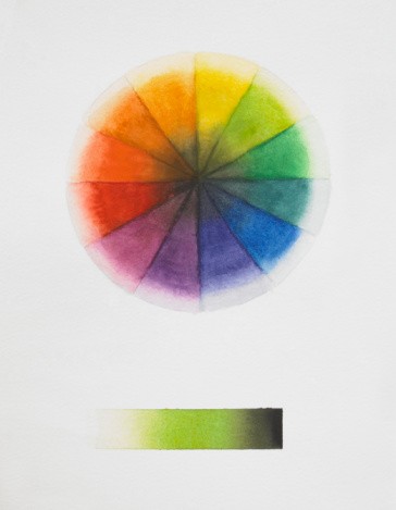
Photo credit: Getty