A version of this post appeared on the 360 Design Events blog.
I’ve always been fascinated by trend forecasting and how the design world seems to keep in step with each other, even when we’re so inner directed and creative.
Looking at the key color trends right now, I’ve pulled out a few that resonate with the way I see the world and my design aesthetic. Take a look:
Warm Neutrals with a Pop
I love these shades which create a soothing and compelling contrast to our fast-paced lifestyles, allowing us to take a deep breath and relax. Neutral palettes have been a key design element for me for a while, and right now I’m using warmer, calming tones.
The pops of color we’ve seen on the design landscape for years are now used in more subtle ways. For example, where you might have used white lounge furniture with brightly colored pillows, today the neutrals are a warmer shade of cream and the pops of color are only on the piping or the back of the pillow, creating a more sophisticated effect. The pop of fuchsia in this arrangement is all that’s needed.

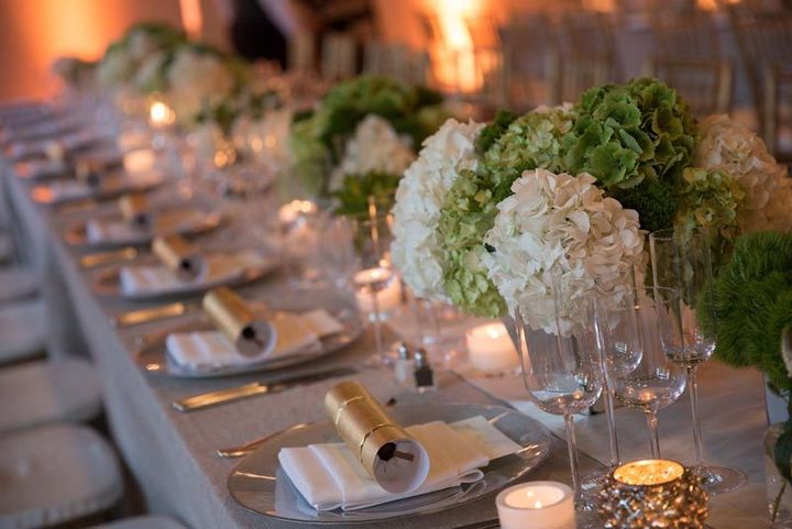
Fresh Greenery
Pantone’s color of the year for 2017 is Greenery, which they describe as “A refreshing and revitalizing shade, Greenery is symbolic of new beginnings.” I find myself constantly incorporating this springtime tone into my designs, either as part of sculptural floral displays or accents.

Event Design by Matthew David 360 Design Events
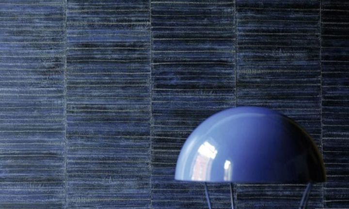
Mood Indigo
I love most tones of blue, but right now I’m drawn to this deep indigo shade. This is in touch with the movement to natural and handmade items and looks great paired with wood or natural stone finishes.

Image courtesy ELITIS, Auteur & Editeur.
Deep Darks
The color forecasters tell is that darks are here to stay, and that makes me happy. I love the way that dark tones like charcoal grey and midnight blue add glamour to a look and help make a space feel dramatic. It’s all theater people.

Ring Dish in Malachite with Gold Rim. Handmade from porcelain, handmade glazes, and genuine gold. Available: Exclusively at suiteonestudio.com