
Earlier this year, the U.S. Climate Assessment warned of parched prairies and flaming forests if we don't reel in climate change right now. Sixteen retired US admirals and generals then warned that droughts and other climate disruptions were about to make the world a very dangerous place. Now the United Kingdom's weather service, the Met Office, has tried to put the basic science in a simple, poster-sized product called the Human Dynamics of Climate Change, which you can download here (PDF, 12 MB). Supplementary information is also available here (PDF, 629 kB).
The map is actually a teaser to and a summary of a much more detailed technical report, but at first glance even this simple illustration is an ungainly thing with seven world maps and a large block of text:
On closer inspection, it's a fairly simple starting point for people new to the climate dilemma, although the name is something of a misnomer, because it barely touches on the human dynamics of climate change. Instead, it offers a very clear and simple starting-off point for those interested in exploring the realities of life on a managed planet, as this sequence of images illustrates.
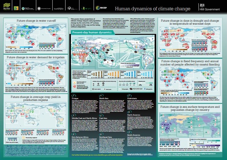
The first image provides a consensus map extrapolated from a variety of climate models, and it shows what they all show: more droughts and higher temperatures.
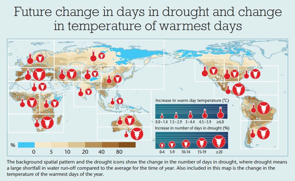
The second shows an increased demand for irrigation worldwide:
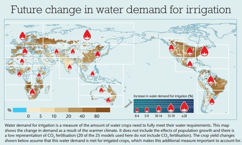
The third - and this one is bound to rightly draw intense scrutiny - shows the winners and losers on the crop yield front, but only if we implement the irrigation measures highlighted above:
These projections come from a synthesis of 35 models that were compiled last year by NASA scientist Cynthia Rosenzweig and others. Those authors, however, made it clear that the projections were incomplete and highly uncertain. They don't include the positive effects of carbon fertilization - or plants growing faster because of excess carbon in the atmosphere - but they also don't capture the impact of long-lasting periods of high temperature on crops.
On top of that, they don't reflect the devastating impact that climate change will have on our planet's living ecosystems - the wetlands and forests that provide the bulk of our green infrastructure - and they don't reflect the way climate varies locally. The chart shows winners and losers on a macro scale, but even regionally, changes will shift productivity from low-lying areas to higher elevation areas and from underpopulated land to places where cities are now. I can't imagine a scenario under which that transition happens peacefully, especially since we don't really know where the productive areas will emerge.
The full technical report does offer much more detail into changing crop yields, fish catches, and changes in transportation patterns - but even that is merely a brief reminder of the challenge we face, and the fact that we cannot return to Eden. Even if we manage to keep the food supplies going, tomorrow's earth will be a lot different from the one we grew up on.
By Steve Zwick, Editor, Ecosystem Marketplace
This post originally appeared on The AnthropoZine. You can view the original here.