By Aileen Wang
Swipe to the left, drag to the right, tap of the finger. It's the 21st century, and this is how we get stuff done.
We're constantly looking for ways to streamline every experience. Escalators let us avoid walking up stairs, headsets enable us to talk hands free, and apps let us refrain from sticking up our arm to hail a cab. As humans, we fantasize about making the most basic tasks simpler.
In the world of apps, a good user interface is like the invisible velcro that lets us avoid having to tie our shoes. Digital success in the app world is defined by an UI that is seamless, intuitive, and elegant. While the definition of that continues to evolve, let's look at five stellar apps that are currently mastering the art of UI design.
30/30
Unlike the plethora of other task manager apps already out there, 30/30 claims it's one of a kind.
The app lets you bulldoze through a list of tasks with a unique timer feature that puts you up against the clock. Unlike competing task list apps like Trello, 30/30 motivates you to finish tasks in real time with its unforgiving countdown.
Above all, it's the app's UI design that sets it apart from the crowd. A multi-colored alternative to the muted brown of Wunderlist and standard Twitter blue of Any.do, 30/30's vibrant colors allows users to color code different tasks.
A brief interactive tutorial introduces new users to the apps simple, graph like user interface system. With basic icons attached to each type of task, the UI is clutter-free, immediately easy to grasp, and pleasing to the eye. The timer, which dominates the screen, looks much like an actual clock face, keeping you on your toes in Final Countdown style.
WWF Together
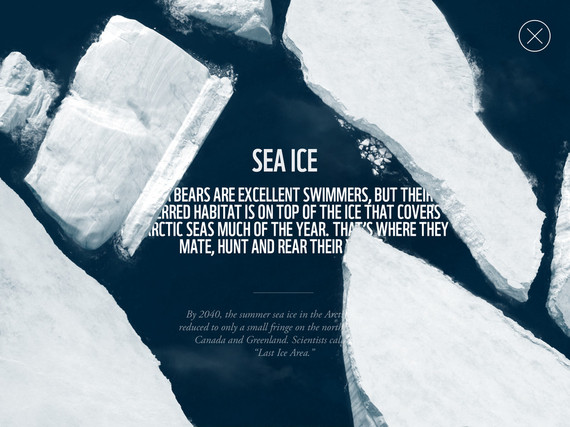
WWF Together's iPad app is a great example of non-profit digital content marketing. Watching the app in action, it's clear why it received the 2013 Apple Design Award and was ranked amongst the best iPad apps of the year.
Set against a full screen interactive landscapes, the app facilitates a breathtaking and elegant journey through a selection of the world's wildlife. With each tap or swipe, you're seamlessly guided through beautiful high resolution photography and video. Like flipping through an interactive digital magazine, the app ties in fascinating facts with surprising animations and interactions. For example, did you know that tigers see six times better in the dark than humans?
Grid
Grid is somewhat of a personal project manager in the form of an interactive sketchbook.
The iOS app not only organizes your to-do lists, photo albums and contact lists, but can also offer price comparisons and curated lists of recommended travel destinations, hotels, nearby restaurants, and more. Having so many features, it' absolutely essential for the user experience to be slick-- which is solved by way of its thematic grid layout.
You can customize the grids to your liking, and other users can share and merge their grids with yours. Through selecting a single intrinsic concept for its UI, Grid is able to categorize multifaceted and complicated information. Suddenly your chaotic life, streamed from a near-infinite number of sources, is funneled into a single square-shaped space.
Flipboard's slogan, 'your personal magazine', is an accurate summation of both its function and excellent UI.
In our social media obsessed lives, we're constantly switching between different platforms and accounts on our mobiles, tablets and desktops. This endless churn of videos, photos and other external media shared between friends and across newsfeeds can be overwhelming. Cutting out the social media platform as the middle man (and the endless distraction that comes with them) Flipboard pulls all your preferred content directly into an interactive magazine. The app lets you get the most of your social media feeds through a single immersive experience.
Featuring elegant, white borders surrounding its enlarged images, the app's visually pleasing text-to-image ratio makes the content incredibly easy to digest. An effortless swipe lets you flick through all the trending posts from across your social networks without having to switch platforms.
Gist
Gist's iPhone app targets every urbanite (and suburbanite) who can't find the time for a scheduled catch up on the daily news. For those who don't have the time to read through entire articles or sit through news broadcasts, Gist provides bite-size nuggets of information that are short and succinct.
The monotone theme of the app is in keeping with the nature of news channels and newspapers in general. Each article is summarized in a single sentence, and a quick click into each item unfolds new detail, offering a UI to match the neatness of the app's concept. The news items are listed in order (according to when they're published) and arranged in 10 simple categories. Gist's swipe-to-the-right function takes advantage of a feature already familiarized by iOS, allowing for immediately graspable navigation and functionality.
Through the combination of clarity, intuitive navigation and stunning graphic design, these five apps encapsulate some of the best examples of UI today. Velcro shoes may still be waiting for their comeback, but the digital world is miles ahead and accelerating fast. Make sure your UI can keep up, so that your app isn't left behind.

