It was 12:30 AM and I was running down the side of the New Jersey Turnpike. I had been driving home from college in March of 2001, and as my feet pounded the pavement, it became clear that I had made some poor life choices -- and dashboards, or lack thereof, were to blame.
Data dashboards of all kinds have quickly become a staple in our daily work and life. Whether it is the recent count of our our likes and followers, internally reported numbers on excel, that new FitBit we received for the holidays, or our web analytics, we are surrounded by Big Data. There are a number of dashboard tools that are racing to make sense of this data, which is great. The only issue is that it's impossible for us to process it all, and we are left drowning in our data.
Which brings me back to the dashboard that led to my unexpected run down the NJ Turnpike. My first car, a red 1992 manual Volkswagen Jetta (I really did love that car -- thanks Dad!), had a great personality and a host of "quaint" traits. These included: a tape deck that only played the Temptations (the tape was jammed in the cassette player), a tailpipe that once dropped right before entering the Holland Tunnel (fixed that with my belt), and a very finicky dashboard. The dashboard spontaneously stopped showing me things like my speed, RPM, and fuel -- crucial data for a driver. My solution was to zero out the trip odometer every time I refilled the gas, and just refuel when I saw the miles were getting close to 450.
The solution had worked surprisingly well for a month, so when my gas pedal stopped responding on that day in March, my mind started racing.
What's wrong with the car?
Am I in neutral?
Did something just blowout in the transmission?
As I glided as far as I could down the service lane, it hit me: my girlfriend at the time had borrowed the car recently and must have zeroed out my odometer. My hackish solution had been unknowingly hacked.
Yet Another Dashboard (YAD)
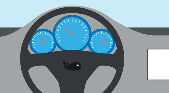
The car dashboard is my absolute favorite dashboard because it gives you exactly the information needed to drive in a real-time feedback loop. You press the gas, the speedometer shows your speed. Go faster than the limit, you get a ticket or know that you are driving unsafely. The simplicity of a car dashboard makes it easy for a driver to incorporate data into their own behavior and seamlessly change their speed or gear accordingly. If car dashboards were built with the amount of data given for my website, Facebook fan page or Twitter account there would be a lot more accidents. Imagine commuting in rush hour with 30 indicators staring at you all the time -- it's distracting and you'd lose focus on the few gauges that really matter. So we're going to make a bold move here and tell you to forget trying to watch all of your Big Data, because less is more.
Looking at your own data with the focused mindset of a car dashboard can be a great exercise for your organization. What are the key performance indicators (KPIs) that you need to see in order to know how you are progressing toward your goal? In a car, the KPIs are gas and oil, and speed, and the goal is to safely arrive at your destination. In your organization, KPIs might be the engagement of your aggregated social network, the number of website submissions, the number of donations, or weekly newsletter signups. The key is to zoom in on a handful of metrics that will serve as proxies for progress toward your organization's mission. Or for the impact geeks out there, predictive inputs and outputs that lead toward organizational outcomes.
The Next Step
So, you've determined which metrics are most crucial to your organization. You've found a tool that displays only these key data as your go-to data dashboard. The next steps are to figure out how these macro KPI's relate to each department. Then figure out ways to build feedback loops to those data, and you are well on your way to building a data culture.
And finally, remember don't drive your organization without the right dashboard, unless you like running with a gas can.
- Sparkwi.se - A free, easy way to grab basic data from various sources into one spot.
- Ducksboard - A simple way to grab data from disparate places, with tiered pricing plans.
- Build a Google Analytics Dashboard - You can create a custom dashboard in Google Analytics that pulls only the most important data from your weekly or monthly traffic.
- Sumall.com - Free social and web analytics monitoring with great ways to pull in external sources and explore your data.
- Using the Whole Whale - podcast that covers this and other stories about data and technology in the non-profit world.