
I was recently asked how some of the key economic indicators are trending right now from the perspective of the president's record. So I crunched some numbers.
Caveats: Election-relevant opinions on the economy are not yet formed, but since I expect 2012 to be a slight improvement over 2011 (with some real risk factors, like Europe, oil, and fiscal drag from fading stimulus), things that look good now could look a little better by the end of 2012. Others, as I point out, might not.
And, of course, there's the argument as to how much this has to do with stuff the president... um... actually did, as opposed to what you'd expect anyway. Normally, that's a strong caveat and presidents get all kinds of undeserved praise and blame. But that caveat should be dialed back, I'd say pretty significantly, given the interventions of the administration, not to mention the Federal Reserve.
All told, I think the president's team will be able to make the argument that things are getting better. Too slowly, for sure. And there are some treacherous holes in the argument -- particularly sagging real wages amidst soaring profits. But see for yourself.
[Data caveat: picking the right dates to compare here is more art than science. I tried to pick ones that made sense to me... you're welcome to suggest others. Also, since we don't have December 2011 data yet, I can't use comparisons for the last quarter or month of the year, but I don't think this should matter much, with one exception noted below.]
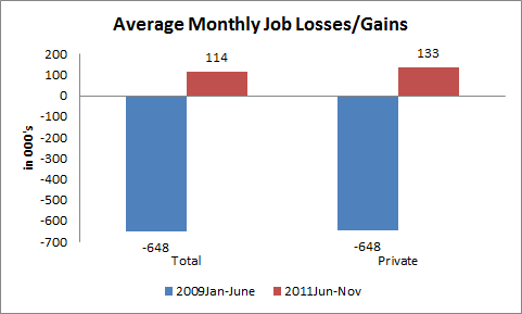
Employment: When the president took office in January 2009, employment was absolutely cratering. Now it's growing, and, in the private sector, has been since the spring of 2010. The figure shows average monthly job losses and growth in the first six months of the administration and over the most recent six months. The swing from huge negatives to positives, albeit small positives, is notable and helpful to the president.
Source: BLS
Unemployment: Here, timing and the choice of dates matters. As the table below shows, averaging over a few months, the unemployment rate is about where it was in the first half of 2009. But what probably matters more in terms of how people experience the jobless rate is the recent trend, and here, from the president's perspective, thing look better. The November jobless rate of 8.6% is significantly off its peak of 10.1% in October of 2009. I suspect it will drift down a bit further in 2012, though there's a wildcard here: if job growth picks up, it could draw more people back into the labor force, and that puts upward pressure on the unemployment rate.
This problem -- the fact that people who've given up looking for work don't show up in the unemployment rate -- is not present in the EMPloyment rate: the share of the population working. That's fallen over the past couple of years and has been basically flat-lining for a year. It's probably the most pessimistic labor market indicator out there, and is a reliable sign that labor demand remains weak.
Similarly, the persistently and historically high shares of long-term unemployment are flashing the same thing -- people stuck in joblessness with not enough opportunities to find work.
On the other hand, unemployment insurance claims have been consistently falling in recent weeks, and that suggests possible improvements to come. Based on claims, private sector job growth, and the tick down in the unemployment rate, my guess is that labor demand will slowly improve next year.
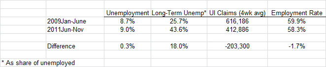
Source: BLS, DOL
Growth: Though it's not something people tangibly feel the way they do unemployment or job growth, you've got to look at the path of real GDP. Like employment it was falling fast when the president took office, 3.7% per year through the first half of 2009.
Here, the Recovery Act and Fed policies of that year seemed to make a real difference. The economy, led by housing, credit, and labor markets was a downright mess in early 2009, yet following the aggressive interventions of those early days of the administration's tenure, the loss rate of GDP was cut sharply, from -6.7% is 2009Q1, to -0.7% in the second, to +1.7% in the next quarter.
Clearly, this growth didn't translate into jobs for a while -- there's always a lag, one which has gotten longer in recent business cycles (and was no longer in this one than in the last two "jobless recoveries"-see figure B here). And, as shown in a moment, GDP growth has not reached paychecks the way we need it to. But while growth doesn't insure better outcomes for the middle-class, nothing good happens without it (it's necessary, not sufficient).
Note that I assume 3% real GDP growth for the current quarter. At this point, we can make a pretty good guess at the initial GDP estimate for 2011Q4, and most analysts have it coming in above 3%.
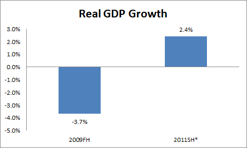
Source: NIPA; I assume 3% for 2011Q4, a bit below most estimates.
Profits, prices, and wages: The next figure shows one of those treacherous holes I referred to above. Real weekly wages are down in real terms. The figure shows the year-over-year changes in the real weekly earnings of blue-collar, non-managerial workers (it's a good proxy for the median, or middle-class wage). It was already falling slightly in 2009 (Dec/Dec) but is falling faster now (down 1.5%, Nov10-Nov11).
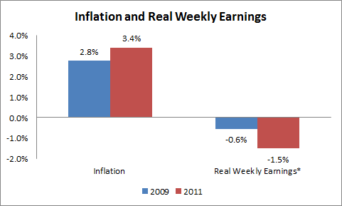
Source: BLS, *production, non-supervisory workers.
Part of this do with faster inflation, as seen in the bars of the left side of the chart.
The other pothole indicator for the president is the increase in profit shares of GDP along with the decline in compensation shares. The figure shows these movements from 2009 compared to now, and while they don't look like big changes in the figure, they're actually quite significant-these variables usually move pretty glacially.
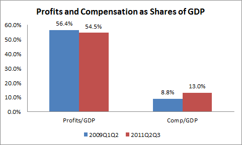
Source: NIPA
Profits as a share of GDP are way up and compensation/GDP is way down. Now, it's not like high profits are a bad thing, and they often recover before wages. But their distribution is highly skewed, and they clearly signal the return of rising income inequality, a major concern for a lot of people today, myself included.
The decline in the compensation share is a symptom of the weak job market, high unemployment, and weak wage growth. It's why a lot of families still feel squeezed while flush corporations sit on trillions in cash.
Like I said, we're a long way out and all of these indicators will change in ways we can't foresee. The president has some strong trend reversals to point to, though while the trend is his friend, the levels still bedevil. And the distribution of growth -- profits up, wages down -- doesn't help either. Of course, here he has a very strong case to make that the Republican's game plan will only make that problem a lot worse.
Stay tuned.
This post originally appeared at Jared Bernstein's On The Economy blog.