
I stare at the brain every day and it was only during the last game of the World Series that I saw an uncanny resemblance between the construction of the baseball field and a map of visual space present in each of our brains.
To illustrate this resemblance, let's check out what a map in visual cortex looks like from real brain data. This map (in the images below) represents eccentricity, which is a fundamental feature of how we process our visual world. While 'eccentricity' is jargony in the context of brain data, the etymology of the concept is easy to understand when considering people you would characterize as eccentric. That is, those who you would characterize as eccentric are people who significantly differ from what you consider 'normal.' In the context of this post, 'normal' is the central portion of visual space (e.g. delineated by the small checkerboard ring in the left image below), and the more we deviate from 'normal,' the more we extend into what we call the 'periphery' (e.g. delineated by the larger checkerboard ring in the right image below).
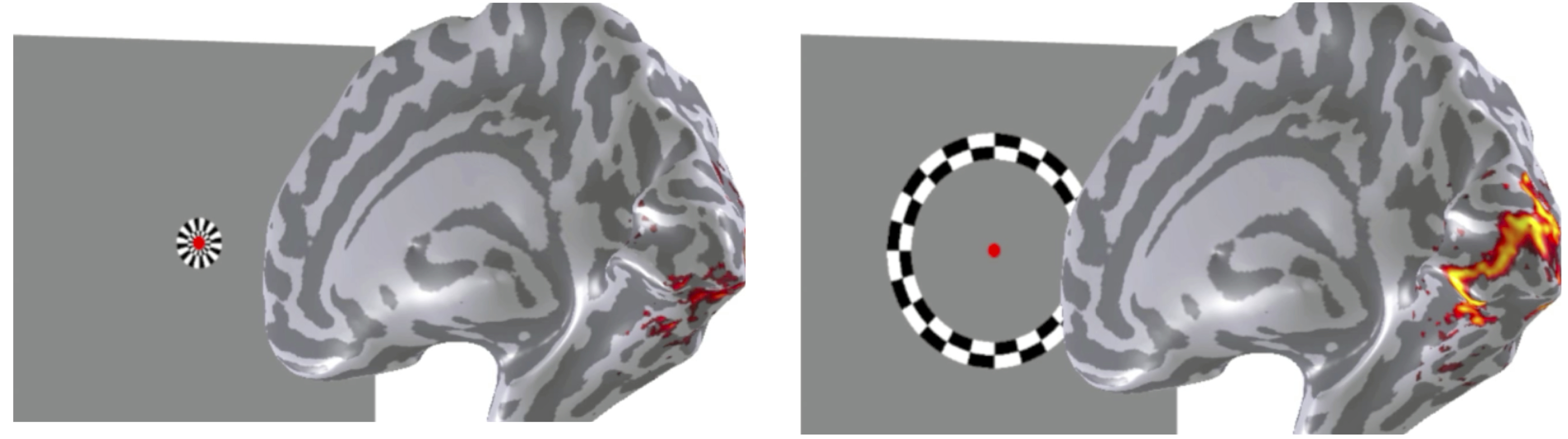
Two screenshots from a video showing maximal brain responses when an individual is looking at checkerboard rings that are expanding from the center (left images) to the outskirts (periphery; right images) of the screen. Small checkerboard rings positioned in the center of the screen maximally activate pieces of cortex in different anatomical locations compared to checkerboard rings that are larger and extend into the periphery. Original video from which these screenshots were taken courtesy of the VISTA lab at Stanford University.
How would we visualize this map in your brain? You would lay down in the scanner and you would watch black and white checkerboard rings expanding and contracting for minutes at a time (as depicted in the images above). Boring, yes. Effective, most certainly! However, you would have to keep your eyes still - if you move your eyes, the map changes. This is why we are so good at navigating our visual world: our brains keep us informed with millisecond precision. The colors on the brain in the images above indicate that maximal neural responses in visual cortex track the location of the checkerboard in a smooth map in particular locations in the brain.
This smooth map of eccentricity resembles a baseball field. Like a baseball field, this map in your brain can be broken down into different bands of activity. Each band codes a different part of your visual world, just like each player has a different function on the field. Due to the shape of our brains in this portion of visual cortex, these representations look like wedges, which resemble the shape of a baseball field: the map converges in the back (where home plate is located) and expands in the front (where the outfield is located). The location of home plate is consistent with representations of the central portions of our visual world, while the outfield is consistent with the location of peripheral portions of our visual world.

By assigning different colors to the separate bands of activity described in the prior images, researchers can visualize the combination of these bands as smooth maps on the brain. The left image is a zoomed portion of the back of the brain (see dotted square in the upper right image to anchor you). Each color represents the portion of visual space that maximally activates the corresponding piece of cortex. Relative to the shape of a baseball field, the central portions of visual space are represented in the back of the map (warm colors) where home plate is located, while the peripheral portions of visual space are represented more anteriorly (cool colors) where the outfield is located. (Image courtesy of the author).
Let's continue the analogy in order to gain some insight into how these maps contribute to your own visual abilities. Just as home plate is where most of the action is - where all the pitches are thrown and where all the runs are scored - the brain invests more neural resources to represent the center compared to the periphery of visual space. Off the baseball field, this allocation of neural resources helps you perform fine-grained processing like reading articles on HuffPost. As your eyes move to read these words, new words become focused in the center of your visual field, while the previous words are now somewhat out of focus in the periphery.
The size of these maps can vary significantly from one person to the next and these variations have been directly linked to individual differences in conscious visual perception. Whether or not these individual differences in map size also contribute to better batting averages is an open question (and a great excuse to scan MLB players!). But one thing is for sure: even though it took 108 years for the Cubs to win the World Series, the players on the field back then had similar visual brain maps as the players on the field a few weeks ago, and to you - whether you're a baseball fan or not!
Kevin S. Weiner is a neuroscientist, as well as member of the Organization for Human Brain Mapping (OHBM) and writes for the Communications/Media Team. The OHBM Media Team brings cutting edge information and research on the human brain to your laptops, desktops, and mobile devices in a way that is neurobiologically pleasing. For more information about brain mapping, follow www.humanbrainmapping.org/blog or @OHBMSci_News.
Further Reading: