Are the sensational headlines true? Are election campaigns really spending so much more than in the past?
The Federal Election Commission maintains detailed campaign financials going back several years, so let's see whether the data agrees.
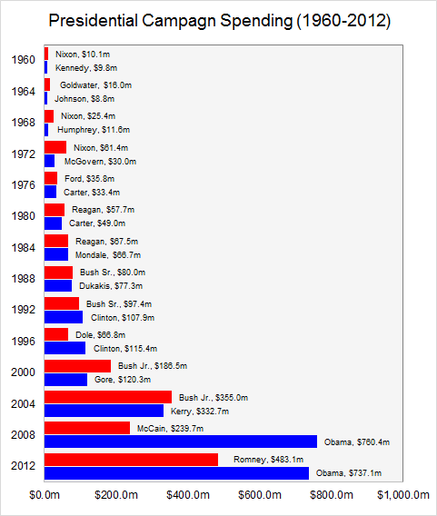
Here are the raw spending numbers for both parties' presidential candidates since 1960 (the same numbers as the chart at the top). These figures are not adjusted for inflation.
This next chart shows the average amount spent by Senate and House winners since 1985.
The trend is increasing, but since these numbers do not account for inflation, or anything else, that doesn't tell us very much.
Adjusting for inflation is not enough
Adjusting only for inflation leads to the false conclusion that spending has increased (Image credit: CNN)
When you do account for inflation, the trend is still upward, as shown in this chart from CNN.
It would be easy to stop here and conclude that campaign spending is higher than ever before.
This conclusion would be incorrect.
Population growth and income growth matter too
Not only has the value of a dollar changed over time, the size of the population has also changed.
More people = more donors
Household incomes have also increased, so the average person spends more today than they did in 1960.
More income to spend = more income to donate
In the charts below, the campaign spending is normalized to 2014 by adjusting for all three factors: inflation, population and income/spending (methods explained below).
Now for an apples-to-apples comparison
Here is how Senate / House spending looks after applying these three adjustments.
For House and Senate races, the historical trend is flat.
When you remove the effects of inflation, rising population, and rising incomes, House and Senate campaigns are spending about as much today as they did in 1985.
Here is the presidential campaign spending chart, after applying the same adjustments.
Now you can see one of the biggest spenders was Nixon in 1972.
Nixon also went on to lose his job for raising that money illegally (yes, Watergate was a fundraising scandal). So let's disregard the spike in 1972.
Between 1960 and 2000, presidential campaign spending actually trends slightly downward.
But after 2000, something changed.
Maybe it's not the spending that's out of control
Since 2000, presidential campaign spending has shot through the roof! And these numbers do not even include spending by super PACs.
Why has presidential campaign spending increased by so much in the last 15 years while Senate and Congressional spending has stayed the same?
The data doesn't tell us that, but it does beg a different line of questioning.
What's changed about presidency since 2000? And what does all this money expect in return?
To normalize campaign spending figures to the present, I assumed these three indices:
• GDP deflator (inflation)
• Population
• Real GDP per capita (income)
When you multiply them together, the result is just nominal GDP. So ultimately, this is the formula used:
2014 Normalized Spend = (Year X Nominal Spend) • (2014 Nominal GDP) / (Year X Nominal GDP)
This post originally appeared on Metrocosm
Our 2024 Coverage Needs You
It's Another Trump-Biden Showdown — And We Need Your Help
The Future Of Democracy Is At Stake
Our 2024 Coverage Needs You
Your Loyalty Means The World To Us
As Americans head to the polls in 2024, the very future of our country is at stake. At HuffPost, we believe that a free press is critical to creating well-informed voters. That's why our journalism is free for everyone, even though other newsrooms retreat behind expensive paywalls.
Our journalists will continue to cover the twists and turns during this historic presidential election. With your help, we'll bring you hard-hitting investigations, well-researched analysis and timely takes you can't find elsewhere. Reporting in this current political climate is a responsibility we do not take lightly, and we thank you for your support.
Contribute as little as $2 to keep our news free for all.
Can't afford to donate? Support HuffPost by creating a free account and log in while you read.
The 2024 election is heating up, and women's rights, health care, voting rights, and the very future of democracy are all at stake. Donald Trump will face Joe Biden in the most consequential vote of our time. And HuffPost will be there, covering every twist and turn. America's future hangs in the balance. Would you consider contributing to support our journalism and keep it free for all during this critical season?
HuffPost believes news should be accessible to everyone, regardless of their ability to pay for it. We rely on readers like you to help fund our work. Any contribution you can make — even as little as $2 — goes directly toward supporting the impactful journalism that we will continue to produce this year. Thank you for being part of our story.
Can't afford to donate? Support HuffPost by creating a free account and log in while you read.
It's official: Donald Trump will face Joe Biden this fall in the presidential election. As we face the most consequential presidential election of our time, HuffPost is committed to bringing you up-to-date, accurate news about the 2024 race. While other outlets have retreated behind paywalls, you can trust our news will stay free.
But we can't do it without your help. Reader funding is one of the key ways we support our newsroom. Would you consider making a donation to help fund our news during this critical time? Your contributions are vital to supporting a free press.
Contribute as little as $2 to keep our journalism free and accessible to all.
Can't afford to donate? Support HuffPost by creating a free account and log in while you read.
As Americans head to the polls in 2024, the very future of our country is at stake. At HuffPost, we believe that a free press is critical to creating well-informed voters. That's why our journalism is free for everyone, even though other newsrooms retreat behind expensive paywalls.
Our journalists will continue to cover the twists and turns during this historic presidential election. With your help, we'll bring you hard-hitting investigations, well-researched analysis and timely takes you can't find elsewhere. Reporting in this current political climate is a responsibility we do not take lightly, and we thank you for your support.
Contribute as little as $2 to keep our news free for all.
Can't afford to donate? Support HuffPost by creating a free account and log in while you read.
Dear HuffPost Reader
Thank you for your past contribution to HuffPost. We are sincerely grateful for readers like you who help us ensure that we can keep our journalism free for everyone.
The stakes are high this year, and our 2024 coverage could use continued support. Would you consider becoming a regular HuffPost contributor?
Dear HuffPost Reader
Thank you for your past contribution to HuffPost. We are sincerely grateful for readers like you who help us ensure that we can keep our journalism free for everyone.
The stakes are high this year, and our 2024 coverage could use continued support. If circumstances have changed since you last contributed, we hope you'll consider contributing to HuffPost once more.
Already contributed? Log in to hide these messages.
 Sources: