WILLIAM EGGLESTON, Untitled, from Paramount Pictures, 2000, Ink jet print, 30 x 24 inches, (c)Eggleston Artistic Trust, Memphis, courtesy Cheim & Read, New York
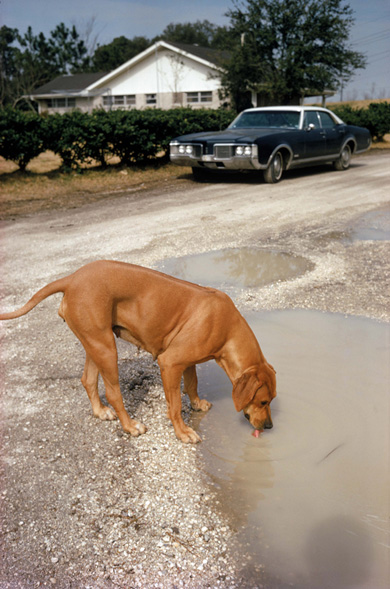
We have to take William Eggleston at his word: his photographs may be primarily about the American South, but his photography isn't. Much is made of Eggleston's visual preoccupation with his native region, and certain "qualities" of the south - the sense of topical wear and even decay, for instance, or the persistence of rural self-sustenance even in the middle of urban environments - do persist. But they persist even in Eggleston's photos of other places, even non-American places. No matter how much the public construes it otherwise (abetted, admittedly, by the exhibition's own wall labels), the Eggleston retrospective at the Los Angeles County Museum (through January 16) documents not the contemporary American south but contemporary approaches to framing and recording perception and to analyzing - perhaps neutralizing, perhaps enhancing - the conditions of modern life.
WILLIAM EGGLESTON, Algiers, Louisiana, c. 1972, Dye transfer print, 16 13/16 x 11 inches, The J. Paul Getty Museum, Los Angeles, (c)Eggleston Artistic Trust, courtesy Cheim & Read, New York
The importance of Eggleston's oeuvre resides in its formal, as opposed to its subjective, topicality. His place of pride in the history books is, of course, as one of the first "art photographers" to be taken seriously as such for a body of work shot in color. But Eggleston commanded that respect and has exercised that influence by shooting the world with what might be called an exacting carelessness. Whether or not he searches for moments and circumstances of emphatic neutrality, he finds them and commits them to perpetuity. Although he frequently evokes the amateur snapshot (especially in his photographs of people), Eggleston never mimics it, imbuing the most banal images with a depth of field and a sense of wonder. His mastery of the dye-transfer print - he was working exclusively in color as of the late 1960s - put this resonance at his disposal early on, and he has gotten us drunk on color ever since. But his color packs the wallop it does not because he amplifies or exploits it, but because he gets out of its way.

Eggleston pretends, in fact, to get out of the way of his camera altogether. A graceful effortlessness pervades his pictures. They seem dumb but right, inelegant in subject matter - a tricycle? A string of Christmas lights? A guy sitting in a motel room? - and piss-elegant in their unforced composition. This is photography in the wake of Pop art, putting life's non-events and negligible stuff back in context, taking consumer objects back out of the spotlight and returning them to the shelf and the street, then celebrating the shelf and the street. Eggleston clearly inherits from pre- and postwar American Scene photographers, urban and rural alike, and is of a like mind with those of his contemporaries, practitioners of the "new topographics" who in the 1970s were measuring the social landscape with an intense dispassion. All that separates Eggleston from these neo-objectivists, in fact, is his ability to avoid stylization, to achieve distinction without taking a distinctive kind of picture. Eggleston's photographs don't look like Eggleston's photographs, they feel like Eggleston's photographs.

BLINKY PALERMO, Untitled, 1964, Oil on canvas, 37 3/8 x 31 3/4 inches, Collection Stroeher, Darmstadt Germany, Photo: Jens Ziehe, Berlin
Getting out of the way of your own ideas, of your own formal language, of your chosen media was a thoroughly '60s and - especially - '70s modus operandi. You didn't want to seem forced or self-aggrandizing; you simply wanted to set a few proposals in motion and explore where that motion took you. That was the approach taken by the German painter Blinky Palermo (a pseudonym that linked him ironically with an American boxing promoter) throughout his brief career, documented at LACMA (also until January 16). One of those young Germans whose minds were blown by studying with Joseph Beuys, Palermo emulated not his teacher's mythmaking, but his fellow students' self-effacement and post-modernist sense of tragic exhaustion. They themselves weren't exhausted, but felt that art was - that it was, in fact, maintainable only by getting out of the way. Art, they - and their peers in France, the United States, and elsewhere in Europe and North America - insisted, was not a goal but a circumstance, residing in the eye of the beholder, and the best way to challenge the beholder into considering this circumstance was to fabricate impersonal objects whose simplicity and near-anonymity only enhanced their dramatic physical and perceptual presence. This was framed as Minimalism in New York, Light & Space in Los Angeles, something else in Paris, and "the new painting and sculpture" everywhere.
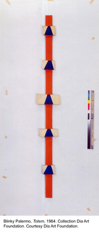
BLINKY PALERMO, Untitled (Totem), 1964, Casein paint on canvas on wood, 86 1/4 x 10 1/2 x 1 1/2 inches, Collection Dia Art Foundation, New York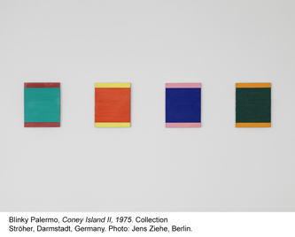
BLINKY PALERMO, Coney Island II, 1975, Acrylic on aluminum, 10 1/2 x 57 7/8 inches overall, Collection Stroeher, Darmstadt Germany, Photo: Jens Ziehe, Berlin
To realize this position, Palermo at first painted nothing-in-particular, straight-out-of-the-tube colors on strangely shaped surfaces. Evidence of his painterly hand was not hidden, but nor was it fetishized a la abstract expressionism. Paint works in Palermo's art as a simple fact. His "paintings" from the 60s attract our interest as objects, not as paintings, sometimes hung absurdly high, sometimes leaned against the wall, sometimes painted directly on the wall. For awhile he exhibited nothing but small single-color triangles. By the early 1970s Palermo had even abandoned those strategies as too dramatic, returning to traditional rectangular formats and painting other rectangles of color on them. These - especially when painted on metal - fell into line with minimalist practice in New York, where Palermo lived on and off for the last four years of his life; but rather than resemble the work of Brice Marden, Robert Ryman, Richard Tuttle, et. al., they effectively merged and summarized such work. Early in 1977 Palermo took sick in the Maldives and died, instantly becoming a "what-if" James Dean kind of art world legend. You do feel a sense of art interrupted in the retrospective here: the increasing elementalism of Palermo's art allowed his lovely sense of color to emerge, and he was setting up not to diminish his painting into nothingness, but to follow that color somewhere else - where, we never quite find out. To be sure, the more eccentric formations of the '60s are the sexier artworks, but Palermo's last works are his most promising.
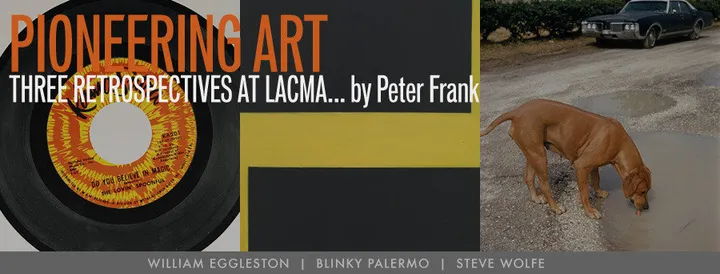
STEVE WOLFE, Untitled (Do You Believe In Magic?), 1992, Oil, enamel, lithography, and modeling paste on board, 7 inches diameter, Collection James and Debbie Burrows
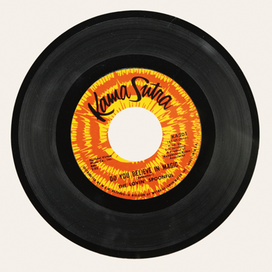
Speaking of minimal approaches, Steve Wolfe copies book covers by hand. That is the extent of his project. Everything else of interest lies in the exactitude with which Wolfe reproduces not only the myriad details of each cover design, but every last rip in the jacket, ding in the corner, accumulated drip or splotch or stain. He thus frames his activity as truly fetishistic, idolizing not just literature as art but the book as object of desire. Bibliophiles are the ones most likely to "get" Wolfe's trompe-l'oeil obsessiveness (not least as he favors first editions); but those of us who recognize the first art book that turned us on, the first book of poetry that fired our curiosity, the first translation into English of a legendary Surrealist novel, the first monograph on our favorite filmmaker will also understand Wolfe's impulse. Wolfe also lovingly forges records - LPs, 45s, inky black disks whose worn labels and shiny vinyl he is able to conjure with oil, lithography, enamel, modeling paste, and who knows what other "false" material.
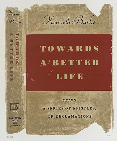
R.B. KITAJ, Towards a Better Life from In Our Time: Covers for a Small Library After the Life for the Most Part, 1969, Screenprint, 31 x 23 inches
Playing off the show of Wolfe's they're hosting (until February 20), LACMA also displays (until June) its set of fifty screenprints by Pop (well, Pop-ish) painter R. B. Kitaj called In Our Time: Covers for a Small Library After the Life for the Most Part. Compared to Wolfe's more visually nuanced work, In Our Time, realized as a portfolio in 1969, is a straightforward transformation of book covers into elegant small posters, although they, too, proudly display their frayed edges as battle scars. The frisson here is in Kitaj's choices, rather more ironic and conflicted than Wolfe's in light of 20th century history and the artist's own self-awareness as a Jewish intellectual and an American living in London. Even the most arftul among the books here may be tinged, at least by association, with racism (Vachel Lindsay's The Congo), anti-Semitism (Ezra Pound, Henry Ford), or other modern perversions, while even the most banal (the annual budget for the City of Burbank) may yield an unintentional charm.