

In my blog post on April 1, I wrote how some (April) foolish scientists announced that they thought they had made an error in major climate data sets. Today things are back to normal (or unfortunately, the new "abnormal) and what we thought we understood about the reality of climate change on March 31, is still the case on April 2.
As a result, the iconic graphics from around the world that show even a small piece of the vast, definitive observation evidence of ongoing climate change remain unchanged. Below, I have redrawn the three graphs from yesterday's April 1 post using the correct data, showing the inexorable increase in heat-trapping carbon dioxide in the atmosphere, the dramatic rise in global temperatures observed over the past century, and the disturbing unprecedented drop in ice volume at the northern ice caps of the Arctic.
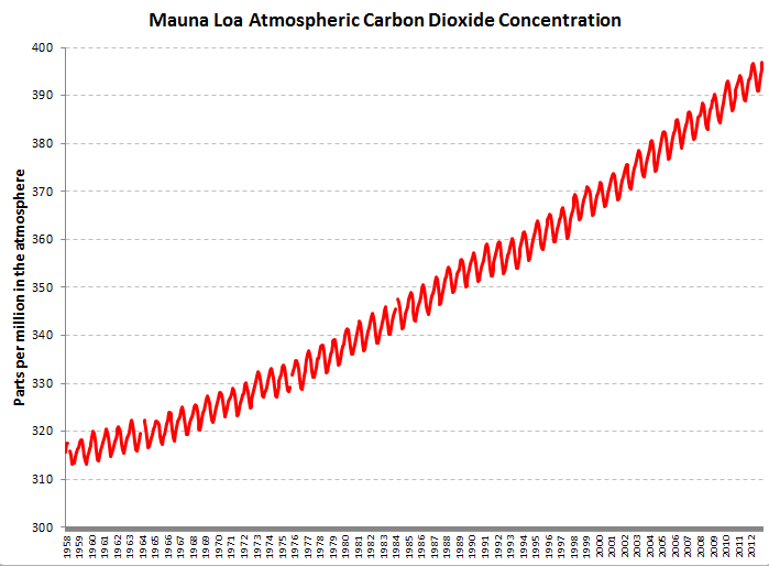
Figure 1. The classic graph of atmospheric carbon dioxide concentration measured at Mauna Loa, showing the rapid rise in this heat-trapping gas.
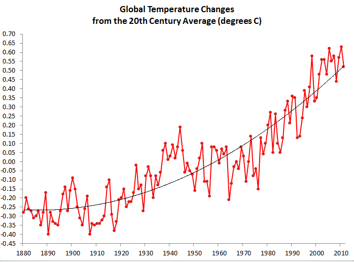
Figure 2. The global average temperature has risen rapidly over the past century. These temperature data come from NASA GHCN-M version 3.1.0 datasets since 1880. I've fitted a standard, second-order polynomial trend line.
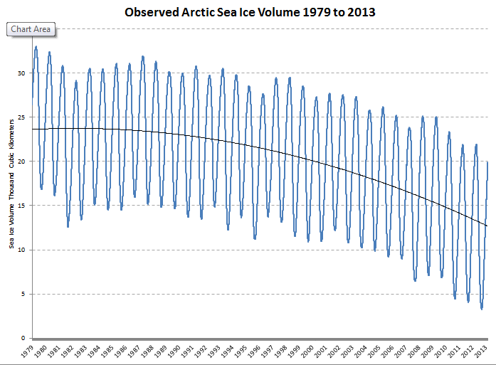
Figure 3. Another consequences of climate change is the rapid destruction of the Arctic ice cap -- far more rapidly than expected. This graph, using the PIOMAS daily ice volume dataset shows the rapid, and accelerating loss of ice. I've fitted a standard, second-order polynomial trend line.
These graphs are our reality.