
Co-written with Naomi B. Robbins
In light of the great Blizzard of 2015 that wasn't, we might look at how accurate are weather forecasts and especially long-term forecasts.
Naomi B. Robbins of NBR Graphs, with whom I co-wrote this post, and I collected predicted highs and percent chance of rain in the long-term weather forecasts from mid-August through December. Special credit to Naomi for all the data visualizations in this post.
Ultimately, the forecasts are quite accurate. Here are some findings....
- Comparing predicted highs to actuals, the same day forecast averages ~2 degrees off, the 1-4 day forecasts average 2.5 - 3 degrees off, and the 9-day averages nearly 6 degrees off. (We used absolute value so +2 one day and -2 the next don't cancel each other out.) Notably, even the 9-day forecast is more accurate than comparing actuals to the average highs for NYC, which average 6.2 degrees off.
Graphs...
Following are some charts that enable a closer look at the data.
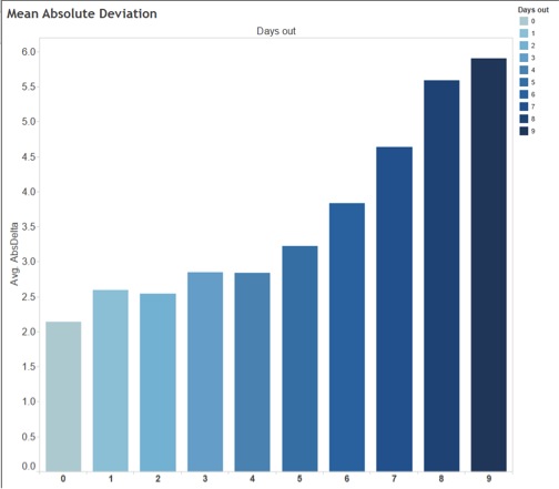
The first figure shows the mean absolute deviation by number of days out the forecast is made. The further out the forecast was made the darker the color in the chart. This color legend applies to all other charts as well.
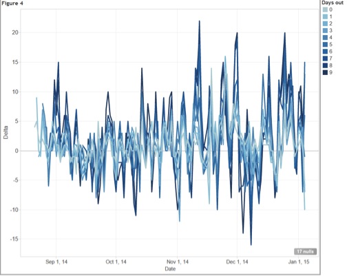
The second chart shows delta, which is the actual minus the forecast by the number of days out.
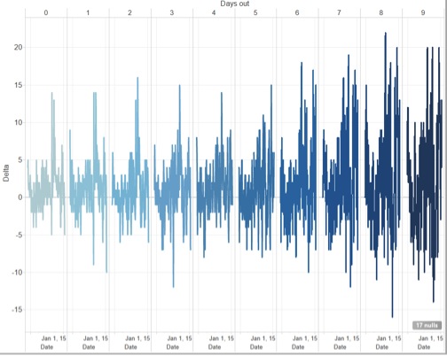
We notice that as the forecast goes further out, the spikes or large deviations get bigger. We also notice that forecasts for all days out were less accurate in November and December than in August through October.
The third figure shows the same information as Figure 2, but with the days out stacked instead of side-by-side. Different arrangements emphasize different aspects of the data.
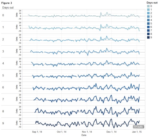
Again we notice that variability increases as we go further out in days forecast and for any of the days out variability increases as winter approaches. In this view it is easier to notice that the spikes are on the same date for all numbers of days out.
The fourth figure shows all of the data in one chart. If we had used different colors for the different days out the chart would look like one jumbled mess. However, this sequential color scheme shows that the lower days out (lighter colors) have smaller deviations and the spikes are mostly the longer forecasts.
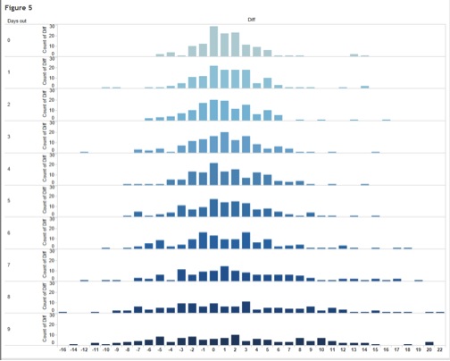
The fifth figure shows temperature difference between forecast and actual by how many days out the forecast is. You can see that same day forecasts are clustered much more closely around 0, while 9-day forecasts are much more dispersed. For all forecasts same-day through 9-day, actual temperatures were a bit higher than forecast.
Some background notes on the data....
- The predictions are from the Weather Channel's 10-day forecast. Interestingly, the predictions on their website sometimes differ from the 10-day forecast on their iPhone app. We tried to get the forecasts at or about 8 a.m. but didn't always get it right at 8. And there were two days when we didn't capture the data.