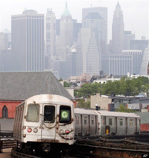
If you've ever been bored on a New York City subway, you may have noticed certain design inconsistencies in the way the transit authority demarcates the different lines. For example, most train lines are marked by white letters -- except for the N/Q/R/W lines, where the letters are black. Illuminated panels on the newest subway cars don't use iconic colors anymore to identify the train line. Why?
Font fanatics were finally given answers to these questions courtesy Massimo Vignelli and Bob Noorda of Unimark. These two men were hired in 1966 to overhaul the ancient and confusing signage system left over from the consolidation of multiple train companies in 1940.
Standardizing the signage at the 463 stations wasn't easy, especially when budgets were tight and MTA's understanding of the problem was poor. Vignelli felt that the administrators understood "about 10%" of what the designers suggested. But Vignelli put his civic duty before his ego, claiming, "design is not embellishment, it's solving problems."
The signage system had many barriers to standardization. Old signs were made out of materials as diverse as wood, enamel and tile; with fonts in both sans serif and slab serif; and a mishmash of sizes and locations. The layouts of the stations were just as random and chaotic, with varying ceiling heights and pipes of all sizes running up and down the platforms.
Unimark submitted signage recommendations including standardizing sign sizes, but the city's financial woes in the early 1970s prevented full implementation. It wasn't until years later that the project was taken up again by a designer named Michael Hurtz.
Hertz attempted to honor the previous work on subway signage standardization while putting his own ideas into motion. Hurtz made yellow "bullet" on the N train and made the letter black instead of the regular white so it would should up better against the yellow background. Trains running along the same avenues were joined under the same color; the 4/5/6 routes all became green instead of being represented by lines of pink, grey and orange.
This decision still perplexes Vignelli, who met Hertz for the first time during the talk. But Hertz defended himself well, and faced similar issues when attempting to implement his own design ideas. When asked about pipes that still block the signage in some Brooklyn stations, Hertz proclaimed, "When God wants to punish a typeface, He sends it to Bergen St."
Waves of new immigrants speaking different languages, subway car redesign and digital screens continue to affect the design of MTA signage. For example, the limits of LED displays don't allow the recognizable colored "bullets" to be used on the new cars. Can you imagine the A train not being blue anymore?
But what's the biggest demand of the design fans among the 4 million people riding the NYC subways on any given day?
Don't mess with the Helvetica typeface!
"Navigating the Labyrinth: Unimark International and the New York Subway System" was sponsored by AIGA/NY and presented at the Tishman Auditorium, Parsons, on Wednesday, February 3, 2010. For further information, see Paul Shaw's book, Helvetica and the New York City Subway System.