
Your logo is one of the most important pieces of your brand. It can bring to mind not only your company name, but also your entire brand personality with just one small picture. Your logo fits where words cannot, so creating one that is recognizable is key for flexible advertising.
To create a logo that is both memorable and impactful, prioritize the following seven ideas:
1. Simplicity: The simplest logos often permeate the business world in the most powerful and lasting way. Think about the McDonald's golden arches or Nike's signature swoosh. Neither of these logos are particularly elaborate. In fact, they're incredibly simple.
Simplicity makes a logo both easy to recall and also scalable. Without complex shadows or gradients, you can make sure your logo will look great no matter where it shows up.
2. Color: It's always best to start working on a logo in black and white, so you can focus on the idea without getting distracted by color. However, you will eventually want to add it some color to enhance your business's message. Huge amounts of research have been done on the psychology of color, in which it has been proven that color has an extremely significant impact on our emotions and feelings.
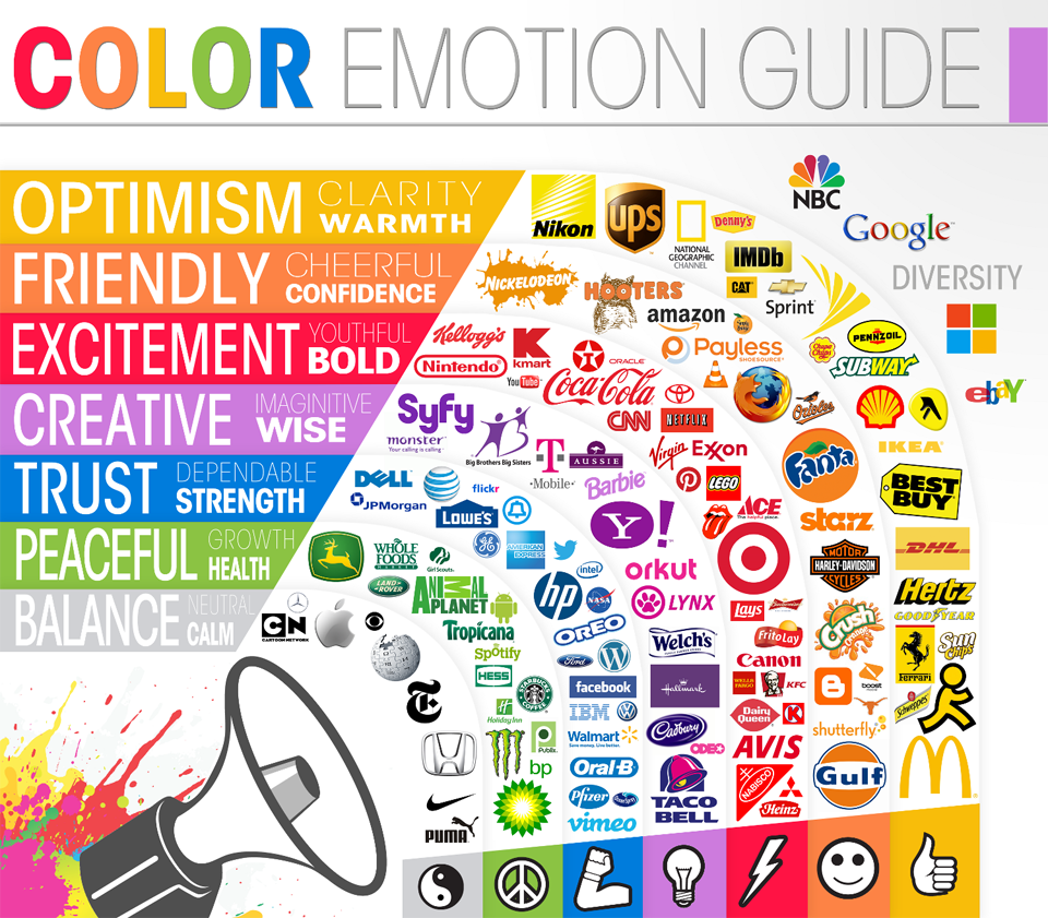
Believe it or not, different colors have powerful meanings and associations. This can differ depending on the person, but in general, you can count on colors to elicit the following emotion associations:
- Red: energy, excitement, immediacy (e.g. CocaCola)
- Orange: friendliness, confidence, fun (e.g. Nickelodeon)
- Yellow: happiness, optimism, youth (e.g. McDonald's)
- Green: freshness, health, growth (e.g. Whole Foods)
- Blue: trust, dependability, loyalty (e.g. American Express)
- Purple: creativity, luxury, wisdom (e.g. Hallmark)
- Black: authority, power (e.g. Nike)
3. Subtlety:  You do not need to hit your customers over the top of the head with your logo's message. Sometimes it's better to be less obvious. A great example of this is Spartan Golf Club's logo, which uses some fancy visual double entendre. Instead of using any old image of a Spartan helmet, the logo plays on the idea by using a golfer and the path of his swing to create the image of the classic helmet in a more subtle way.
4. Originality:  At this point, you might be wondering how you can make your logo stand out if it's both simple and subtle. The answer is by making small, clever tweaks to keep you logo original and tie it into the purpose of your brand.
There are many ways you can go about adding small original pieces to make your logo special. FedEx, for example, uses negative space to create a forward pointing arrow between the "e" and the "x" of its simple, typed-out name.
Evernote is another brand that adds original edits to seemingly classic logos. Brands from Animal Planet to the Republican Party have used elephants in their logos, but Evernote ties the elephant into its brand by using negative space to create a page fold in the ear that instantly connects the elephant with note taking. Small touches like these may seem superfluous, but they are the aspects that will make your logo truly special. It may seem hard to come up with an original concept or tweak, but many of the best designers find inspiration from the world around them.
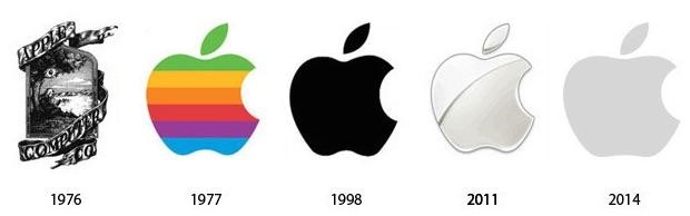
5. Longevity: You want your brand to be around for the next ten, fifty, or even one hundred years, and you want a logo that will last with it. It may be tempting to go along with the latest trends in graphic design, but don't let that temptation pull you away from the end goal: an enduring logo that will represent your brand for years to come.
But just because you want to design a logo that will last with your brand does not mean you can't change it over the years. That's where simplicity comes in. If you create a logo with simplicity in mind from the beginning, you can make small changes over time to keep your logo and brand current with the times.
Consider the Apple logo, which everyone is familiar with. Setting aside the earliest version, the logo of a simple apple has remained solid and recognizable over the years while still adopting small color and style changes. Shoot for something similar with your own logo.
6. Memorability: In the end, what you want out of a logo is memorability related to your brand. All of the ideas listed above will help your logo become memorable, but sometimes you have to go the extra mile. The average consumer is bombarded by commercial messages every second of every day. If your brand's representation isn't memorable, it's just going to become white noise.
What makes a logo memorable is the experience your brand can consistently deliver. If you develop a good product or service, customers will begin to connect that experience to your logo and, in return, your brand. So keep your logo clear and simple, and work on providing a great customer experience behind the design. With that combination, you'll hit the logo jackpot.
