
You may not know Paula Scher by name, but you'd recognize her work: from the red-arched "citi" logo to Boston's first record album cover, Paula Scher's award-winning iconic identities are legendary. While maintaining her successful career as a graphic designer for the international firm Pentagram, and applying her eclectic typographic skills to a more personal project, Scher has, quite literally, mapped out the world. Seeing the world through Scher's eyes - something you can do in her stunning exhibition of paintings currently on view at the Maya Stendhal Gallery- offers a provocative insight into an abstract world.
There's a paradoxical conflict between the expressionistic complexity of your own maps and the simplicity in your branding.
When I paint I can reveal much more. It's my point of view and I control the information. The painting can be oblique whereas with graphic design, I'm taking information and distilling it to its purest form. The branding speaks to the whole concept and finding a way to make that emblematic so it is clearly understood. It's the opposite of what I'm doing with the map painting. The two kinds of work inform each other.
Why map paintings?
They are the result of my entire life, of a worldview that's always changing. My father worked for the United States Geological Survey as a photogrammetric engineer. He invented a measuring device called stereo templates and helped develop aerial photography techniques. He was looking for the perfect representation of an area, knowing there would be no perfect representation. He was always frustrated when we were on a road trip -- if we got a map at a Mobil station, the road with the Mobil stations was always highlighted. So if you were lost in a city and were in search of the main road, the road that appeared as the main road was the one with another Mobil station! Similarly, you can have two maps of the same area by two different companies and the size of the towns are different based on some information or evidence that they've weighted differently. The information is slanted based on the manner and methodology different mapmakers use.
What was the starting point for your Map Paintings?
I started painting small maps in the 1980's. At first they were comical and satirical but as the paintings got bigger, around nine years ago, I became interested in information as a medium and as abstract expressionism. I've become obsessed with the useless information that bombards us through every form of media. I like to paint with this "information" - I can dictate a spirit and aesthetic form. When you are designing you have to be specific about the slant of the information, whereas when you are painting you can be as oblique and absurd as you like.
Do you map them out, so to speak?
I do them by eye. I paint from about five sources. I want to make sure I have as much information to work with as possible so I skew it for my own purposes. I'll do the landmasses by eye and they are necessarily distorted as part of the painting. But there's a point where they need to be somewhat recognizable or they become too abstract.
Do you see yourself as an artist or a graphic designer?
When I design I have a client who has a say in the work. When I paint I have no client. It's all my own voice. I didn't stop being a graphic designer to become a painter. One informs the other and I am richer for both.
How did your past inform this body of work?
I was a child during the Eisenhower administration and lived in Washington, D.C. in a world perceived by white, middle class people to be wonderful. But I remember "step to the back of the bus if you are black." How could that world be wonderful? I knew early on that information was skewed. My paintings are personal, overt, admitted skewing of information.
Which are your favorites?
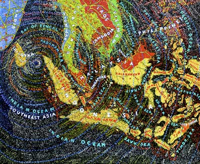
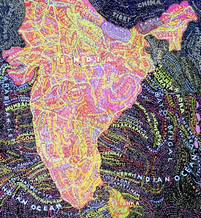
I like the radiated typography of the Tsunami. The supercharged Bollywood colors of India amuse me. It's definitely 21st century India mixed with past prejudices.
How can these paintings make a difference?
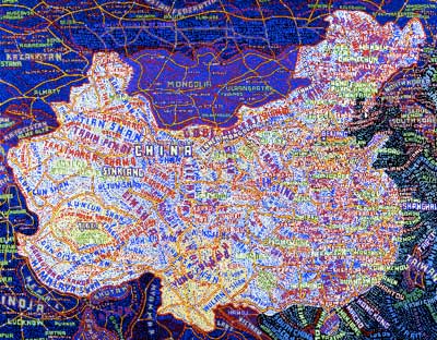
The maps represent an impression of the world through contemporary media. For example, the complex growth and industry of the giant capitalistic China can be felt by the complication caused by the patterns here of text and color. China can be felt, as well as seen. But the interpretation is ultimately one's own. My maps are a personal expression of the world I see, from my thoughts and my prejudices. I hope people are moved by them in some way.
How can other people "make a difference?"
I would like to see a world where I encountered more individual thought among young people, not the prevailing conventional wisdom of the moment. I think the power and voice of a lone individual helps change and shape things in communities, large and small. In order for one to think independently, one has to learn to be suspicious of the dogma generated by various socio-economic-ethnic-cultural-religious milieus. That's difficult because it means one becomes a bit of a loner and outsider.
Written with thanks to Alice Twemlow, Jennifer Rittner, Hillman Curtis and of course, Paula Scher.
For insight on art and mapping, take a gander at Jennifer Liese's exhibition catalogue essay Paula Scher: Mapping the Age of the "Sort of Right" and there's a new book, Cartographia: Mapping Civilizations by Vincent Virga and the Library of Congress as written about in The New York Times Book Review and mentioned in a separate article by William Grimes, Happy Trails.