

This post was co-authored with Dash Davidson.
Major League Baseball's All Star Game is played this week in Cincinnati. This year's midsummer classic has garnered significant attention for the players selected to the game -- and those perhaps should have been and were not. The players in the All Star Game are chosen by one of three different methods: Fan selection for the starting lineup of each league; Peer selection by the players for 8 pitchers and 8 positional backups for each team; Managers selection to fill out the remaining roster spots until each team has 34 players.
Unlike in the MVP, Cy Young, or Rookie of the Year voting at the end of the season, sportswriters and industry insiders have no say whatsoever in selection for the All Star Game -- which can lead unpredictable results. This year is a prime example. Consider the Kansas City Royals, coming off of their first World Series appearance since 1985 and boasting one of the most galvanized fan-bases in the game. They managed to vote in four starters to the All Star Game through the fan balloting process. This is in stark contrast to previous years when larger market teams, with larger fan bases have dominated the fan vote of the All Star Game. In fact the game in Cincinnati will represent the first time in baseball history that no player from either the New York Yankees or Boston Red Sox will be in the starting lineup. Notable players were also left off the All Star Game roster -- specifically Alex Rodriguez, baseball's firebrand, who has been enjoying an incredible season at 40 years old following his year-long suspension in 2014.
Statistics inundate baseball, allowing for its players' performance to easily be compared and contrasted. For fans, this can lead to a game of analysis off the field. Let's combine baseball stats with some data analysis and ask the question: Did the players who most deserve to be called All Stars crack the roster?
To critically assess the merit of the All Star Game rosters, we need a dataset that contains the relevant baseball statistics. Let's use one on Fangraphs.com by exporting the spreadsheet from their "2015 Batting Leaders" table. From Fangraphs, let's also download the 2015 Steamer Hitters Rest of Season Projections, so we can integrate insight on who is projected to perform well in the season's second half. With data in hand, we are ready to analyze it and our tool of choice is Tableau Public, which is a free data visualization software that connects to excel files like the one we downloaded from Fangraphs. We can create interactive data visualizations, which can be saved, live, to the web. You'll soon see that such visualizations let the user interact with and explore the data. In a sense, you can come up with your own answers to our All Star question.
Below you will see a visualization we created with Tableau Public showing a scatter plot of Major League hitters; each dot represents a hitter and is colored based on the legend of if and how they were elected to the All Star Game. The user can control which statistics to display on the axes by selecting from the menu on the right-hand side of the graph. The options are, for the Y axis: OPS (On-base + Slugging Percentage, measuring a hitter's power and plate discipline) and HR (Home Runs) from the 2015 season's first half, and Proj. OPS and Proj. HR's (courtesy of Steamer Projections) for the season's upcoming second half. And for the X axis: WAR (Wins Above Replacement, a catch-all metric for determining how valuable a player's total contributions are to the team winning games) and BA (Batting Average) from the season's first half and then the corresponding projections for the season's second half. Click the image to visit the interactive graph.
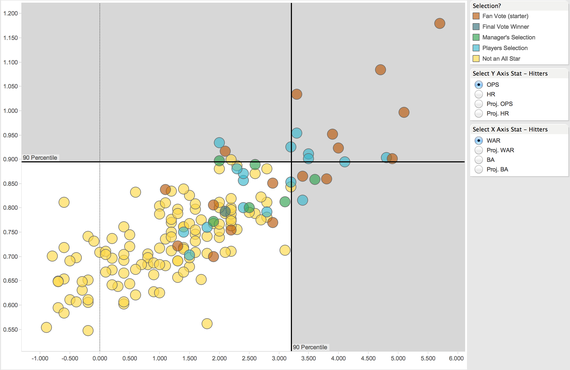
Analyzing the scatter plot lets you see quickly and accurately how some players who were selected for the All Star game fall far below the 90th percentile line for the displayed metrics. How do Alcides Escobar, Matt Holliday, and Salvador Perez beat out players like Alex Rodrigues, Joey Votto, and Adam Lind?
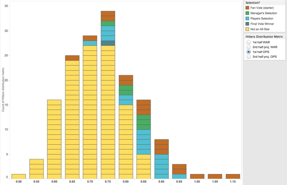
Stories can be told from different perspectives. The same is true with data and visualization is a powerful way to gain more insight. This next data visualization offers a different take on the same data represented in the first one. Here we see the distribution of all the players in the dataset for whichever of the four metrics is selected in the right-hand menu. This histogram chart is perhaps even easier to digest than the scatter plot: selection 1st half OPS as our metric shows clearly that certain players further to the left in the columns who made the All Star Game -- colored in brown, blue, and green -- did not deserve to be selected over others who had higher OPS's to the right in the columns but who were not selected and colored yellow. At least the top five columns all made it into the game, but poor Anthony Rizzo, whose 0.954 OPS is good for fourth in the Major Leagues, but was shown no love by the fan-vote and had to rely on his peer players electing him to the All Star Game. Dive into some visual analysis and let the data tell the tale. Click the image to visit the interactive graph.
One of the most powerful parts of Tableau Public is the ability to combine single visualizations like the two we have shown above together on a dashboard and create interactivity between and amongst them. By so doing, we have a true exploratory environment for fans to probe the simple question posed earlier by easily accessing and manipulating the underlying statistics of those players. The dashboard presented below features the scatter plot and histogram from above plus another chart, a box and whisker plot, showing the median and distributions of the four categories of elected/non-elected players in the dataset. It also has a filter based on team, so the user may click on the logo of their favorite team along the top of the dashboard and see where its players fall in the three charts below. It also features the full stat line of all the players visualized in the dataset - just hover over a dot on any of the three charts and see the stat line for that player populate in the middle of the dashboard. Click the image to visit the interactive graph.
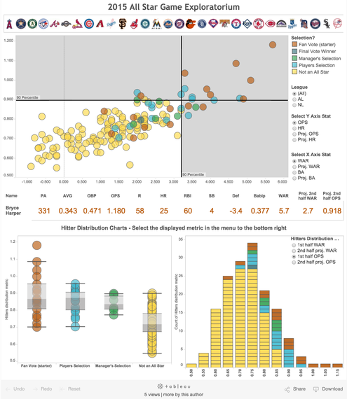
With the exploratory dashboard, you are ready to ask and answer questions like: Are the Royals players worthy of their fan-voted All Star spots? Should Arod have been an All Star? Do the Managers or the Players pick better All Stars? Should the fans vote in more players -- or fewer? Ask other questions and explore the data for more your answers. Find data and create your own visualization and become your own sports analyst. Let the numbers tell the tale with some major league analysis!