People are fascinated by wealth. We read with great interest about the lives of the rich and famous, ogle their fashion choices in glossy magazines, feeding herds of paparazzi in the process. The advertising industry nourishes our feelings of deficiency and mediocrity, and feeds a sense that our lives are bland unless, of course, we purchase its wares. If you spend your whole life looking up at giants it is easy to feel vertically challenged. How instructive it is to glance down from time to time!
The fact that most countries in the world are poorer than the United States based on GDP per capita will not come as a surprise. Almost no one, however, earns exactly his or her country's GDP per capita and it is therefore more interesting to compare people's incomes directly. That is what we have done in a recent study issued by the Peterson Institute for International Economics. We used results of household income surveys in over 140 countries and combined them with population statistics to calculate the distribution of incomes across the whole world.
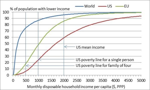
The graph below allows you to compare your income with that of all human beings in the world, using data for 2013. To make the comparison fair, incomes in each country are converted into US$ using PPP (Purchasing Power Parity) exchange rates that take into account differences in the cost of living across countries and so ensure that a dollar of income in India or China can purchase the same value of goods and services as a dollar of income in the United States.
To locate yourself on the graph you need to calculate your total household monthly income (including earnings, income from capital and all monetary benefits you receive from the government), subtract taxes and social insurance contributions paid, and divide by the number of people in your household, including children. You can then read off the blue, red and green lines what share of the population in the world, in the United States and in the European Union, respectively, is poorer than you are.
For example, average household disposable income per capita reported in the United States was around $2,000 per month in 2013. Around 60 percent of the U.S. population (roughly 190 million people) had an income below the U.S. average. In Europe this figure was 86 percent. Working out the share below the U.S. poverty line is more complicated because the poverty threshold depends on one's family situation. It is higher for single people than for individuals who live with family because families are able to share certain expenses and benefit from economies of scale in living costs. The official poverty rate in the United States was 14.5 percent in 2013.
The really striking comparison, however, is the one with the world as a whole. The average citizen of the United States is comfortably in the top 5 percent of the world's income distribution. Over 6.6 billion people live on less than the U.S. average income. The position of the world's population relative to the poverty line in the United States is even more shocking. We do not have information on the family situation of every survey respondent so we cannot calculate precisely the share of the world's population living below the U.S. poverty line, but it is likely to exceed 80 percent. That is over 5.5 billion people!
Looking up at the stars is not a sin. Aspiration is the motor of progress. As a reality check on our seemingly existential concerns, however, it is useful every now and then to cast our eyes toward earth. We will see literally a world of souls less fortunate than you and me.
