

I had some terrible taste when I was a teenager.
My mother had great taste, and would look at me with horror when she'd see the outfits I had concocted. She'd wince when I pleaded with her to buy things in Hot Topic (I'm dying of shame as I admit this).
But let's face it: many of us women, as teens, liked some pretty embarrassing things.
This confession has a point. When I was reading the Internet last week, I came across this Jezebel post on a reissue of Sylvia Plath's The Bell Jar for the book's 50th anniversary.
Don't get me wrong: I love classic reissues. What better way to keep physical books alive than to give classic books beautifully-done updates by amazing designers?
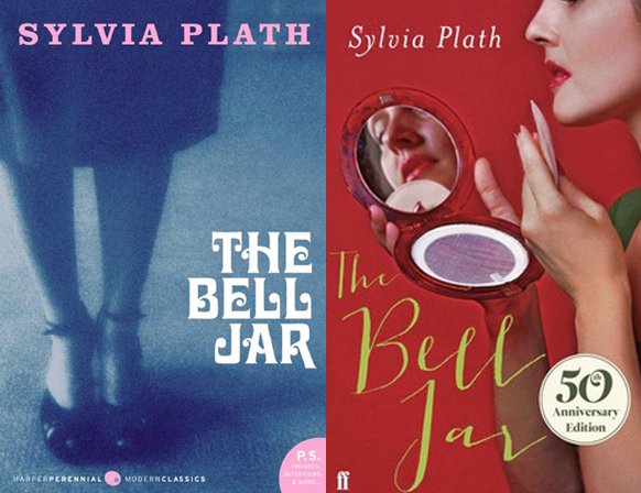
However, this new Sylvia Plath cover was the worst. As the author of the Jezebel post points out, "If Sylvia Plath hadn't already killed herself, she probably would've if she saw the new cover of her only novel The Bell Jar."
I surmise that publishing houses are making these ugly, horrifying book covers for female classics to appeal to teen girls, maybe even female lovers of genre fiction.
This needs to stop.
Sure, as I said above, many teen girls have bad taste. But why would we encourage that by destroying the covers of these beautiful classic books?
I imagine that most of these powerful female authors who wrote about femininity and struggled for equality to the male sex would be turning over in their graves if they knew that their feminist tomes were being churned out with makeup compacts and Twilight book cover rip off designs, like this new edition of Emily Brontë's Wuthering Heights.
It's insulting to women and girls everywhere to essentially trivialize the topics of these books by creating these book covers showcasing female stereotypes.
The Bell Jar deals with a mentally unstable girl who suffers from severe depression and makes several suicide attempts. It is considered a semi-autobiographical version of Plath's life. Plath went on to commit suicide by putting her head in an oven.
Who made the call to put a girl on the cover looking at herself in a makeup compact and applying powder to her face?
This doesn't only apply to Plath. The cover of Charlotte Perkins Gilman's Herland is absolutely ludicrous. I feel sorry for whoever buys this book thinking it's going to be about creating the perfect virtual girlfriend who ends up coming to life. They will be sincerely disappointed.
Are these books attempting to highlight the things that girls do and enjoy doing? Girls only enjoy applying makeup? Reading Twilight? Looking sexy? Running through fields, mussing up their hair? Gossipping with their girlfriends? Dancing with men?
Because these novels were written for women and by women, did it just made the most sense to give them ridiculously sexist book covers that presuppose a number of things about the entire female sex?
The irony in all of this is that these female authors were trying to overcome these feminine stereotypes in writing these books.
HOW DID WE GO FROM THIS TO THIS?!
I think that while the cliche "Don't judge a book by its cover" is well-intentioned and may certainly be true when referring to people, it is bullsh*t when referring to actual books.
Of course book lovers judge books by their covers. If we didn't, we might all be reading all of our books on ereaders. Book cover design is a big part of what helps keep physical books alive.
Book covers are art. They are a representation of the book itself and what is to come in the book. Why would we strive to make bad art?
Great book covers tend to pick a theme that runs rampant in the book and stick with that as an inspiration for their cover design. This Wizard of Oz (Penguin Threads edition) shows Dorothy and her friends walking down the yellow brick road. However, there are also more subtle ways to showcase a theme. The upcoming Random House reissue of Truman Capote's classic Breakfast at Tiffany's is done in the iconic Tiffany's robin's egg blue. Coralie Bickford-Smith's designs for the Penguin clothbound classics were subtle as well. For example, her cover for Oscar Wilde's The Picture of Dorian Gray features simply peacock feathers (a perfect summation of Gray's pride and arrogance about his appearance).
As a Books Editor who understands all the problems that are going on with the traditional book publishing industry right now, I understand the publishers' dilemma. They need to make money in order to stay in business. These embarrassing book covers are probably selling more and maybe even resonating more with teen girls than the original book covers had.
But should the publishing houses lose their integrity and insult women just to make money?
What do you think? Should these insulting book covers of female classics continue to be published? Let me know in the comments!
The following book covers are insulting both to women and books. (NOTE: Not all of these are U.S. editions of the book):
CORRECTION: Jane Eyre was pulled from the slideshow, as it turned out to not be a real cover.
