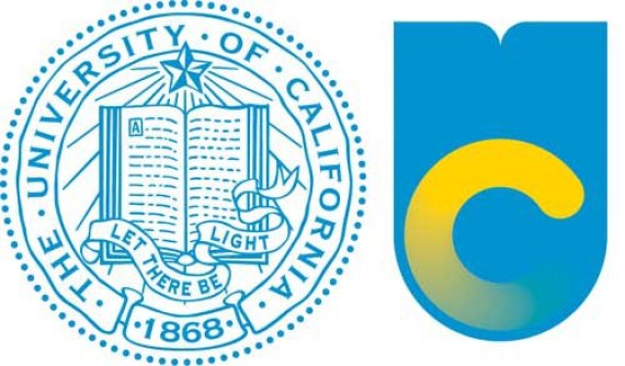
The University of California is changing its look after 144 years, quietly unveiling a new logo in November, and a lot of people are pretty upset about it.
Last week, as a sleek animated video promoting the branding began circulating online, people took more notice of the new logo -- and began calling for its "quick, painful death."
A petition to stop the new logo, started on Saturday, has gathered more than 38,000 signatures, and more than 4,300 people joined a Facebook page devoted to stopping the logo change. UC alumni created an anti-logo Facebook page as well.
The design was roundly mocked on Twitter, and it didn't take long for an animated gif of a "loading" version of the logo to make it to the front page of Reddit.

At left, the old University of California seal; at right, the system's new logo.
According to the San Jose Mercury News, the new look was designed by an in-house team, and is "meant to catch the eye of California residents, businesses and politicians alike -- to show how relevant the university is to the state, and, in turn, bring in more fundraising and state revenue."
In a statement released over the weekend, James Simon, UC director of marketing communications, said the university would not do away with its old seal entirely in favor of the new mark. The seal will continue to be used to represent the UC system, he said, and the university does not intend to replace any campus identities.
"What we have tried to do is to create a mark that is iconic, flexible, and solid enough that it works to represent the UC system as a whole," Simon said. "The mark can be used in a combination of the various UC blues and golds as well as in a multitude of applications. Seals are wonderful and carry a legacy and tradition. They also signify bureaucracy, staidness, and other not-so-great characteristics. Much of this was evident in the testing and discussion we did as part of the process."
Vanessa Correa, creative director for UC, told the California Aggie that the new look was meant "to reinstate the systemwide seal’s authority and gravitas after years of casual, indiscriminate use," and to create "a coherent identity that would help us tell the UC story in an authentic, distinctive, memorable and thoughtful way."
But non-fans say the more modern design is not "dignified" enough. As Berkeley student Correy Johnson told the Oakland Tribune, "I feel like when you're talking about a prestigious school, you don't change big things."
Anirudh Sri, another Berkeley student, reinforced that point: "Harvard's not going around changing its seal," he told the paper.
The UC system seems to be brushing off the criticism, for now. Spokeswoman Dianne Klein told the Los Angeles Times, "Like anything with design and change, people have opinions."

