A highly-detailed map pinpointing every person and their race in the U.S. dramatically illustrates how racial segregation still plays a major role in everyday American life.
Demographic researcher Dustin Cable at the Weldon Cooper Center for Public Service at the University of Virginia recently released the racial dot map based on data collected during the 2010 U.S. census (the latest census to date).
The map, which is labeled and zooms all the way down to street-level, has 308,745,538 dots -- one for each person living in the U.S. during the census. They're color-coded into five categories: blue for whites, green for African-Americans, red for Asians, orange for Hispanics and brown for all other races. Wired notes that it is the first data visualization to map both everyone in the U.S. and the way racial segregation plays out across the country.
In an interview with the Huffington Post's Meredith Bennett-Smith, Cable said he hoped the easy-to-read map would help the general public get a sense of both ethnicity and geography in their neighborhoods.
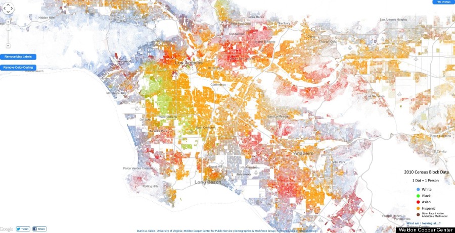
A screenshot of Los Angeles. To see the interactive racial dot map, go to demographics.coopercenter.org.
For instance, zooming in on Los Angeles makes it very apparent that the city is a four-race area, according to UCLA Professor Gary Orfield, Co-Director of the Civil Rights Project.
"[It's] not just about black-white and Latino-white relationships, but also about all the complex relationships among Latinos, blacks and Asians as well as class relationships within these communities," wrote Orfield to The Huffington Post.
If you've lived in LA for some time, the racial dot map will confirm anecdotal observations about different neighborhoods in Los Angeles County. Coastal areas from Pacific Palisades to Palos Verdes Estates are predominantly white -- no surprise, as those areas have the "most desirable areas of economic growth, the beaches and the most perfect climate," wrote Orfield.
However, the map also points out possible misconceptions we may have about the demographic make up of different historical neighborhoods, like South Los Angeles.
"The idea of South Central as a black community is out of date," explained Orfield. "There are many areas where we see African Americans and Latinos living together or in close proximity." However, a "modest corridor" of historic black communities remain intact.
Asians dominate the San Gabriel Valley and cluster in parts of Koreatown, Chinatown, Sawtelle and Westwood (where UCLA is). Headed east, Hispanics dominate the region.
Zooming in to find the most integrated neighborhoods, Mid-City, Mid-Wilshire, Koreatown and Westlake appear to be the most diverse neighborhoods in LA. Another integrated neighborhood is West LA, east of the 405 freeway and Sawtelle.
The bottom line? Cable's map is a great first step at understanding race in Los Angeles. But when it comes to examining the way geography intersects with other measures of inequality, more needs to be done, said Orfield.
"The true significance of this map would come from overlaying it with the distributions of average income, health conditions, joblessness, school quality, graduation rates, foreclosures, school segregation, college graduation and dozens of other patterns of opportunity and success or failure in key attainments." wrote Orfield. "Those maps show that virtually all of these things are distributed in ways that are likely to reinforce and perpetuate inequality."
Related
Before You Go
