This week, Bitly launched an interactive, real-time map that shows how different states are biased toward certain media outlets.
Some of the map's results weren't too startling. Illinois, for instance, seems to like the Chicago Tribune more than any other state, NPR is apparently beloved by Californians and Fox News appears to be big in Georgia and Alabama.
But the map -- which shows which states are most disproportionately sharing links from one news outlet -- provides some surprising and novel insights as well. Scroll down to see what we mean:
Newspapers:

TV/Radio:
Magazines:

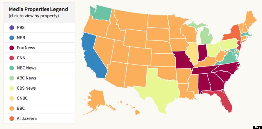
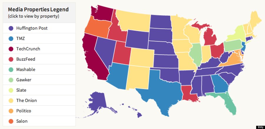
Online News Outlets:
In a blog post about the interactive maps, Bitly explained why it decided to look at disproportionate traffic rather than raw traffic to compare how successful certain media outlets are in different parts of the United States.
"It makes for a more interesting analysis to highlight which properties were doing unexpectedly well in certain geographic regions relative to the nation as a whole," Bitly writes. "If raw clicks were used to rank states, the national map would be more likely to be dominated by the largest media properties from each media category, and the regional affinity towards certain properties, whether based on geographical proximity, or the content itself would be lost."
Explaining this rationale further, Bitly Labs' lead scientist Brian Eoff told Nieman Journalism Lab:
It might be best explained through a hypothetical example. Let’s say that Al Jazeera gets 1% of all traffic in the US and USA Today gets 10% of all traffic in the US. If Al Jazeera then gets 2% of traffic in Wyoming and USA Today gets 11% of the traffic in Wyoming, Al Jazeera would be ranked above USA Today for that state because Al Jazeera has the higher disproportionate amount of traffic compared to the rest of the country. (Al Jazeera has a 100% increase versus USA Today which only has a 10% increase.)
Our goal was to show which states have a preference towards certain media properties compared to the rest of the country, not which media properties are the most popular (which would unfairly bias the results to media sources who heavily use our service.)
"It's a fascinating look -- albeit from a small, self-selective sample size -- at our media habits, not just what we read but how much more of it we do than our neighbors," writes Gizmodo's Brian Barrett of the new media map.
Check out Bitly's media map here. Other than seeing how media outlets are faring in each state, you can also choose to see the activity of real-time traffic and -- by clicking on the news outlets' name -- the most shared stories from each organization.
Related
Before You Go
