Some design rules are meant to be broken. And then there's color. While the vast array of palettes and fabric colorways allow some room for interpretation, too many options means even the pros among us are bound to take an occasional wrong turn around the color wheel.
Enter Tobi Fairley, award-winning designer and color maven, who recently hosted a course on using color in home design on creativeLIVE.com. Tobi chatted with the Huffington Post about the most common mistakes we make when choosing paint color for our homes... and the best ways to avoid them.
Mistake #1: Picking Your Paint Color First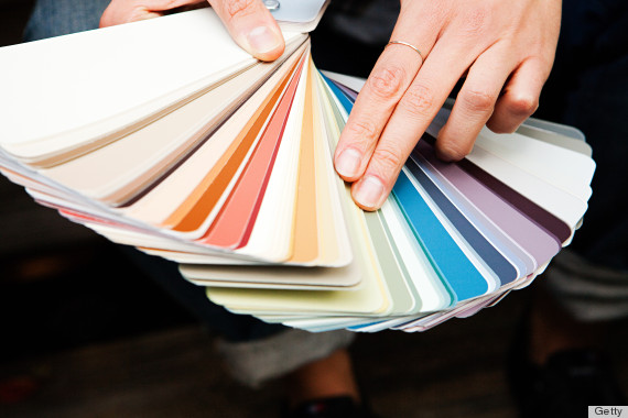
"It's one of the last things I pick, because I wait to see what all of the fabrics and other elements in the space are. If you pick the paint color first, you can really pin yourself in a corner as far as finding the right things to match."
Correct It: Get the room planned and then select the paint to support all of the other things going on in your space. You can take your color cues from fabrics, whether it's accent pillows or an occasional chair that has a pattern or print to it. That's usually my jumping off point for selecting a color for a space.
Mistake #2: Picking A Color That's Too Bright Or Saturated
"A bright cobalt blue, which is really trendy right now, can look great as a ceramic lamp, because it has a sheen to it, or as a silk pillow, because it has depth or interest, but when you put that same really bright color on the wall, it's a whole lot stronger. Lighter, muddy colors (meaning they have more gray or black mixed in with them) work better than a really bright strong hue."
Correct It: If the walls are going to scream a bright color, you want to wrap the rest of your furnishings in neutral tones or even white. Decide what your focal point is. If it's the wall color, then let everything else support it, not fight with it.
Mistake #3: Not Considering The Home As A Whole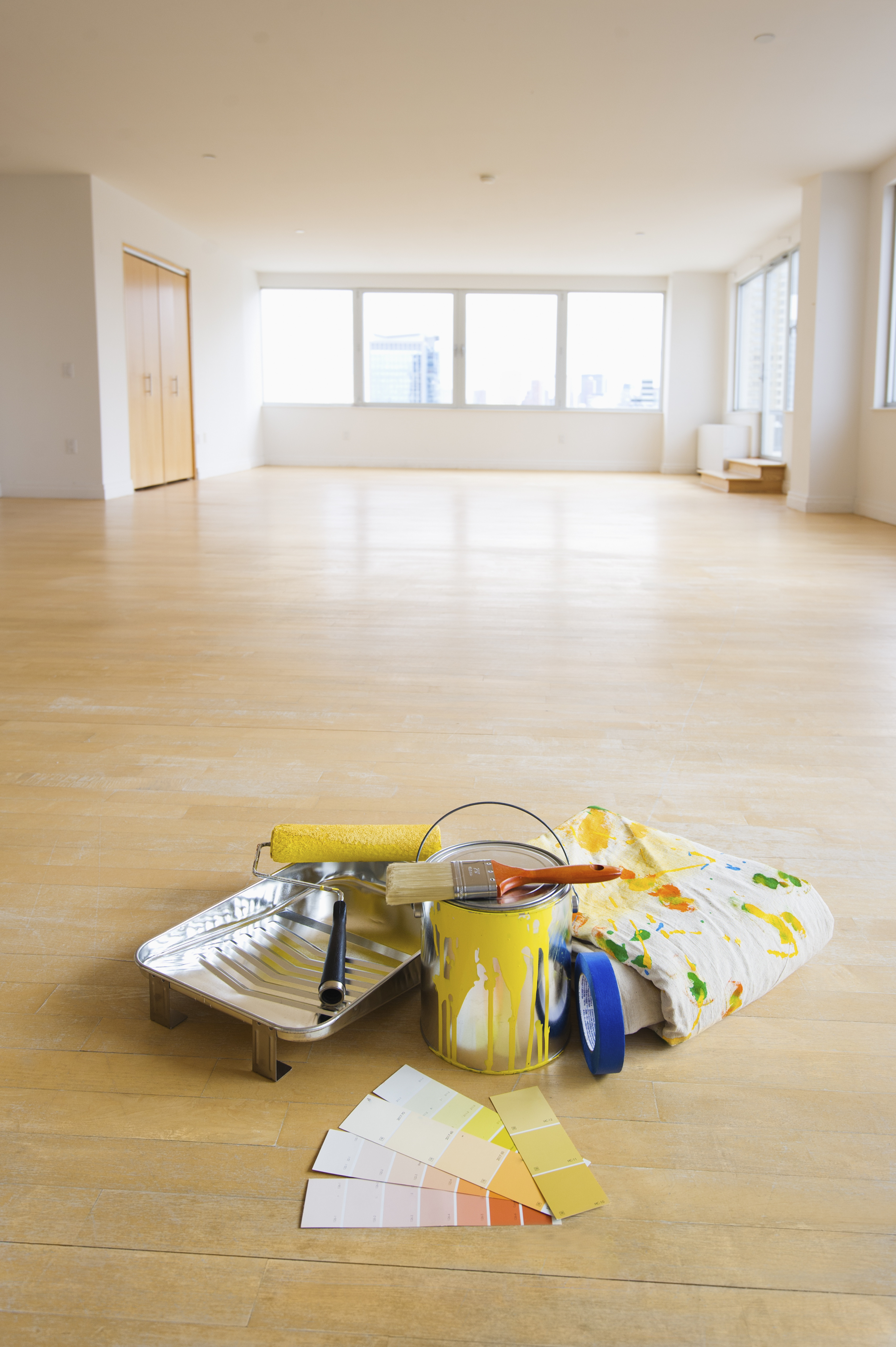
"Even if it's a small apartment, transitioning color from one room to the next can be tricky and it doesn't flow well if you've got bright orange in one room and bright pink in another."
Correct It: Use other things to bring the spaces together.
Mistake #4: Losing Sight Of Your Emotional Goal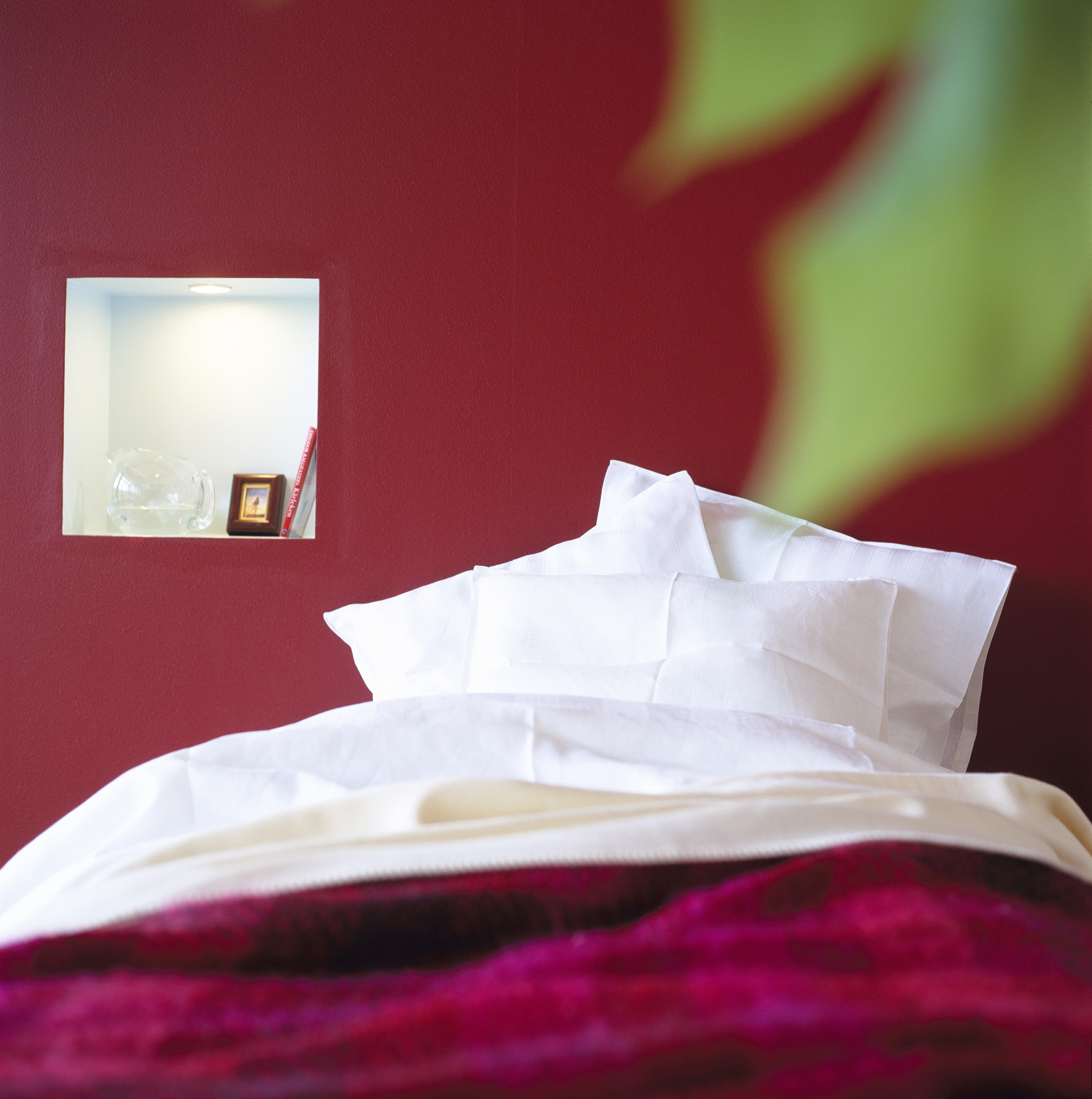
"I hear people say things like, 'My favorite color is red, I'm going to put that in my bedroom,' but what they really ultimately wanted was a space that was relaxing and calm, so there's a disconnect between picking colors and what the space is intended for."
Correct It: If you want a room that's really serene, you might want to look at cool colors on the color wheel, like blue and green; if you're looking for something energetic and exciting, warmer colors like yellows and oranges.
Mistake #5: Ignoring Trends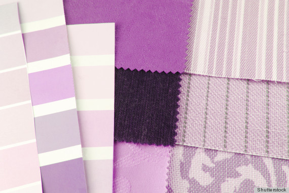
"Even though I'm known for using really bright colors, we are trending back to softer colors, more muted tones and a lot of black with metallic accents. A lot of the hot orange, painted lacquer furniture -- all of the things that I've really enjoyed using over the last several years -- have become overexposed.
Correct It: When you see it everywhere, which is where we've been seeing tons of bright colors of the last several years, it's time to think of something different that's maybe a little fresher or softer or moodier. Look to colors like lavender and black... metal and brass... things that work well and support a rich, sophisticated, even a little bit more masculine look.
Have something to say? Check out HuffPost Home on Twitter, Facebook, Pinterest, Tumblr and Instagram.
**
Do you have a home story idea or tip? Email us at homesubmissions@huffingtonpost.com. (PR pitches sent to this address will be ignored.)