The great postwar artist Inoue Yuichi famously destroyed any work he thought “inferior,” As a result, Japanese collectors tend to hold onto their Yuichis.
But thanks to a rare sale, visitors to the Erik Thomsen Gallery in Manhattan are currently soaking in the sight of dozens of these special works -- many of them enormous canvases painted with a single Chinese “kanji” character.
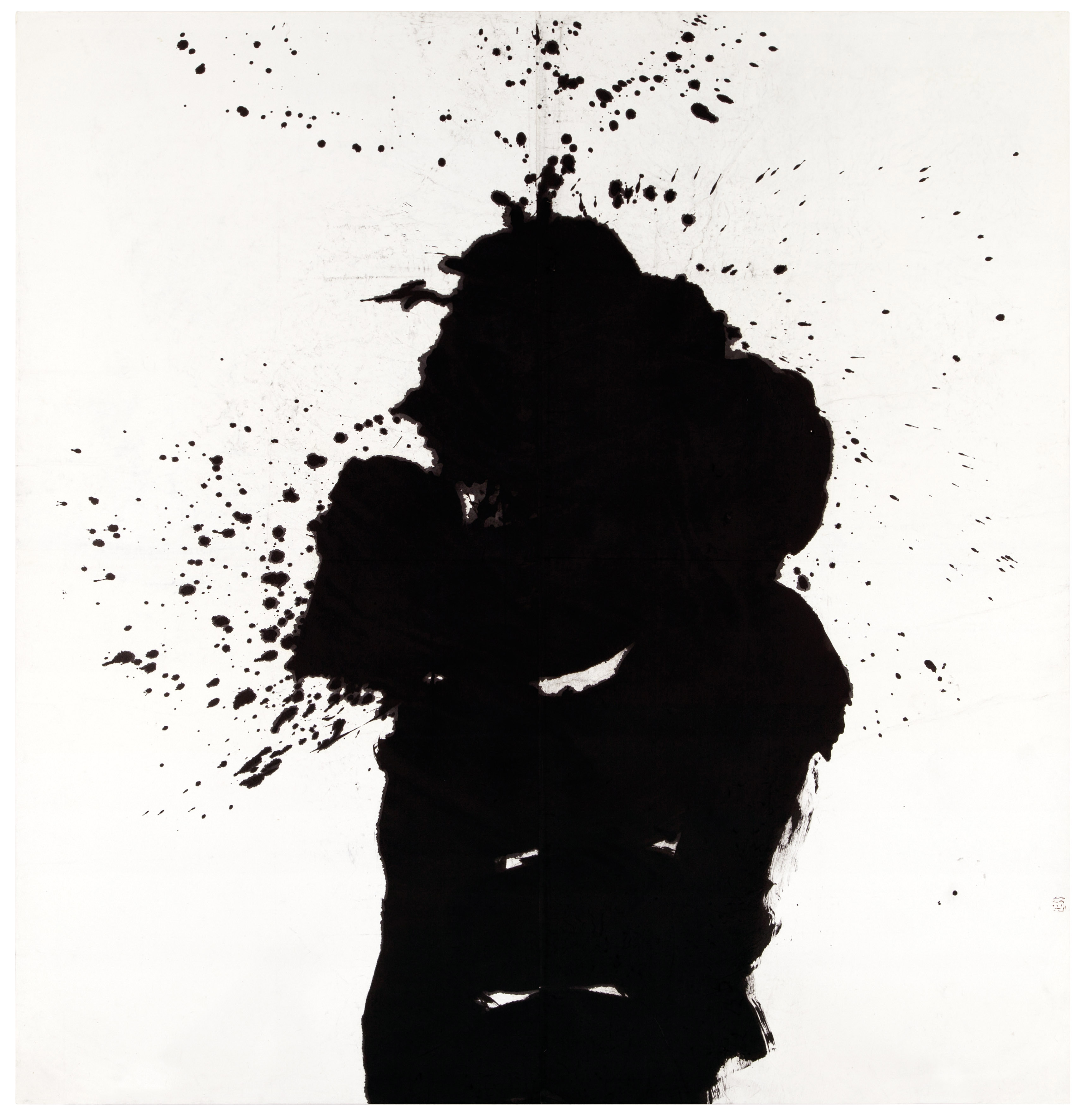
A 1959 painting by Yuichi titled Kotsu 骨, after the kanji character depicted, which means "bone."
The artist, who worked as an elementary school teacher for most of his life, is considered one of Japan’s first modernists. He is perhaps best known for "Ah, Yokokawa National School", a painting inspired by the horrors of the bombings in Japan, which drew comparison to Picasso’s "Guernica" at the time of its debut at the Guggenheim Museum.
His approach cut a sharp contrast with the Japanese artists who came before. Their style was realistic and straightforward, their work rooted in cultural traditions rather than their state of mind at the moment of creation.
Yuichi modeled himself instead on abstract expressionists of the west. He seized upon the key symbols of his world: kanji, some thousands of characters that make up one of three scripts in the modern Japanese writing system.
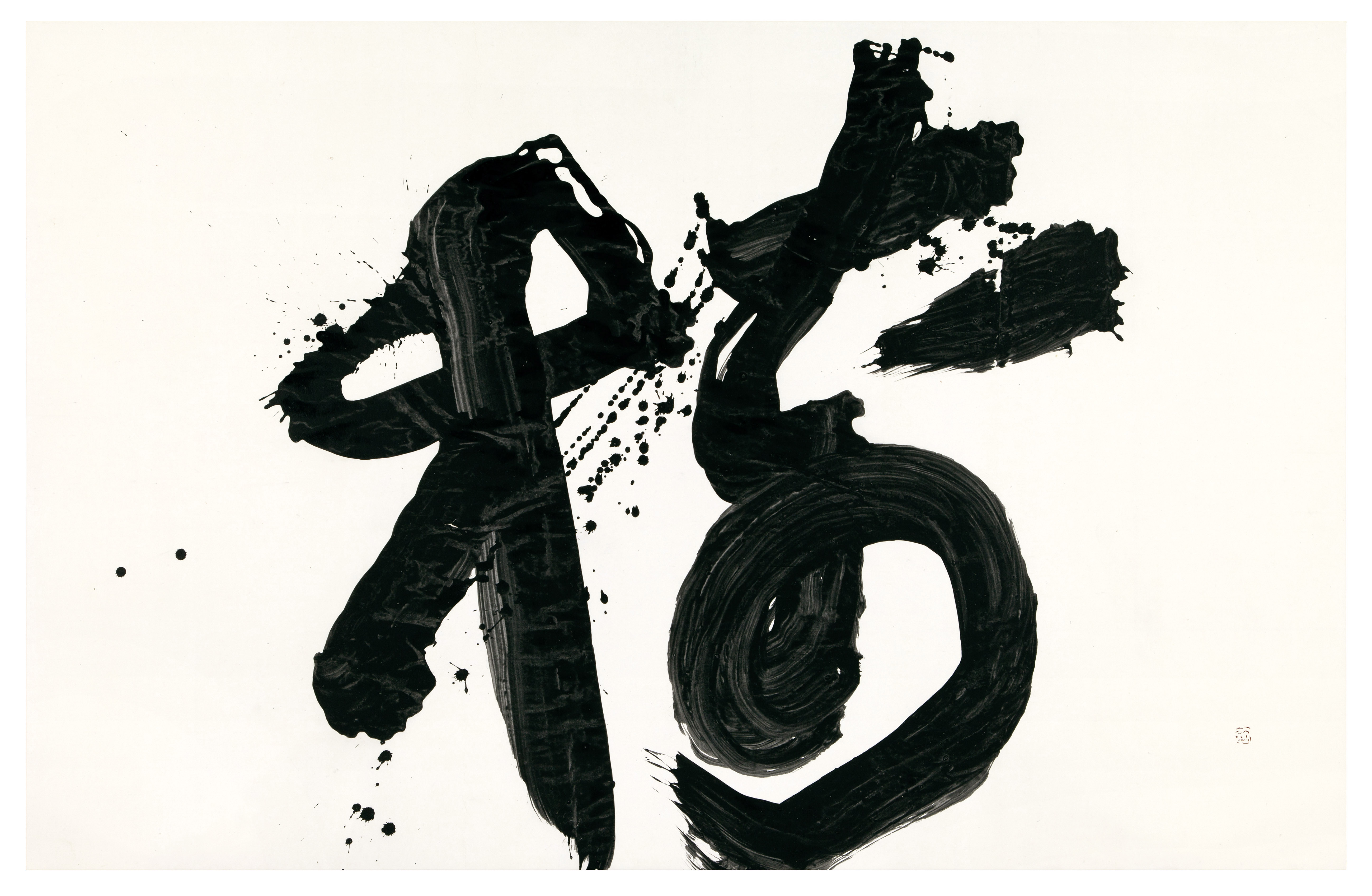
Ju 樹 , painted in 1978, is named for the character depicted, which means "tree."
“I could say,” Yuichi once wrote, in a passage reprinted in a biography by Masaomi Unagami, “I worship the character.” He describes the incredible pull kanji had on him:
“When I start getting absorbed in writing a single character, I can never forget about this character all day long, though I usually write only in the morning. While pondering how to improve the writing of it I feel as if I have found a solution and thus enthusiastically face a sheet of paper the next morning.”
Moments of epiphany were “rare” but thrilling, he wrote:
“When something unexpected suddenly emerges in the middle of such struggles… when I come to a standstill after trying every approach and idea, the bottom comes off… to open a new world.”
Yuichi’s best known works have been described as “single character action calligraphy.” Portraits of him at work show a technique that’s downright Pollock-esque -- Yuichi, small and muscular, hunched over massive, floor-stretched canvases splattered in paint. The Thomsen exhibit catalogue argues that his method was far from random: “The unorthodox proportions of Hin (“Poverty,” no. 12) make the character look poor, Ran (“Lazy,” no. 13) slides off to the right-hand side in a slovenly manner, while Yama (“Mountain,” no. 15) is an impressively craggy, cloud-topped peak.”
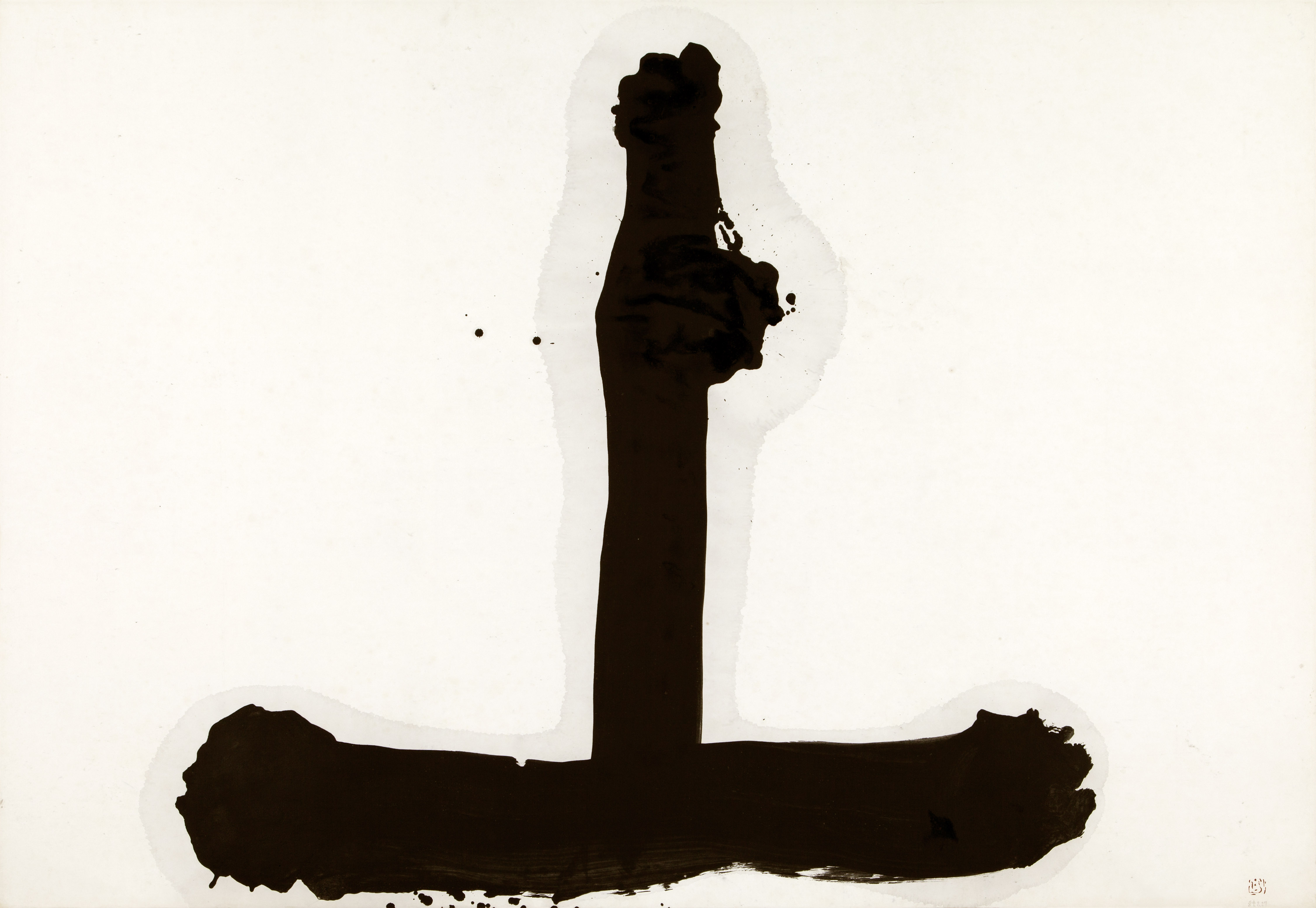
A 1985 Yuichi painting of the character Jo 上, meaning "above." The painting is a favorite of Erik Thomsen's, owner of Thomsen Gallery, because "it’s so powerful in its simplicity," he says.
Gallery owner Erik Thomsen obtained these and the rest of the exhibit’s pieces after hearing about a sale through a colleague in Tokyo. The seller -- a collector who’d spent decades amassing the 30-plus works -- was looking to unload all of them, for reasons Thomsen says he never found out. He jumped on it, knowing how rare the opportunity was. The result was “a seven figure deal,” Thomsen told HuffPost, involving canvases so large they have to be cycled through the gallery in two rounds (the second of which began this week).
“I was very lucky,” Thomsen said. “I have admired Yuichi’s works for decades, but I never thought I could get an exhibition together.”