

If it ain't broke, don't fix it.
There's a reason this is an old adage. It's true.
Despite having one of the more innovative and unique apps on the iPad, Twitter felt the need to give its app a dramatic refresh.
This wasn't just a facelift. It was a complete redesign -- one mimicking the iPhone app and not taking advantage of the larger tablet interface.
I get why they did this, why it looks like the iPhone app blown up. Simplicity. Unification. One UI across all platforms. (Business Insider explains more here.)
It's still a mistake. Gone are the window panes that you could expand or slide aside with the flick of your fingers. The pinching gestures are history. Now you have to tap-tap-tap, like a lot of other apps. It's laborious. Open window, close window. Open link, close link. No more fluid motions. No more doing two things at once.
It used to be you could browse the Web while looking at your Twitter timeline. No more. One or the other.
It used to be you could one-tap to get to a person's profile. Now it's one tap to expand a tweet, another tap to get to the profile.
All in all, it's a lot more difficult to use, takes more time to operate and instead of adding features, it subtracted them. Lists are now very hard to find as well.
OUT WITH THE OLD: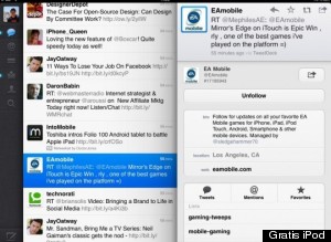
IN WITH THE NEW: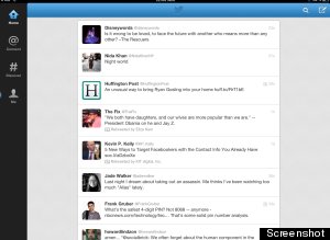
Why is this so mind boggling? Again, the app it had in the first place was so good.
Here's how Twitter introduced that app when it first launched Sept. 1, 2010:
Twitter for iPad takes advantage of the iPad's fluid touch interface, letting you move lots of information around smoothly and quickly -- without needing to open and close windows or click buttons
Now they've gone backward on that premise.
The original app got rave reviews too.
Twitter's sliding panels UI is definitely one of the most unique and usable iPad interface concepts we've ever seen.
Twitter for iPad [...] has a few new UI touches that you haven't seen elsewhere. These features are custom-designed for the larger screen and touch capabilities of the iPad. It also caters to what the iPad was made for: media consumption rather than creation.
Macstories raved, "This changes everything," noting the following:
Just like Inception, you "have to go deeper". It's not a possibility: you have to, if you want to enjoy the complete experience Brichter and the mobile Twitter team built.
It's all gone now, replaced with a iPhone app clone that really does just look like a big iPhone app on an iPad, hardly innovative and not the most user friendly. That said, it is very fast, so props there.
All in all, if you haven't yet updated your Twitter app to the new one, you might not want to hit "Update."
If you already did and you're not happy, or you're looking for another option, Tweetbot has been marked down, now available for 99 cents. I played with it a bit, and it's absolutely worth the price for an alternative. It's a good one too.