Sometimes it's hard to remember why anyone would want to work on Wall Street, what with the long hours, popular scorn and legal entanglements involved. Then you remember the money, and all those fears gently wash away into the sea.
Just look at the below infographic by Catherine Mulbrandon of VisualizingEconomics.com. Besides the very general classification of executives, managers and supervisors, financial professionals comprise by far the largest percentage of the one percent. Can't stand the thought of life on the Street? Then it looks like law or medical school might be your best bet.
We'll be presenting infographics from Catherine Mulbrandon's series Visualizing Economics all week on The Huffington Post. Here's the second from her new book, "An Illustrated Guide to Income in the United States":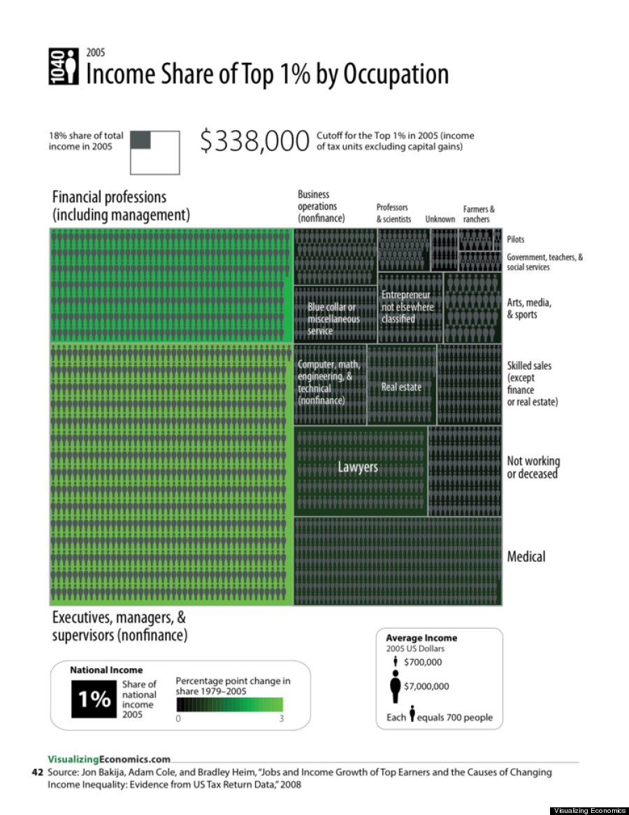
Visualizing Economics is a website by Catherine Mulbrandon dedicated to publishing infographics about economic data. Visualizing Economics has been featured at Slate.com, NPR.org, WashingtonPost.com, The Big Picture, Seeking Alpha and on MSNBC. Mulbrandon's new book "An Illustrated Guide to Income in the United States" is also now available.
Related
Before You Go
