Establishing a visual presence on the web is proving to be crucial to any brand. At the Heritage Foundation, our brand encompasses conservative policy objectives. But how do you take complex policies and frame them in a visually compelling way? How do you make images that every American not only understands, but wants to share?
Our digital team has made this a priority and I lead the creation of our very successful "snack-sized" visuals every day.
Discovering the secret behind viral images inspired a recent panel discussion at Heritage and I want to share some of the secrets behind my personal "creative process" with you.
A Few Secrets to Heritage's "Snackable" Success
Before starting any graphic, always ask yourself three questions: Who is the audience? What is the goal? What emotion do I want people to feel?
1. Who is the audience?
Our audience for each social media channel is different. While much our Twitter presence includes "inside-the-beltway" engagement, those who share our graphics most on Facebook are just regular people yearning for answers from Washington.
We know our audience wants less government control, appreciates the core values America was founded on, hates massive government spending, and is unhappy with President Obama. Indentifying those things helps to build the graphic's purpose in my mind.
It's crucial that the information in the graphic has the ability to be "snack-size" and easy to understand. Sometimes that means killing an idea for a graphic completely -- or it could mean re-working an idea from a policy-driven perspective. That idea must seep into copy and imagery that resonates with most Americans.
Here is an example of a successful graphic that was requested from our policy shop:
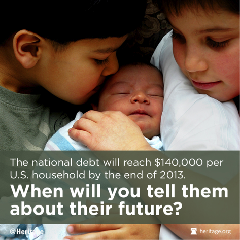
Our Budgetary Affairs experts had a ton of great information on how the debt limit is an opportunity to reverse our nation's long-term debt and spending crisis. However, we know that "debt-limit" can be an abstract term if you haven't had time to dig into the facts. For this graphic, I implemented the root of that message: high government spending. I coupled it with imagery and copy that American families can relate to.
2. What is the goal?
Once you know your audience, deciding on the ultimate goal of the graphic can help decipher what channels should be targeted - and how to write the copy. Here's a quick checklist to help decide.
- Do we want people to share it on their own channels? Facebook is the spot.
- Do we want people to want to read more on our blog about a subject that isn't getting attention? Include links.
- Are we trying to inform Capitol hill-staffers? Bullet points are best.
- Is there a lot of information? (This may mean going outside the snackable size image to produce a longer, more informative infographic).
- Are we engaging with a campaign? Twitter is optimal - and include hashtags within the graphic.
Here is an example of when a graphic was good for our audience, but embedding into a blog or email was better for the end goal:
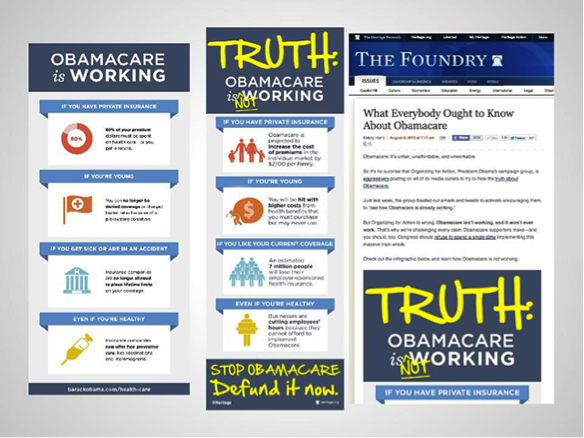
After seeing the original graphic Organizing For Action published, we saw an opportunity to engage with their #ObamacareIsWorking campaign.
By playing on their infographic, we created an effective counterpoint. We were also able to cut the full image into "snackable" size images for various social media platforms.
Our digital team tweeted them out aggressively using the same hashtags as Obama's team. Soon enough, Heritage graphics were showing up right next to OFA's. These same graphics did not perform well on Facebook though -- a good indicator of how different our two platforms are. See the post here.
3. What emotion do you want the audience feel?
Emotional response to each graphic is what drives the image selection and copywriting most. Are we factually informing our audience? Are we thanking our followers for their grassroots efforts? Are we uplifting a conservative principle? Do we want people to get fired up enough to take action? Are we playing into pop culture?
Never put out a graphic that doesn't stir up emotion. This takes time, but the end result is worth it.
A few more pro-tips:
- Find your brand and stick with it. Don't mix up fonts because they look cool -- find fonts that complement your brand and stay consistent. Incorporate your logo or website so people who see your images organically know where to find more.
- No more Comics Sans and Times New Roman. Go beyond average.
- Memes aren't always the best option. They are funny and very popular right now, but are they the most effective way to tell your message? Not usually.
- Editing isn't just for writing. Send every graphic to at least three people for input if possible. Someone should edit the copy, but also give a different perspective on the creative. Collaborative efforts work best.
- Stay from stock photos if possible. When you must use them, utilize filters and play with alignment to create a brand new photo. Try to make it look like you took the photo on your iPhone. Familiarity is key.
- Say no to Microsoft Word. Just because you don't know how to use Adobe Photoshop and InDesign, doesn't mean you can't create professional images. Sites like PicMonkey, Infogram and Piktochart give you the tools you need.
- Would you share this? Always, always, always ask yourself this question. If the answer is no, start over.