We love the crispness and simplicity of a well-curated neutral palette. From the kitchen, to the bathroom, to the bedroom, it's a great way to create a stylistic cohesiveness throughout the home. But if done incorrectly, a neutral palette can feel cold, or even boring. If you're looking to keep things interesting, follow our guide to designing with a neutral palette.
Textured Materials
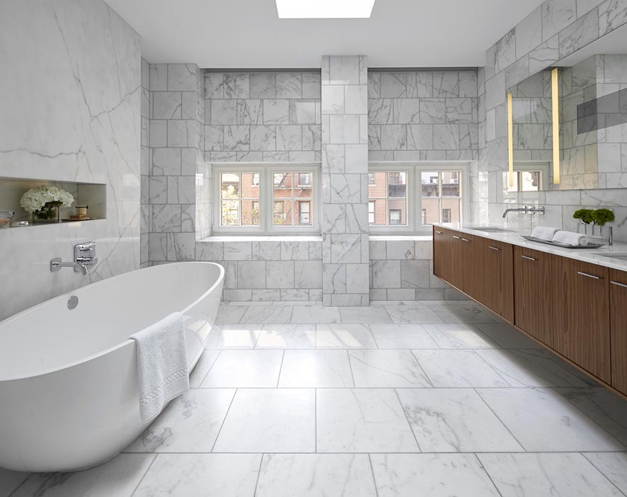
When sourcing materials for a neutral palette, it's important to consider the texture of your materials. Instead of going for a solid all-white look, go for something with more contrast. Natural materials are a great way to do this.
Check out the contrast between the wood cabinets and the floor-to-ceding marble in this Manhattan Brownstone that we redesigned.
Patterns
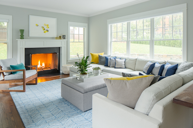
Just because you're designing with a neutral color scheme doesn't mean that you have to only pick solid patterns. Look for a tasteful geometric pattern that riffs on a color that you already have in mind.
If you're looking for inspiration, check out the patterned area rug that we incorporated into this Westchester home.
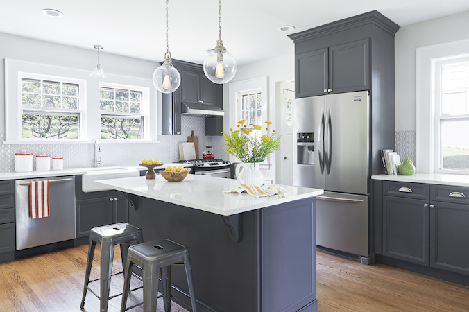
High-Contrast Colors
A neutral palette should never be bland. Offsetting darker greys and blacks against bright whites is one of the easiest ways to create a dramatic, high-contrast neutral palette.
Check out the high contrast color scheme we implemented into the kitchen of this South Orange, New Jersey home.
Muted Colors

Designing with bright colors is certainly more fun than picking between black and white. But incorporating too much of a bright color can easily disrupt your design scheme. If you want to incorporate brighter colors into your neutral palette, pick muted versions of your personal favorites.
Check out the muted pink chairs that we had reupholstered for this luxury condominium on the Upper East Side.
Pops of Primary Colors

If swaths of muted colors aren't your thing, try incorporating pops of primary colors. Whereas brighter muted colors work well in clustered chunks, primary colors function best when peppered evenly throughout the home.
Check out the primary accents that flow through the living room, kitchen, and breakfast nook of this Westchester family home redesign.
Natural Elements

Natural elements are a great way to keep a neutral scheme from feeling bland. Plants are an obvious way to add a bit of greenery to the home, but don't forget to incorporate other natural elements, such as branches and geometric table objects.
Check out the living room table that we styled in this luxury condo on San Francisco's Market Street.
Artwork
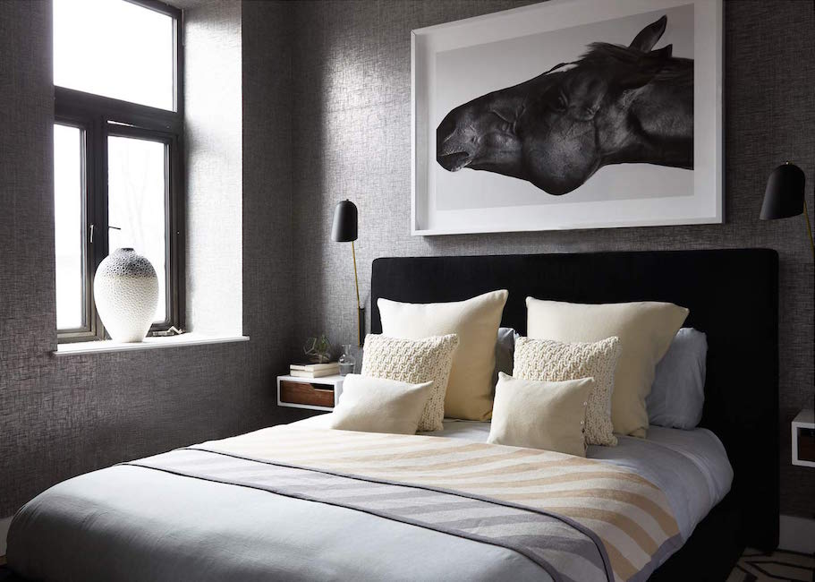
One of the advantages to designing with a neutral palette is that you can incorporate a wider array of artwork into your design scheme. We find abstract paintings with bold colors, or black and white photographs particularly appealing.
Check out the horse photograph that is framed above the bed in this SoHo duplex that we redesigned.
Shapes
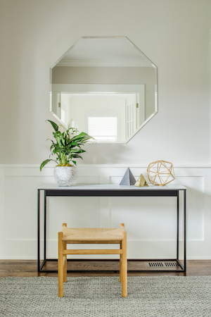
One of the easiest ways to add needed contrast to a neutral palette is to incorporate objects that vary in shape and size. If you're looking for inspiration, check out the variety of geometry in the foyer of our Westchester home redesign.