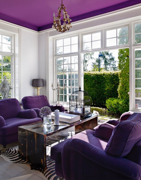
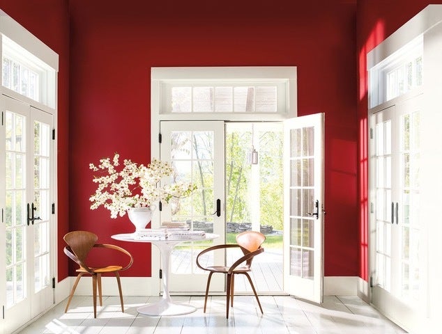
Chili pepper red, aquamarine and a celestial shade of purple will be everywhere in 2018. So say the color soothsayers—the Pantone Color Institute, Benjamin Moore and Sherwin-Williams—who christened Ultra Violet, Caliente and Oceanside respectively their “color of the year.”
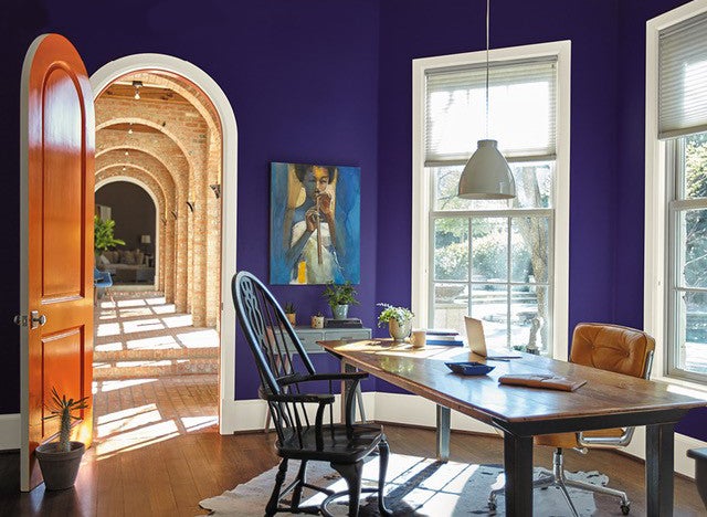
So will these undeniably bold hues really make their way onto everything from the walls, furnishings and appliances in our homes to our clothing and cars? Perhaps in the mass market, where inexpensive housewares and apparel are made and marketed with lightning speed. But we’re not betting that these audacious colors will make much of an impact on high-end fashion or home furnishings, especially given the comments they’ve garnered the press.
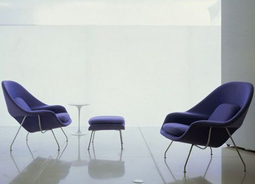
“Huh?” That was the New York Times’ response to Ultra-Violet, which is, in fact, a type of light rather than a proper color, notes LiveScience.com. It’s also a storied term; the “highlighter-purple shade …has also been the name of a Warhol superstar who died in 2014; a 2006 dystopian action film starring Milla Jovovich as a rebel infected with a vampiric virus; an online activist community founded in 2012 to combat sexism and violence towards women; and a kind of light that can cause skin cancer,” the paper pointed out.
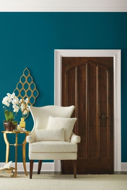
Caliente was an equally surprising pick. “It’s not what we were expecting, noted PopSugar about the energetic hue. A far less controversial Oceanside seems to be a bit more embraceable; House Beautiful said it’s “the opposite of muted and subtle…and doesn’t disappoint,” while Realtor.com said it’s “intense” but “breathtaking.”
What Doesn’t Count: What 2018’s Colors Of The Year Have In Common
What the three colors of 2018 all have in common speaks volumes about the state of the state, so to speak, and by that we mean our bruised psyches in trying times. We’re not in the midst of a real disaster, but few Americans would assess our national emotional state as anything better than “not great,” noted the New York Times earlier this year. And all three of these hues are happy, or at least bright, radiant and cheerful enough to take our minds off our current apprehensions.
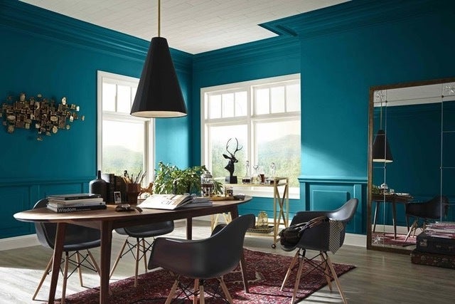
Caliente is “pleasing, passionate and makes people feel special,” claims Benjamin Moore. Oceanside, “the color of wanderlust” by Sherwin-Williams reckoning, will inspire us to travel. And Ultra Violet “brings hope and an uplifting message,” says the Pantone Color Institute.
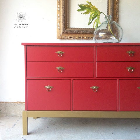
But does that mean we should use them in our homes? Not necessarily. None of these hues are easy to use, especially if the homeowner is truly at the center of the design process. Not many of our clients would be open to say an Ultra Violet Womb Chair, a Caliente breakfront or Oceanside walls. Perhaps pillows or throws are a better option; they’re easy to break out and trade out when boredom sets in. But that’s precisely why we don’t put much stock in short-lived fads such as the Color of the Year.
What Does Count: How Color Can Improve Our Quality of Life
But we do put a great deal of stock in the power of color, which research shows can affect many aspects of our behavior and mood, notes Freshome. For example, red has been scientifically proven to raise blood pressure, respiration and heart rate, while blue has the opposite physical effect, which makes it calming, relaxing and serene. That makes red an ideal hue to use to raise a room’s energy level, draw people together and stimulate conversation, and blue perfect in spaces where we need to relax.
And some colors, such as yellow and gray, are full of surprises that impact how we use them in design. While yellow reflects the cheery radiance of sunshine and conveys happiness, it’s a tricky option for an entire room. Yes, it can make a kitchen or dining room energetic and uplifting, but studies show yellow can also intensify feelings of anger and frustration; provoke people to lose their temper and incite babies to cry, notes Verywell. And gray inspires people to be passive, uninvolved and lack energy, points out Science of People, so it must be paired with brighter hues to offset its negatives.
But no matter what we’re designing, there are so many factors to consider that it’s not wise to rely on color trends, or a hue’s scientifically proven properties, to formulate a color palette. It’s also important to take a home’s natural light, climate, setting and the needs, wants and lifestyles of all of its occupants into account. Trends and psychology are some of the issues about color we weigh in every space we design, but we don’t let them lead us astray—we use them to elevate a homeowner’s quality of life.
