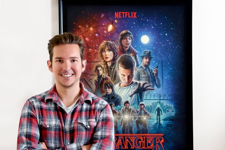
Kyle Lambert is an extremely talented movie poster artist who has created the artwork behind some of Hollywoods biggest movies and TV shows. If you are a fan of the hit Netflix series Stranger Things you've probably seen his work featured on everything from posters to lunch boxes, t-shirts, and giant billboards. Kyle's impressive use of color and composition has made him an artist that is in high demand. He was kind enough to take some time to chat with me about his early influences, how he got started as a professional illustrator, what type of techniques and tools he uses to make movie posters, and his experience creating the widely seen artwork for both seasons of the beloved Netflix series, Stranger Things.
Who were your early influences in illustration?
As a child, it was movies that inspired everything I drew. I sketched all of my favorite Disney characters and obsessively created Jurassic Park and Batman themed artwork. Later, when I reached university I mostly focused on portrait painting in oils and leaned towards realism in a big way. I was fascinated by the large portraits of Chuck Close and his systematic approach to his art. Recently, I’ve been exploring more of an illustrated style that reflects the work of many of the movie poster artists from the 80’s but with a modern twist. I’m a big fan of Drew Struzan, an artist who, in my opinion, perfectly balances art and storytelling in his work.
Speaking more broadly, I’m heavily influenced by people in all creative professions who show extreme dedication to the details of the work they do.
How did you make the leap into becoming a professional artist?
I started promoting my artwork online around the time I left University. I released a few painting videos on YouTube that helped establish my name as a digital artist and they ended up getting the attention of companies such as Apple and Adobe. I worked with them on a few promotional videos to demonstrate the capabilities of their products.
It was at that time I was commissioned to create my first illustrated poster for the movie Super 8, which lead to many of the projects I have worked on since.
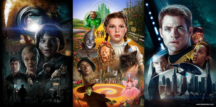
I really love the use of composition in your work. I feel that a lot of illustrators these days have compositions that are too busy and overcrowded. What is your process in developing fantastic compositions with great eye movement?
I see composition as the single most important part of what I do. I spend a lot of time at the beginning of a project sketching very loose layouts, focusing on aspects such as the position and scale of the characters, their relationships to each other, and the overall story points. In my experience, the more you try to add to a poster, the more of a challenge the composition becomes. Whenever possible, I like to keep the composition simple to keep emphasis on what is important about the story.
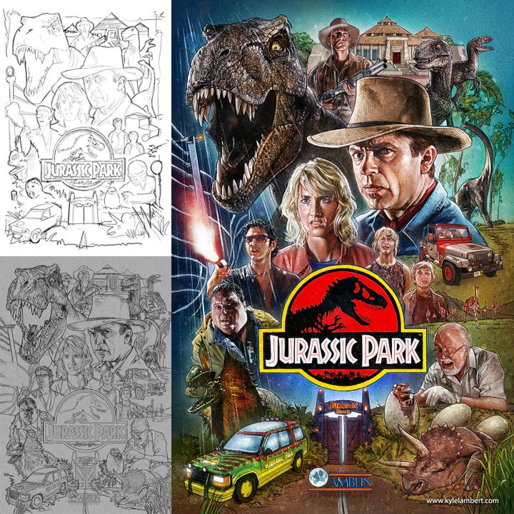
You also use a lot of color in your paintings, is this a conscious choice?
Color is an incredibly valuable tool for establishing mood in a visceral way, so I select the pallet very carefully. From a technical stance, the use of color and lighting are essential when combining the various elements of the poster in a single cohesive image. Wherever possible I try to use the practical light sources in the poster to accurately illuminate the characters.
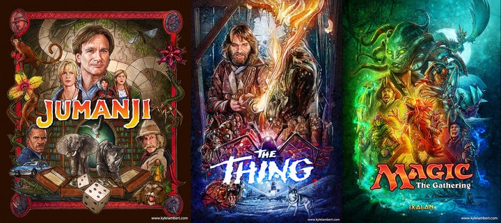
What is your process in creating your artwork from idea to completion? How much is done traditionally or digitally?
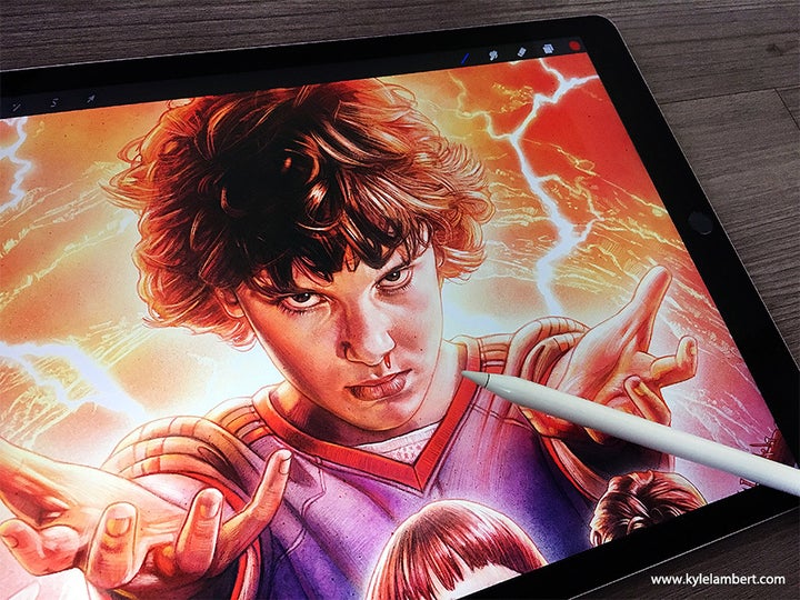
My whole workflow is now digital. The first step is to gather as much information as I can about the subject. That can include still photos, trailers, or rough cuts of the show/movie. I then try to pick out the key story points and characters to include in the poster. With this in mind I begin drawing lots of composition ideas using my iPad Pro and Apple Pencil with the Procreate app. I sometimes even use apps on my phone if I am struggling with a composition and happen to come up with an idea at an unexpected time.
Typically the studio / directors / producers will want to review the composition before I begin illustrating the finished poster. This usually results in a series of revisions to get closer to their collective vision.
Once approved, I work between Procreate on my iPad Pro and Adobe Photoshop on my Mac to fully illustrate the poster. I do most of the line-work in Procreate, because of the accurate and natural input of the Apple Pencil. I then import the artwork into Photoshop to color and build out the layers in a way that can be used for multiple formats needed for an advertising campaign. This includes alternative layouts for billboards, merchandise and social media.
How did your artwork for the first season of the Netflix show Stranger Things come about? Were you surprised by how widely seen and popular that artwork became?
I believe Netflix remembered the Super 8 poster I had done and thought it would be a perfect fit for their new show. After being hired, I decided to study my favorite 80’s posters and develop new techniques to reproduce the hand drawn style digitally. It was a really fun project, but I had no idea how big it was going to be. Stranger Things became the big hit of that year, and the artwork was popping up all over the world. There were billboards, t-shirts, action figures and all kinds of other merchandise. It was truly a life-changing experience for me.
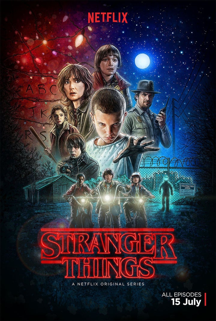
You recently did the artwork for season 2 of Stranger Things. Did you see the new season before creating the artwork and how did that effect your work?
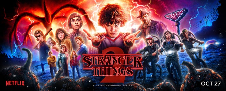
Yes, it began with me watching rough-cuts of the first few episodes and talking with the team at Netflix about the direction we wanted to go. The episodes helped me get a sense of the tone of the new series and establish which story points and visuals to focus on. A few of the images jumped out immediately and demanded to be included in the poster, others took longer to determine.
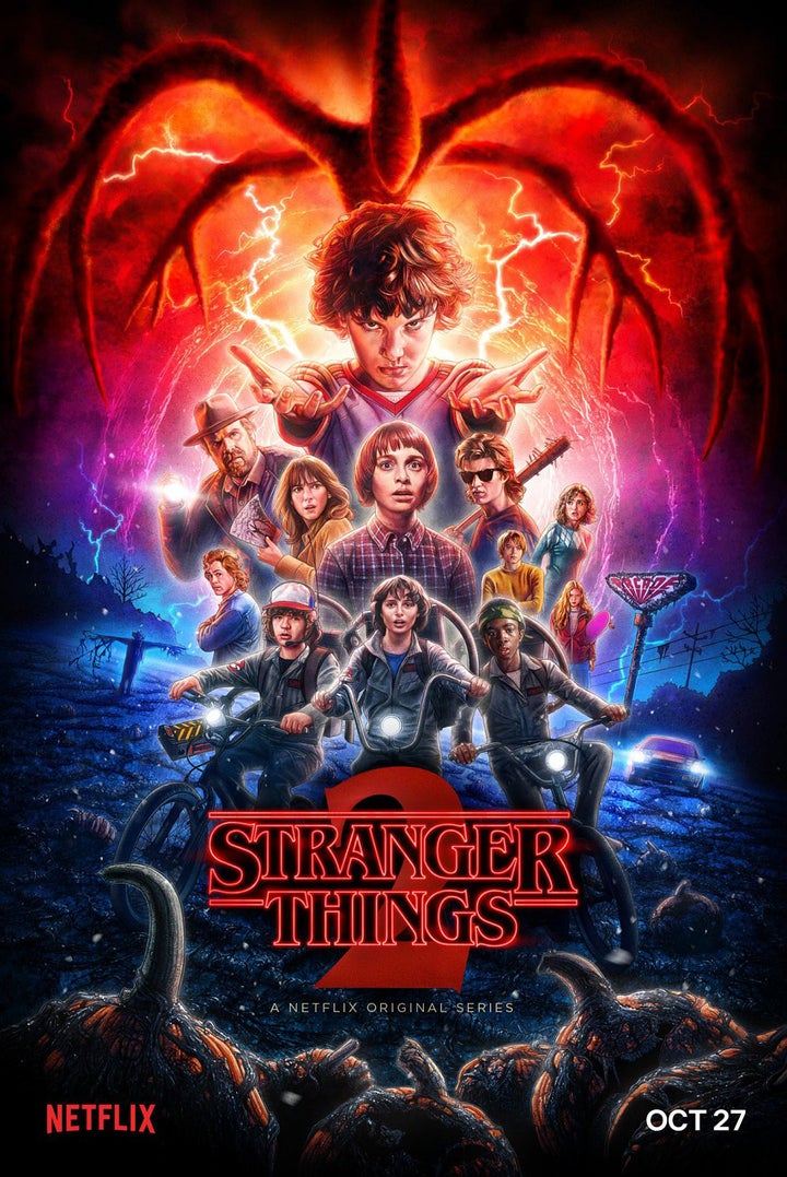
How much freedom were you given to create your new Stranger Things artwork and did you do a lot of comps?
I had a lot of freedom in the beginning to explore every idea that I had. This involved literally hundreds of quick sketches experimenting with composition variations. Once I had curated my own ideas, Netflix and the Duffer Brothers gave their input and we worked together to shape the final poster. It was a very collaborative process, with everybody offering ideas in service of making the poster as good as it can be.
Which project that you have done has been the most satisfying?
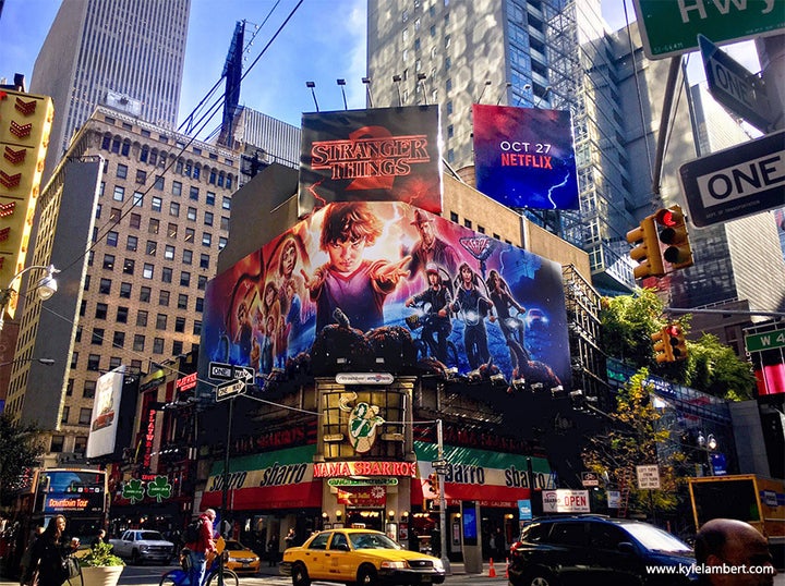
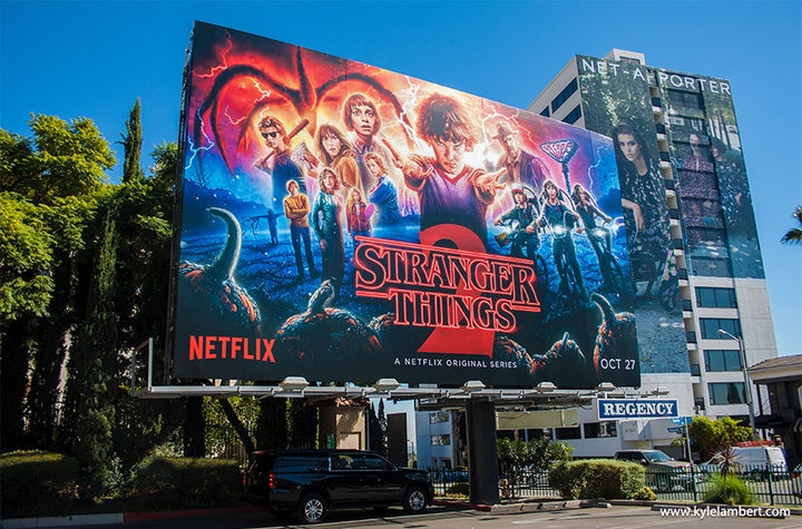
The recent work I did on Stranger Things 2 has been the most satisfying by far. I received such positive feedback about the season 1 art, that there was a built in expectation that the second poster needed to take things to the next level As I was working on the piece, I could sense the anticipation grow around the release of the show and it was impossible not to feel that pressure. This resulted in a very powerful feeling of relief once the art had been released around the world and fans expressed how much they loved it. My friends kept sending me photos of billboards in New York and London, and I was able to drive around L.A. to see the art in the places I visited when I was a kid - It really doesn’t get any better than that.
See more of Kyle’s artwork at www.kylelambert.com or follow his updates on Instagram - www.instagram.com/kylelambertartist
