This piece originally appeared at Medium.
There is a strife brewing between people who claim vital stories are being overlooked by the media vs. those in media with the prerogative of deciding what stories to cover. Both sides seem frustrated. Too many important stories don’t read enough. Too many important stories don’t get covered enough. And the events of last week has brought this disproportion to the forefront. The disaster in Beirut might have been under-reported compared to the tragedy in Paris, but is the media solely to be blamed? What I found really surprised me.
Media has always existed for public service. But today more than ever, it also needs the public’s service. Social networks have overlaid the Web, resulting in destination sites (like newspaper home pages) facing consistently lower organic traffic. Instead, you click and read what your friends share on a social networking platform. And they click, read and re-share what you deem worthy of sharing. Your attention not only influences what your friends see, but what people 10 hops from you in the network see. Your attention is important and goes long way in making News, more than you know.
But which comes first, the disproportionate coverage or the attention bias? Media coverage is assumed to be a pre-requisite to attention while at the same time being reactive to attention itself. However, is it possible that one affects the other more than the reverse, especially in cases like Beirut and Paris? Cogent answers don’t exist in outrage or rants. They exist in data.
When a calamity strikes, many of us turn to Twitter for news. Both coverage and attention manifest there. I analyzed the first 30 hours since both the Paris and Beirut stories broke on Twitter. With the help of topic model algorithms, it is possible to classify tweets with links and filter the ones about Beirut bombings and others about Paris attacks. Our network analysis algorithms also assign a “authority” score to every node (a.k.a user) that is tweeting out the link. Thus, the “attention” score we measure for a link does not just depend on the number of times it was shared or retweeted, but also how influential was the person/account that shared it within the community.
Coverage — Beirut vs. Paris
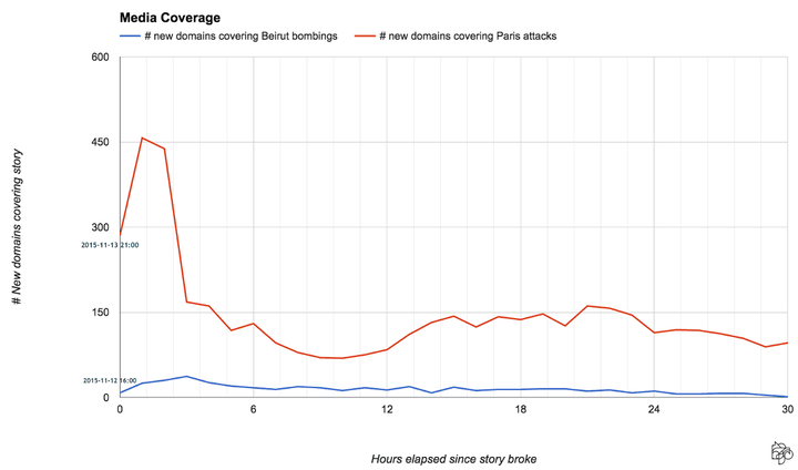
First, lets look at the number of new media outlets/news domains that began covering Beirut and Paris after the story first broke. This ensures its not repeated coverage by a publisher — instead its when they first decided to feature the story. In the first 30 hours, 443 media outlets wrote about Beirut at least once. Comparatively, 4507 media outlets covered Paris during this time. We see a massive spike in the coverage within the first hour for Paris. In fact, within the first six hours, almost 40% of the domains that would ever cover the Paris incident had already posted about it.
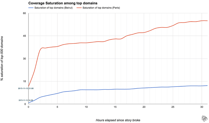
But not all media outlets are equally reputable or have a significant large following or can influence the masses as the others. So, we took the top-500 news domains that get most shares (irrespective of these two incidents). These 500 media outlets is a superset of Alexa’s top news sites by traffic. Our goal is to find out how many of these top media outlets reported about the two events at least once since the story broke. We call this Saturation, the percentage of top-500 domains that have covered the story.
Again, we see a wide discrepancy in the saturation during first 30 hours. For the Paris attacks, the saturation of top media domains is almost 5 times more than that of the Beirut bombings. Moreover, there is a very steep rise in coverage saturation for Paris within the first 2 hours, indicating that the saturation was not just larger but also considerably faster. For an entirety of 24 hours since the Beirut bombings, only 57 or ~11% of the top-500 media outlets had written about it. Comparatively, 51% of these top media outlets had covered Paris in that time.
These two charts strongly indicate that there is disproportionate media coverage on the Paris vs. Beirut incidents. In fact, several reasons have been floating around the Web, but very few of them have any data proof to support their conclusions. To judge such an important discussion, opinions maybe salient but ultimately, not sufficient. So we must look at data, and particularly the other half of the media equation — audience attention.
The Other Half — Audience Attention on Beirut and Paris
Why does social media matter? Because it has become the most powerful engine of news distribution. Distribution is something the media industry has been steadily losing control of. Under such drastic circumstances, the consumer now wears a new hat of the distributer, whether or not he/she is aware of it. Media is bound to the distribution metric, because it not only craves impact but needs ads. Thus, before we draw overriding conclusions from the disproportionate media coverage data, lets look at attention on Twitter around both these events.
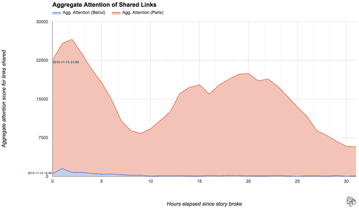
The attention score of a shared link in a tweet about Beirut or Paris depends on the number of times it was shared, re-tweeted and the authority of the person tweeting it. We define a measure of Aggregate Attention per hour by considering all links posted within that hour, then summing up their individual attention scores. There are other ways to measure attention, such as like reading minutes, likes or favorites. But in this analysis we only use shares and the authority score of the sharer — two significant attributes that affect distribution.
What we see looks disconsolate — attention for Paris in Twitter literally dwarfs attention on the Beirut bombings! The data shows that in spite of the Paris attacks starting almost 15 hours after the Beirut tragedy, the first blue peak did not get relatively significant attention, even though it was uninhibited by the Paris news during that period. After an hour of both stories breaking, the highest attention received by links about Beirut bombings is just 5% of what the Paris links achieved in the same time.
Coverage vs. Attention — Who affects the other more?
Notice the red curve of social media attention in the context of Paris looks similar to the red curve of media coverage on Paris. In fact in both cases of Paris and Beirut, we found a strong correlation between coverage and attention, as measured by the Pearson Correlation Coefficient. For Paris, this correlation is strongly positive (+0.74). And for Beirut as well, the correlation between attention and coverage is still strong (+0.66). So between attention and coverage, which one influenced the other?
But wait — ok I know what you were thinking: “correlation does not imply causation”. The phrase is so well known it has its own Wikipedia page. This appears to be a complex chicken and egg problem — did the coverage hurt the attention or did the attention hurt the coverage?
Predictive Causality
The thing about signals like “Coverage” and “Attention” is that at the end of the day, they are just time series data. The Granger Causality Test is a statistical hypothesis test for determining whether one time series is useful in forecasting another. It has been widely used to predict different kinds of scenarios, including macroeconomic pricing data and neural spikes in the brain.
The ideology of Granger Causality is simple: a signal X is said to Granger-cause another signal Y, if past values of X can help predict the current level of Y. This is a type of predictive causality test based on causal ordering. If Xand Y are correlated purely by chance, it is unlikely that the past values of one will be able to predict the current value of the other. The only way that can happen is if one plays a significant role in generating the other.
I will skip the gory math details here, but when you Granger analyze coverage and attention you are basically asking a question like: does the coverage in the 5th hour since the story broke depend on the attention received in the first 4 hours on the story?
The granger analysis sprouts out certain values at different lags between the time signals, and using them we can estimate if the result is significant. What does “significance” mean? A significant result means there is a high probability that if you pick a random sample, then the pattern you are observing wouldn’t be there at all. That means the data pattern you are observing now is indeed special. On the other hand, an insignificant result means the test is hinting that this data pattern is quite possible in a random sample, hence your data pattern is nothing special.
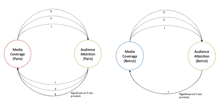
When I tested if coverage in the last-x hours depended on the attention in the last (x-1) hours, I ended up empty handed in both cases. For the first 7 lags, the data showed insignificant chance that the coverage causes attention. But when I tested the reverse, i.e. if attention causes coverage — I found in both cases a significant result within the first 3 lags. This statistical method in combination with our data shows that the attention signal can significantly predict the coverage signal in the future, for both Paris and Beirut.
What this suggests is something I would have never expected. We are quick to blame the media for lack of coverage on an issue. However, it is the amount of attention such issues received in the past that determines media coverage on it in the future. Attention causes coverage more than the reverse.
The implications are huge. As consumers of news media, we share a responsibility for what effectively becomes “news”. Our behavior — what we choose to read, what we decide to share — helps shape coverage across the media ecosystem.