
Maps are incredible because they are capable of so much.
They can tell you where you are or where you're going. They can inform you about a city's history as well as what to expect in its future. They can even tell you where not to go on Saint Patty's Day, and what microorganisms might crawling around your nearest subway station.
This list includes all of that and much more.
In no particular order, these are my picks for the 10 best New York City maps of 2015.
The most commonly spoken language in each neighborhood that's not English or Spanish
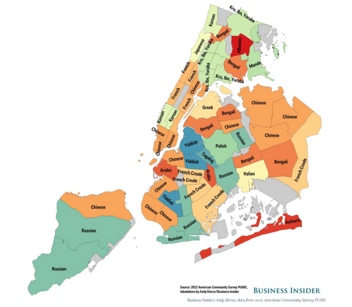
Throughout it's history, New York City has served as the primary gateway to the U.S. for immigrant populations from all corners of the world. Some, such as the wave of Germans who arrived in the late 1800s, once made up a substantial portion of the City's population, but have since dispersed throughout the country. Other populations have largely remained in New York, carving out their own local communities in which they retain much of their original culture.
This multicultural character of New York is clearly apparent when you examine which languages are spoken in the home. Based on data from the U.S. Census American Community Survey, this map displays each neighborhood's most commonly spoken language (other than English or Spanish).
Who knew there were places in New York where Yiddish was commonly used, let alone Mande, Amhario, and French Criole?
You can read more about the map at the original post by Business Insider.
New York City in the style of Inception
This visually striking map was made with the Tangram mapping engine, an impressive new tool from Mapzen. What makes Tangram special is its use of WebGL, an esoteric programming library that works directly with your computer's graphics card, allowing complex 3D visuals far beyond what would otherwise be possible.
The map, reminiscent of the horizonless landscape from Inception, 3D buildings and all, is just a taste of what Tangram is capable of. You can find a few more great examples here.
Added bonus: New York City in the style of Tron, another Tangram creation.
New York City of the past
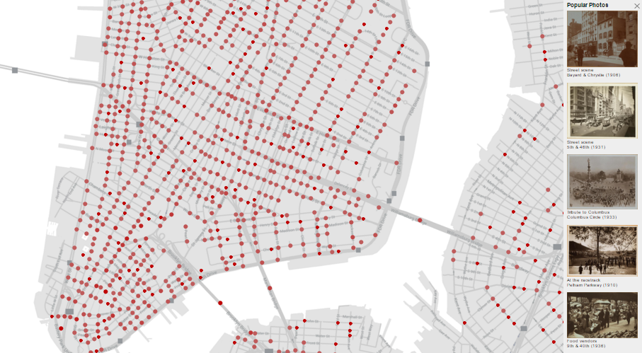
The New York Public Library's initiative to digitalize its collection of historical documents and photos goes beyond just scanning and uploading. It has recruited the help of NYC's tech community to get the images geocoded, documented, and organized into an API, where there are easily accessible for anyone to use.
One result that highlights the NYPL's achievements is this interactive map, OldNYC. Clicking on a red dot brings up a series of historic photos taken in that location. Each one includes a description and the date the photo was taken.
To give a sense of the depth of the project, the dots cover nearly every street corner in Manhattan, and an impressively larger number of locations throughout the rest of the city. And many of them may contain a surprisingly large number of photos. On my street alone, which is not a particularly noteworthy place, there are 20 historic photos, all taken within a few hundred feet of my front door.
New York City of the future
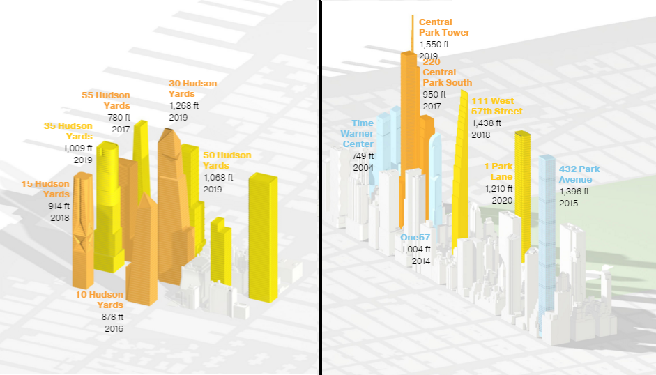
This map, by National Geographic, documents the unprecedented transformation that the New York City skyline will undergo over the next few years.
2014 saw the completion of the One57 tower, an ultra-tall, ultra-skinny, and ultra-expensive condominium located just south of Central Park. At a height of 1,005 feet, it was the tallest residential building in New York City and #6 overall... until three months later, when it was surpassed by the taller, skinnier 432 Park Ave tower, constructed only a few blocks away.
Over the next few years, One57's height will be surpassed again, and not just once or twice. Construction is either planned or underway for an additional 32 supertall towers, 15 of which will be taller than One57!
To learn more about each of these buildings and the neighborhoods where they will be built, have a look at National Geographic's interactive map.
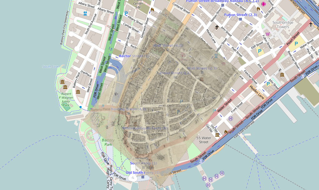
New York City of the distant past
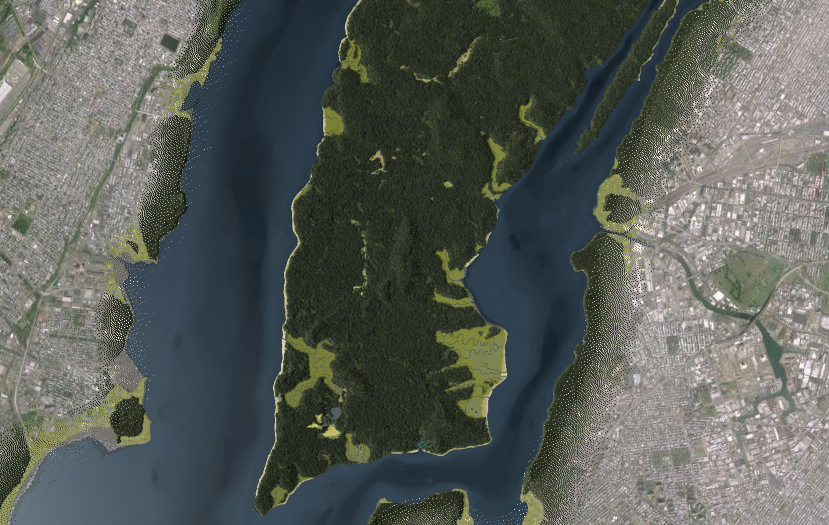
This map, created by the Welikia Project, gives you a view of "Manahatta" circa 1609, prior to the European arrival to the island. The map allows you to zoom in on the current location of individual blocks to learn more about their original ecology and wildlife.
Though not viewable in this map, it is striking to see what the southern tip of the island looks like when superimposed over the current map of Manhattan. To give an idea, this next image comes from a 1660 map of the first dutch settlement. Seeing them together makes clear how much of Lower Manhattan's land is actually man made.
Street Trees

Based on data from New York City's tree census, Brooklyn developer Jill Hubley plotted 600,000 of New York City's street trees, each one color coded by species and sized proportional to trunk diameter.
The colors and shapes make for a visually stunning piece of work, one which is not done justice by the image shown here. To fully appreciate the map, it's worth having a look at the interactive version and panning around a bit.
Microbes on your morning commute

Earlier this year, researchers at Weill Cornell Medical College used DNA samples from each of New York City's subway stations to produce the City's first "pathogen map." The samples were found to include genetic material from 15,152 different species. Though the authors acknowledge most of it is harmless, they did identify 67 species of disease-causing bacteria.
Perhaps more interesting [and gross] than the study itself is the interactive map made by the Wall Street Journal, which allows you to examine the data yourself.
Now you know, if you find yourself in the Times Square station, you may be in contact with bacteria associated with medical-device infections, meningitis, toxic cleanup, or Italian cheese.
Crime and transparency
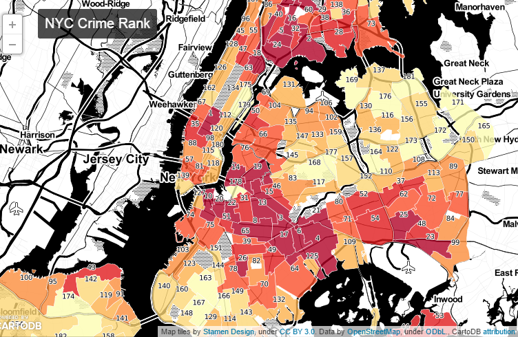
For the job they have done keeping the city safe from crime, my hat's off to the NYPD. But when it comes to their record on government transparency, the NYPD is perhaps the worst public agency in the country, at any level of government. As it relates to crime data, which they are required by law to post online, the NYPD has released only an incomplete set of details, spanning a short time frame, and locked behind a crude map, leaving the information inaccessible and all but useless to the public.
- Murder and assault are at least four times more common in our least affluent neighborhoods as compared to our most affluent ones.
- More robberies happen in the three hours between 2-5PM, than 2-5AM.
- The neighborhood with the worst felony ranking is Midtown South, followed by Hunts Point and Ocean Hill.
- The best ranked neighborhoods are: Arden Heights, Annadale-Huguenot-Prince's Bay-Eltingville, and Rossville-Woodrow, in that order.
Inside Airbnb
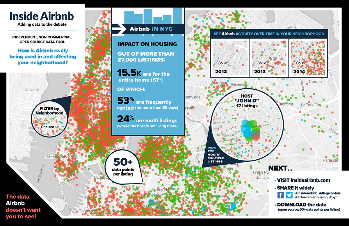
Since the City began cracking down in 2014, Airbnb has become a highly controversial subject in New York. As in other cities, proponents claim Airbnb benefits local businesses by allowing for more tourism. And for those families struggling to afford housing costs and don't mind accommodating guests, it offers a supplemental source of income.
Critics argue that Airbnb contributes to the problem of unaffordable housing by inflating rents, that is violates zoning regulations by overcrowding, and it leaves a building's permanent residents feeling unsafe with strangers freely roaming the halls.
Enter InsideAirbnb. Created by "independent digital storyteller, community activist and technologist" Murray Cox, InsideAirbnb allows you to dig through an impressively large and detailed collection of information about Airbnb rentals in NYC, to help you understand the true consequences for your neighborhood.
- "How many listings are in my neighbourhood and where are they?"
- "How many houses and apartments are being rented out frequently to tourists and not to long-term residents?"
- "How much are hosts making from renting to tourists (compare that to long-term rentals)?"
- "Which hosts are running a business with multiple listings and where they?"
Mapping New York's interestingness

Each line in the map represents one person's photo snapping path through New York City.
To create the map, Mapbox's Eric Fischer compiled 10 years of geotagged images from flickr, grouped them by photo collection, and joined them together in chronological order. The red lines are those in which the photographer traveled at between 7 and 19 miles per hour between photo sites.
The result is a map of the places people found interesting, and the paths in which they traveled through them.
This project covers not only New York City, but the entire world. You can explore the interactive version here: Geotaggers World Atlas.
Placename origins and a housing cost sanity check
If you're familiar with Manhattan's ordered layout of parallel streets and avenues, you may have wondered why its most iconic street, Broadway, traverses the island along the diagonal. The answer to that and the origin of many other iconic New York City placenames are contained in this map.
The map was made by Constantine Valhouli on behalf of his forthcoming startup NeighborhoodX. Through its analysis of neighborhood-level data, NeighborhoodX aims to give people better insights about their cities and neighborhoods. For an early preview with some surprising results, see this 3D map of NYC housing prices, one of my favorite maps from 2014.
Along similar lines, the map below also helps put NYC housing prices in context. Click on a neighborhood marker and it will show you where else in the world you could get an apartment for roughly the same price.
The real Manhattan subway map
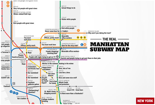
This "Judgmental Subway Map" from Thrillist shows what to really expect at each of the subway stops (larger version).
For anyone offended by the stereotypes, please don't shoot the messenger.
Honorable mention
This timelapse of New York City's growth, 1815-2013, comes from reddit user Africare.
This post originally appeared on Metrocosm