The definition of good user experience (UX) is always evolving. As design capabilities become more sophisticated and our understanding of what users need grows clearer, usability norms rise to the occasion. Good user experience necessarily depends on the user -- specifically, on what his or her desires and goals are. That means there’s no single answer or set of recommendations that can define good UX. However, there are best practices that are fairly broadly applicable, especially when it comes to B2B.
Those of us who run B2B companies know that our challenges are distinct from those of B2C companies. For one thing, the sales process is much longer and customers require access to more resources and information. We often also have to appeal to a number of different groups and functions within a company.
Based on some of those unique challenges, here are four B2B website UX best practices to follow.
1 - Distinct user pathways
B2B websites often face the challenge of designing a website that can serve a variety of user groups. Your business may serve many industries or offer a variety of solutions for companies of different sizes. Even if you only serve a single industry, within every company there are usually many people involved in choosing and implementing a B2B service or software. Further, each person involved in the process may have a different function or role within the company. The needs and desires of these users will likely not be exactly alike, which is why it’s important to design user pathways that can guide them appropriately.
We’re a digital agency and clients come to us for a range of different digital services. We also serve a variety of industries. When prospective clients come to our site we want to make sure they’re able to find a pathway to information that’s applicable to their needs. Rather than simply forcing users down a single path to browse, we make sure to offer multiple avenues to relevant landing pages.

For example, a marketing director might come to our site knowing he or she needs an agency to help with social media management. For that user we offer a direct path to information about our process and the results we’ve achieved for other clients. On the other hand, the owner of a small business might come to our site knowing he needs help with the digital marketing, but without any idea of which services will be right for his business. For that user we present a pathway to explore our service offerings within the context of a specific industry.
2 - Human contact
The buying process for B2B is much longer and more complex than it is for B2C. Companies deciding whether to invest tens of thousands (or more) in a service or product are necessarily going to have more questions than an online shopper picking out a new t-shirt.
An important component of good UX for B2B is the ability to access resources. B2B websites need to offer multiple ways to get in touch with a human who can help answer questions or concerns that arise for the user as he or she browses your site.

In the above example, Salesforce offers onsite users the chance to speak with a sales agent in a variety of different ways, depending on whatever their communication preference may be.
Even if the user doesn’t have any concerns per se, B2B is still a sector where many customers still feel most comfortable taking the first step over the phone as opposed to online. Business needs are often complex and each B2B customer comes to the table with a unique set of circumstances. You can increase your chances of success with prospects by making it easy for them to find out how to contact you directly to discuss those needs. “Contact us” calls-to-action, phone numbers, and live chat options (if available) should be placed in prominent positions on your site, especially at key decision points where users are most likely to abandon.
3 - Clear messaging
Clear messaging is important across the board when it comes to web design. B2B or B2C, ecommerce or lead-generation, all of us need to pay attention to how we convey the value of our business, brand, or products to web users. So while this recommendation isn’t necessarily exclusive to B2B sites, it is one that is often badly handled by B2B sites in particular.
What usually happens is that in a race to sound intelligent and impressive to business audiences, B2B websites end up with messaging that is needlessly complex, technical, or jargon-heavy. There’s a time and place for technical language and industry-specific jargon -- in fact, it’s a critical element of successful B2B UX, as will be discussed in the next point -- but a website shouldn’t become overwhelmed by this type of content.
Content and messaging have to be carefully crafted so that a clear value proposition is apparent on your homepage and key landing pages. Technical information and product or service specifics should be present, but only once the user has expressed enough interest to merit their introduction.

Marketo, a marketing automation platform, presents the user with concise messaging immediately when they land on the page. The messaging is compelling, and incredibly descriptive, succinctly informing the potential customer of what the company offers.
Strong messaging must also avoid the pitfalls of meaningless corporate lingo. Words like “synergy”, “solution”, and even “technology” are too vague to impart real meaning and they won’t resonate with users. When it comes to messaging, be specific about what you do and what makes you unique. Everything else is supporting material.
4 - Content availability
While your messaging should be clear, direct, and as simple as possible, that doesn’t mean your website can afford to be light on content. The B2B sales process is much more research-oriented than the B2C sales process. The bigger the investment, the more research customers are going to want to do. And, as mentioned earlier, the B2B website has to work hard to convince many different user types of the value of its services or products. Doing so means providing in-depth content that speaks to user needs and concerns.
This is where your expertise in your industry comes in. Technical product information, for example, might be very important to some segments of your website audience. On pages oriented towards those audiences, you need to present relatively large amounts of technical information in a way that still manages to be visually appealing. This is also a scenario where that jargon we talked about avoiding in main messaging and value propositions can finally be put to work. After all, a certain amount of jargon will help demonstrate that your business is a member of the industry you serve.
Determine what information matters to each of your user groups. Make sure that in-depth information is accessible at the appropriate stage of the buying process, and that it’s written in language that appeals to your distinct audience.
The Ultimate B2B User Experience
These recommendations are a good starting point for making sure your B2B website is designed to speak effectively to your audience. The work doesn’t stop here, though. Everything falls out of date eventually if it isn’t maintained, so it’s necessary to improve website usability on an ongoing basis. As you implement changes you’ll also start to learn what works best for your specific users and begin to tailor your website experience even more closely to appeal to them.
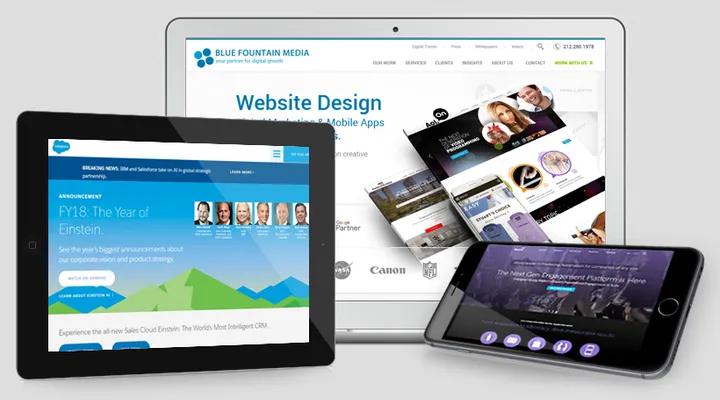
To learn more about B2B website design, visit Blue Fountain Media online.