Over 215 million people today are considered migrants, 3.15 percent of a world population nudging seven billion -- data beautifully visualized on a website called peoplemov.in, which tracks on one dynamic page all the population outflows and inflows for every county on the planet.
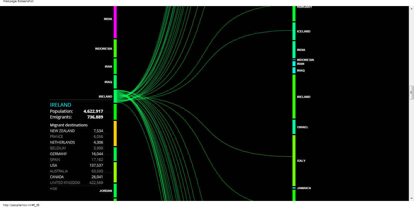
So, naturally we turn first to Ireland, where one click traces the emigrations of 736,889 of Ireland's 4,622,917 people. For 422,569 the journey wasn't too far, just to the U.K. Another 137,537 Irish went to the USA, the world's top destination for world migration. Australia drew over 63,000 from Ireland, Canada just over 26,000. The rest of the top 10 destinations from Ireland were in western Europe, plus New Zealand. But the Irish also found their way to new lives in Bolivia, Iceland, Japan, Turkey and so many other lands around the globe.
Click the icon on the parallel column of nations, however, to see that more people actually moved to Ireland -- 898,630, with almost 400,000 coming from the UK, over 93,000 from Poland, and just shy of 37,000 from the USA. The rest of that top 10 list is completed by Lithuania, Nigeria, Latvia, Germany, China, Philippines and India. They were joined by people who had been living in Kazakhstan, Malaysia, Mongolia, Vietnam and many more global outposts.
And that's just Ireland. The website provides a similar look at migration patterns for every country in the world, based on data from a variety of sources, current for 2010.
According to peoplemov.in, the almost 43 million immigrants to the USA accounted for 13.8 percent its population. Not surprisingly, the biggest movement was from Mexico, listed here as an inflow of 11,635,995. The outflow from the USA was a modest 2.4 million, with Mexico being the top destination.
The other top migration corridor in the world runs between Russia and Ukraine, with over 3.6 million people relocating in each direction.
UK-based data visualization specialist for Nokia Carlo Zapponi, describes his online experiment this way:
peoplemovin shows the flows of migrants as of 2010 through the use of open data. The data are presented as a slopegraph that shows the connections between countries. The chart is split in two columns, the emigration countries on the left and the destination countries on the right. The thickness of the lines connecting the countries represents the amount of immigrated people.
According to the site, no one emigrated from Albania to American Samoa, Aruba to Gambia, or from Malta to Uganda... which is to say you can burn through a lot of spare time tracking the world's wanderings on peoplemov.in.
Follow Zapponi on Twitter at https://twitter.com/littleark