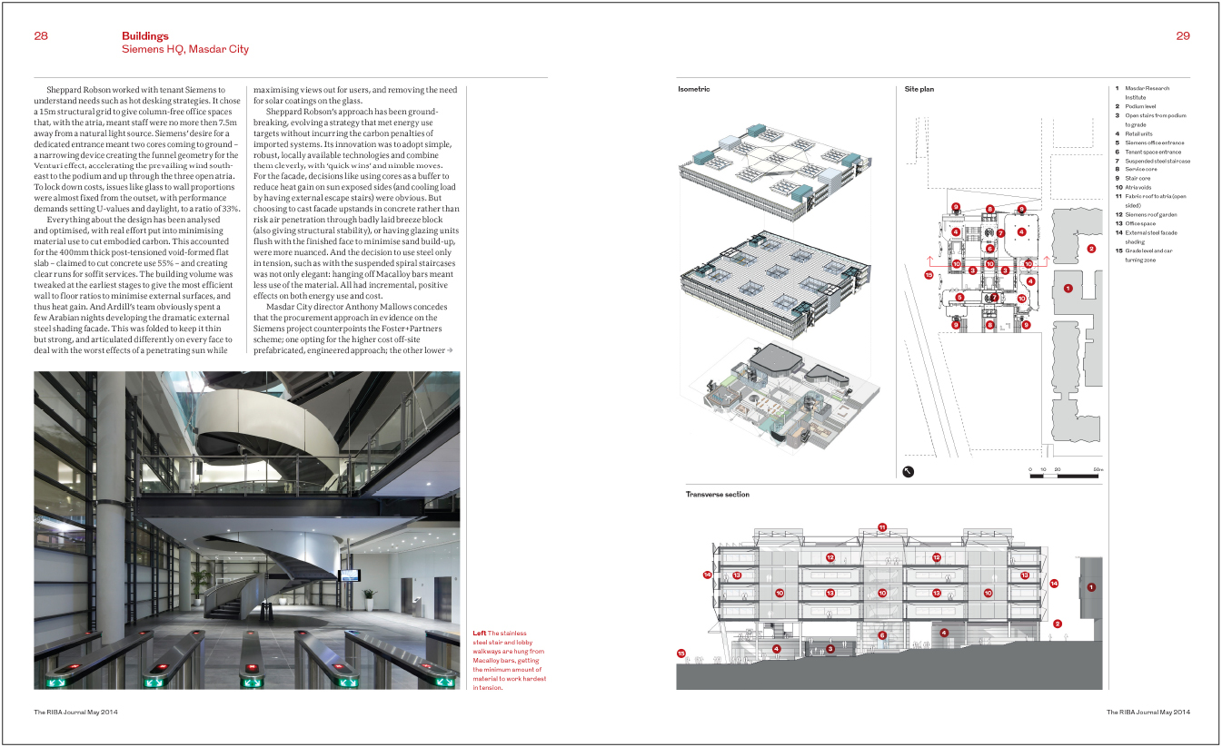
First published in Edge Condition June 2014
What happens from the building to the printed page.

I'm not an architect but I specialize in representing architecture on the printed page. I'm a graphic designer and magazine art director, and a great deal of my work involves translating 3 dimensional structures into a 2 dimensional format either on paper or via a computer screen. I'm not alone in this process. I collaborate with architectural photographers and often the architects themselves who supply me their visualizations and drawings.
I also work with architectural journalists. In most cases they would have visited the buildings before me and have their own opinions of what is important to represent and brief me accordingly. I've also been privileged to work with great editors like Vicky Richardson on Blueprint (currently head of Architecture, Design and fashion at the British Council) and more recently Hugh Pearman at the RIBA Journal, who is also the architecture critic of The Sunday Times.
The process begins with discussing the main concepts behind the projects, and we look though the photography, and the various drawings of site plans, floor plans, elevations and sections. If appropriate we might also include sketches, models and renderings. But more often than not the photography and drawings combined are enough to describe the building or scheme. Editorially there is limited space due to issue size and the amount of pages that can be dedicated to each feature. Therefore the picture editing has to be selective, and each image chosen to communicate a specific view of the architecture. Also when I am looking through the material and considering how to approach the layouts I'm also looking for a strong opening image through to an appropriate end shot, and possibly an arresting front cover.
So from a graphic point of view architectural imagery in all of its forms can be required to serve more than just accurately representing a building. When I redesigned Blueprint magazine in 2006 the process did not only include the magazine design but was also an opportunity to reconsider the use of imagery starting with the front cover. Blueprint has always covered a broader range of design disciplines, but unlike before we decided to set a rule with the relaunch of always choosing architecture for the front cover to reflect the core subject matter of the magazine. The photography chosen or art directed for the cover was not purely descriptive, but intriguing and atmospheric with a graphic impact that would lead to it being picked up from the newsstand. An example of this is when I worked on a cover and feature for ZH Architects the recently completed Maggie Centre (Link) in Fife, Scotland. Although the photographer Helene Binet had been commissioned to document the building, part of the brief was also to shoot an exclusive image for the cover of Blueprint magazine. When I discussed this with Helene, one of the challenges that became apparent was how to photograph such a landscape structure to fit a portrait cover format, as well as allowing space for the logo and cover lines. I suggested that the cover image could be quite abstract compared to the rest of the more descriptive photography that she was shooting for the feature itself. As a result, Helene confidently came back to me with one unusual night shot that worked perfectly to make a bold and dynamic front cover.
Drawings on the front cover of an architectural magazine is nothing new, however rather than just use a supplied architects work I chose to collaborate and see what could be achieved working together. The process was fundamentally the same as art directing a photographer or illustrator as giving guidance on how their work could be used in the context of a magazine. I thought it worked particularly well when collaborating with East architects on an issue where we featured their new public square in Bermondsey that was completed in 2009. A profile piece on the practice included more images of the square, but the theme was continued in another broader feature on the design and use of public spaces. Various locations in London were selected and appropriately used a reportage style of photography capturing the spaces in use.
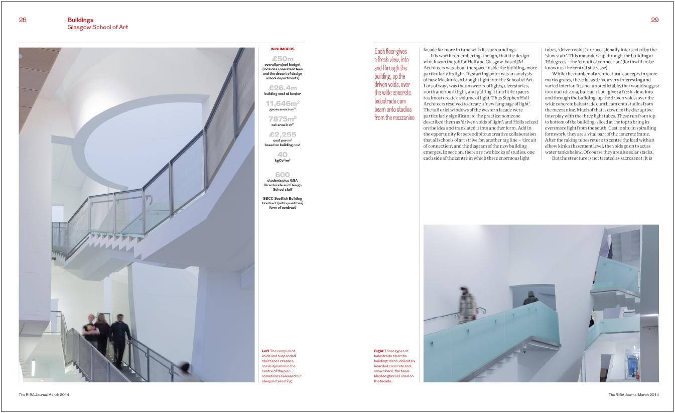
Editorially showing the function and the life of the built environment might be fundamental to what the piece is about. For example the photographer Iwan Baan has been acclaimed for doing just that and his own take on architectural photography is to capture the built environment in use and more often than not that includes people being in shot. The RIBA Journal recently published his images of the newly completed Glasgow School of art building (shortly before the disastrous fire), and as is his style, Iwan creatively included people within the building helping to depict an overall sense of function and scale.
As an art director and designer of architectural magazines and books, it is important to identify key images to translate 3 dimensional architecture into a 2 dimensional format. If correctly edited and presented the reader will be taken on a descriptive tour of a building and come away with a good understanding of its form, function and ambitions.