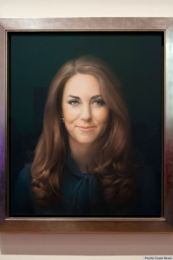
The recent kerfluffle over the official painting of Kate Middleton [Huffington Post] isn't the first portrait-related royal ruckus. The Telegraph and other UK sources have reported that a long-disliked picture of Queen Elizabeth II will finally emerge from storage. Soon after the 1953 unveiling, the picture was criticized for being a weak likeness and for having distorted features, like too much neck. The artist responded that he knew that the planned exhibit site would be up on a high wall and that the picture was intentionally somewhat distorted to account for the viewing angle.
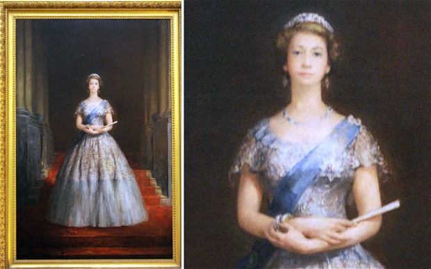
Today's technology allows one to test the theory by digitally adding a perspective-shift to the image. (Presumably old-fashioned technology also could have worked since a large format camera's movable bellows can allow one to nudge the apparent perspective, though perhaps it wasn't tried then.)
Shifting the vertical perspective by 40 percent (a fair approximation of looking up toward a picture hung high up) creates these changes:
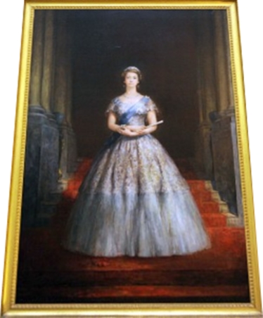
Artist John Napper's 1953 coronation portrait of Queen Elizabeth II -- promptly rejected and whisked into storage for six decades. (Photo by TrinityMirror.com via The Telegraph, used under journalistic/commentary "Fair Use" terms.)
So indeed her neck shrinks a bit -- though it still looks too big. Perhaps a somewhat-oversized neck is passable in the same way fashion images are often elongated.
(Shifting less than 40 percent made little noticeable change. Shifting more than 40 percent was bizarre: neck perhaps better-sized but topped by a pinhead -- and with forearms inflated to Manchester steelworker proportions. Manhands on Her Royal Highness just won't do.)
Less obvious problems with the picture include:
1) Alignment of her skirt's horizontal color change area with the horizontal of the stair-step behind her (a compositional "fault" for which realist art instructors of the time would have downgraded any student), and
2) Confused rendering of linear perspective. When lines recede into the background, their various angles should converge at geometrically-predictable "vanishing points," but the artist managed to muddle these. The nearest steps seem to have a vanishing point at odds with the steps further back; the column bases' vanishing points are elsewhere; and the horizontal floors appear oddly-tilted.
Remove the person and make this a perspective assignment in a high-end art academy and this would have been graded B+ if the teacher were in a forgiving mood.
Either way, it would seem like the picture would look at its best if indeed hung up high as the artist intended.