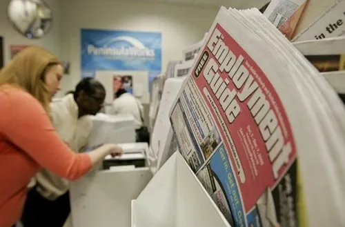
They call this synchronicity. As I write this I'm looking at more than 500 responses to our small business survey that we started two days ago. And I'm also looking at an unusually bleak, cold, and wintery scene in Western Oregon, which is normally green and gray and rainy this time of year, but is now white and icy and arctic. And there's a match there.
You don't have to take my word for it. At the end of this post we're putting three maps showing different views of the data, including an interactive one you can click on to open up individual comments. And below that, you can download the raw data and add your own insights -- or what the heck, show me where I'm interpreting the data wrong. We'd also really like to hear from you about it, please leave your thoughts as comments on this post.
The quick summary is that the situation out there in the world of small business doesn't look good. On the interactive map here, you can click on any circle to open up the actual responses we got, including comments.
Interactive Map with Comments:
(My apologies - The Interactive Map has a tech glitch and isn't displaying this morning 19 Dec.) -->
For example, just about a third of the businesses that responded have had layoffs already, and almost half have reduced hours. Overall, they say layoffs are about equal to 15% of the total remaining jobs from the companies in the survey.
The results so far are surprising to me. I would not have guessed that 32 percent of the companies have already laid people off. I feel like things are bad, but that's worse than I expected. And I would not have guessed that 49% have reduced hours.
It gets worse as I browse through the predictions for next year. The average guess is sales declining by 49%.
The hardest to read are the ones that aren't trying to blame or complain, but just describing their situation. For example:
I cannot overstate how profoundly sad I am to have had to lay off staff members and reduce the hours of those who remain. I have been working like mad trying to figure out a way to survive in these enormously trying times. I've always provided our staff with health insurance benefits and year's end bonuses. Right now I am unable to even pay our monthly bills.
Many are profound in their simplicity. This one projected 70 percent decline in sales, adding,
We are event planners. No one wants to look like they are spending money and no one wants to look like they are celebrating.
And I couldn't help noticing the one saying sales will go down 70 percent and describing the situation eloquently enough with one simple word, an expletive.
There are also those bright spots, the exceptions. One owner expects to double sales next year; they sell nutritional cleansing products. A business that ships Maine lobsters via airfreight reports strong growth because the price of lobster is down. An insurance broker expects to double the business next year because "people and businesses have quit being lazy about their finances."
For the record, this survey -- like the vast majority of the surveys we see these days -- doesn't have the statistical seal of approval we'd get if we rigorously randomized our respondents to represent a cross section of American business. That's very hard to do, and few surveys really do it. What we do have, however, is the collective opinion of the people who saw the earlier post and chose to take the survey. How they are different from a true cross section is anybody's guess.
Map 1: Showing the numbers laid off or work reduced
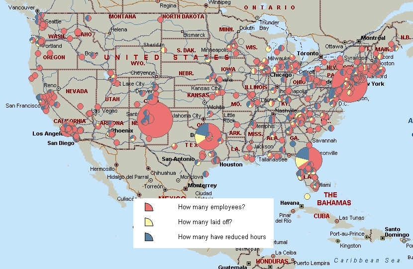
The circles show the zipcodes of our respondents, the size of the circle indicates the total numbers of employees, and the color shows how many of those numbers were laid off or had work reduced.
Map 2: Showing respondents affected
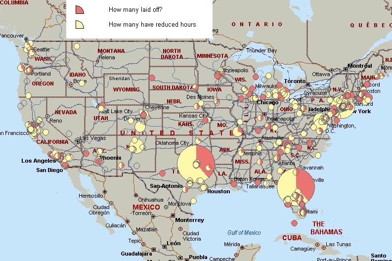
In this map the circles show the zipcodes of our respondents, the size of the circles indicates the number of employees affected, and the color shows how many of those employees lost their jobs and how many just had hours reduced.
Excel Version of the Data:
http://big.assets.huffingtonpost.com/HuffPost-SmallBiz-Survey.xlsx
Raw Text File of the Data:
http://big.assets.huffingtonpost.com/HuffPost-SmallBizSurvey.txt